
11 Ways to See How Climate Change Is Imperiling the Arctic
The latest data is sobering. These visualizations show just how perilous the situation is.
While the average temperature of the planet is slowly creeping up, the Arctic is warming far more quickly—as much as two to three times faster. On December 22, a weather buoy near the North Pole reported temperatures at the melting point of 32 degrees Fahrenheit. And recent research suggests that the average summer temperature in the region over the last century is higher than in any other century for at least 44,000 years.
Maps and visualizations of the resulting changes in the Arctic make it clear that global warming is no hoax.
Scientists are getting a vastly improved picture of what is happening in the Arctic today as sea-ice extent, thickness, and volume are tracked by satellites, ocean buoys, and submarines with upward-looking sonar. The measurements show that the Arctic keeps breaking records for rising temperatures and declining ice cover. The sea-ice extent hit an all time low in 2012—1.27 million square miles less than the average since 1979. And the winter maximum hit its lowest extent ever at the beginning of this year—620,000 square miles less than average.
Numbers like these are worrisome on their own, but translating them into maps and graphics can result in startling depictions of the situation. From warmer air and melting ice to struggling polar bears and new shipping lanes, here are some of the best and most revealing visualizations of the changing Arctic.

This NASA graphic uses a concept known as small multiples, popularized by data-visualization pioneer Edward Tufte. The technique is a way to show many slices of a dataset for comparison without cluttering up and confusing a single diagram. It is particularly apt for showing incremental change over time, which makes it an effective format for climate-change visuals.
The chart above shows the monthly extent of Arctic sea ice from 1979 through the first half of 2014. (The latter half of 2014 is missing because the graphic was made during that year.) Looking from top to bottom, each row shows the ice during a given year as it wanes and then grows again from January to December. As your eyes move to the right, you can see the amount of ice slowly decline. The trend is particularly visible for September (fourth row from the bottom), when the sea-ice extent is at its lowest point of the year.
Depending on which method scientists use to forecast future ice loss, the Arctic could become completely free of summer sea ice in the second half of the century. Or by the middle of the century. Or even in less than a decade.

This animated chart, published by NASA’s Earth Observatory on December 6, offers another way to visualize sea-ice extent. You can easily see the slow and steady trend downward from 1979 to 2016. You can also see the variation within that downward trend—which is why sea-ice extent that increases over one or two winters shouldn’t be used as evidence that the trend is reversing.
The record low for summertime sea-ice extent, set in 2012, appears significantly lower than in any other year. And though this year’s ice line runs above the record low during September, by late October it had dropped below the 2012 line, putting us on track for a record low wintertime maximum for the third year in a row.
The National Snow and Ice Data Center offers an up-to-date interactive version of this chart.

The changing Arctic has caught the attention of cartographers as well. Last year, citing evidence that the the U.S. is already feeling the effects of climate change, President Obama said, “Shrinking ice caps forced National Geographic to make the biggest change in its atlas since the Soviet Union broke apart.”
You can see the change he was talking about in the animation above. The last image is from the 10th edition of the National Geographic Atlas of the World, published in 2014. On that map, the multiyear (older) ice from 2012 is shown as a white mass; the maximum extent of sea ice is shown as a line.
It’s a challenge to map something that varies so much throughout a season, and from year to year. You can read more (and watch a video) about the cartographers’ decision-making process in this article.

Earlier this year, climate scientist Ed Hawkins of the the National Centre for Atmospheric Science (NCAS) created an animated spiral of the rising average global temperature between 1850 and 2016. The graphic quickly became popular, gaining millions of views on Facebook and Twitter. A version of the spiral was even incorporated into the Olympic opening ceremony in Rio.
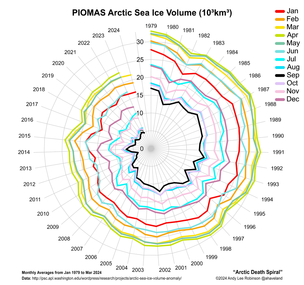
The spiral above is Hawkins’ animation of Arctic sea-ice volume from 1979 to 2016. It’s lopsided because the ice fluctuates seasonally, but the trend is very clear. (Another scientist, Andy Robinson, has been slowly building a static “Arctic death spiral” that separates the trend by month and traces sea-ice volume during each month through the years.)
Hawkins has made more spirals, including one of atmospheric CO2 concentrations and another temperature spiral in 3-D. His work inspired Jay Alder, another scientist, to make a terrifying spiral of projected future temperature increases.

Underlying all the changes in the Arctic is the rising temperature. This visualization shows the Arctic surface temperature between October 2010 and September 2011—and how much warmer it was compared to the average for the preceding three decades. What scientists had predicted is starkly visible: The Arctic is warming as much as two or three times faster than the rest of the planet.
One of the biggest reasons for this disparity is a feedback loop in the Arctic that reinforces the trend. Bright white ice reflects more solar radiation than darker ocean waters. So as rising temperatures cause ice to melt, the larger ocean surface absorbs more solar radiation, which causes more warming in the region, which causes more ice to melt.
The relative reflectivity of a surface is known as its albedo. This cycle is known as the ice-albedo feedback loop.

Between 2000 and 2014, loss of reflective sea ice has exposed darker ocean water. That, in turn, has raised the rate of solar radiation absorption in the Arctic by 5 percent. Averaged over the Arctic Ocean, the increase is equivalent to about 10 watts per square meter. During that same period, the rate for the rest of the globe has stayed pretty much the same.
The image above shows where the absorption has increased the most: the area just above Alaska and Canada’s Yukon and Northwest Territories, known as the Beaufort Sea. Here, where sea-ice loss has been particularly pronounced, the increase has been around 50 watts per square meter.
One very troubling aspect of Arctic sea-ice decline is the rapid loss of the oldest, thickest ice. This is ice that stays solid through multiple years as the younger ice melts and refreezes around it. The old perennial ice acts as a buffer against summer melts, making it a stabilizing force in the Arctic. But recently the older ice has drastically thinned and shrunk, leaving the entire ice cap more vulnerable to the changing climate.
Scientists can use satellites to track the movement of specific sections of the ice. The satellites detect the particular signature of microwave energy emitted by individual floes, so they can watch how the ice moves and determine how long it’s been around.
This tracking has revealed that the oldest ice has suffered two big periods of loss since 1984 (visible in the animation above). The first one, which starts in 1989, is the result of a change in the atmospheric circulation pattern, which caused ice to be flushed out of the Arctic at a higher than normal rate. The second one starts in the mid 2000s as the older ice becomes less consolidated, leaving isolated floes more susceptible to melting.
Older ice is also thicker ice. This graphic shows how the average thickness of Arctic sea ice has declined as older ice has melted. New ice forms each winter and grows to a thickness of three to seven feet, much of which melts the following summer. Multiyear ice, which is generally 10 to 13 feet thick, acts as a bulwark against summer melting.
This visualization shows how the average depth of the Arctic sea ice dropped dramatically between 1979 and 2013. This decrease leaves the remaining ice more vulnerable to increasing temperatures and changing atmospheric circulation patterns.

Warmer temperatures mean longer, more productive growing seasons in the Arctic. Using satellite measurements of the visible and near-infrared light reflected by the land surface, scientists can quantify and map how much green vegetation is present. The map above shows the change in greenness during the peak growing season from 1982 to 2012.
Throughout the Arctic, virtually all of the tundra has become greener as taller shrubs and trees have spread. This is due to a number of factors, including temperature increases, reduced snow cover, and changing atmospheric circulation patterns. Scientists estimate the growing season has increased by about nine days per decade since 1982.
It’s still unclear how the increase in tundra vegetation will affect permafrost in the long run. But the permafrost could play an important role in future warming: As it melts, it releases methane, a powerful greenhouse gas that could further accelerate warming.

The large, charismatic animals at the top of a threatened ecosystem’s food chain often come to represent the plight of all the animals there. In the Arctic, this role is undoubtedly played by polar bears. Not only are they beautiful and appealing creatures; their problems can also be dramatic and photogenic. Photographs of bears clinging to small bits of ice, trying to reach food sources that are increasingly out of reach, have become iconic images of the consequences of climate change.
But for a number of reasons, the polar bear’s climate story is a complicated one. As the map above shows, each of the Arctic’s 19 identified subpopulations is dealing with different environmental conditions. Four of the subpopulations are declining, five are relatively stable, and only one is growing. For nearly half of the subpopulations, there isn’t enough data to know what is going on.

As Arctic sea ice recedes, more open water will mean more opportunities for shipping. Research published in September in Geophysical Research Letters forecasts that in the coming decades, the Arctic Ocean will become a viable shortcut for more and more ships moving cargo between Pacific and Atlantic ports. Today, most ships from Europe to East Asia take about a month when they use the Suez Canal. The route from North America to East Asia via the Panama Canal takes an average of 25 days. By the end of the century, various routes through the Arctic could shave four days off the journey from North America, and almost two weeks off a voyage from Europe.
The graphic above shows when these possible routes will open up to ships with a moderate amount of built-in protections against the ice (in pink), as well as regular open-water ships (in blue). The images on the left are based on a scenario in which future greenhouse-gas emissions are lower; on the right is a higher emissions scenario. You can see the routes begin to converge on the straightest routes as time goes by and more ice is lost.
The new study estimates that with lower emissions, the Arctic will be open for four to eight months of the year by the end of the century. Under the higher emissions scenario, it will be open for 10 to 12 months. But there may be an upside: The researchers point out that as shipping routes are shortened, ship emissions may be reduced as well.
