By Rachael Bale, ANIMALS Executive Editor
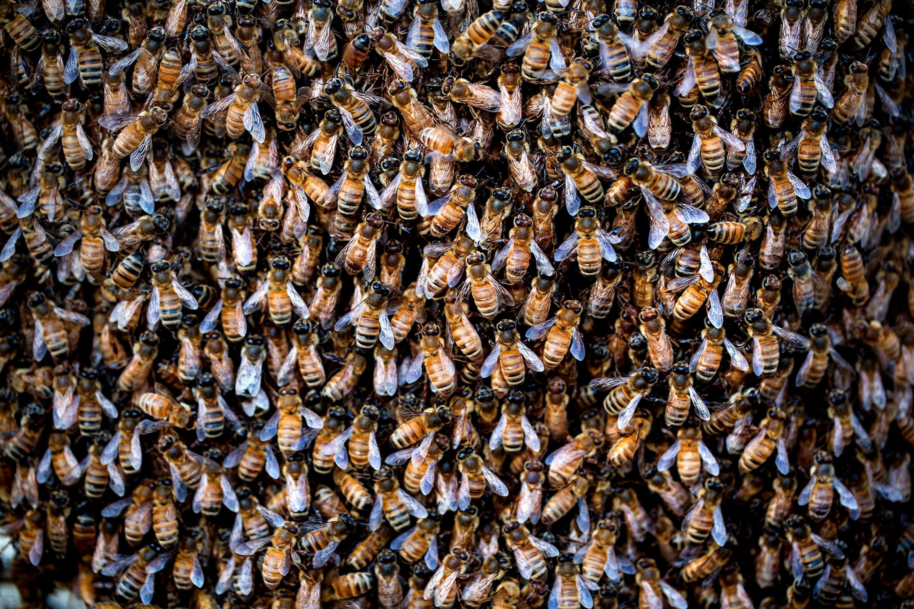
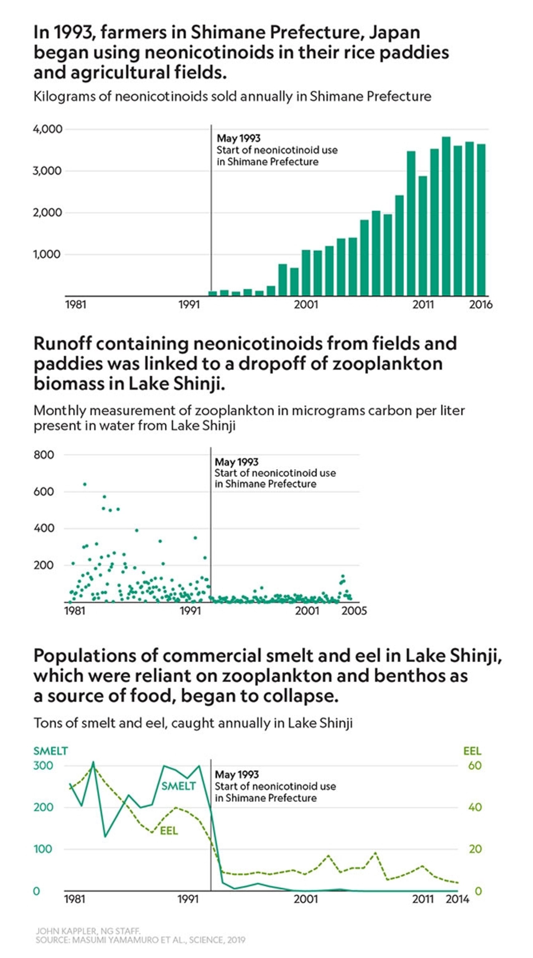
A class of pesticides called neonicotinoids—neonics, for short—are some of the most controversial in use. They’re super effective, insect-killing chemicals widely applied to seeds before they go in the ground, and they work by disrupting with the central nervous system of insects. They’re linked to the decline of honeybees (pictured below) and wild bees around the world, as well as birds. Now it looks like they could be connected to fishery collapses as well. A recent study found that after farmers in southwest Japan started using neonics on their rice crops, plankton and fish numbers in a nearby lake plummeted, Douglas Main reported.

The devastation at Lake Shinji can be summed up in three simple graphs, created by Nat Geo graphics editor John Kappler: One shows the increase in nenonic use starting in 1993; the second shows the drop of zooplankton in the lake starting in 1993; and the third shows the drop in smelt and eels starting around 1993.
National Geographic is known for its award-winning maps and graphics (like this incredible stunning visualization of bird migration) or these maps showing how tigers have been traded across the U.S., but sometimes a simple bar chart or line chart (below) is all you need to to make your point loud and clear.

Your Instagram photo of the day

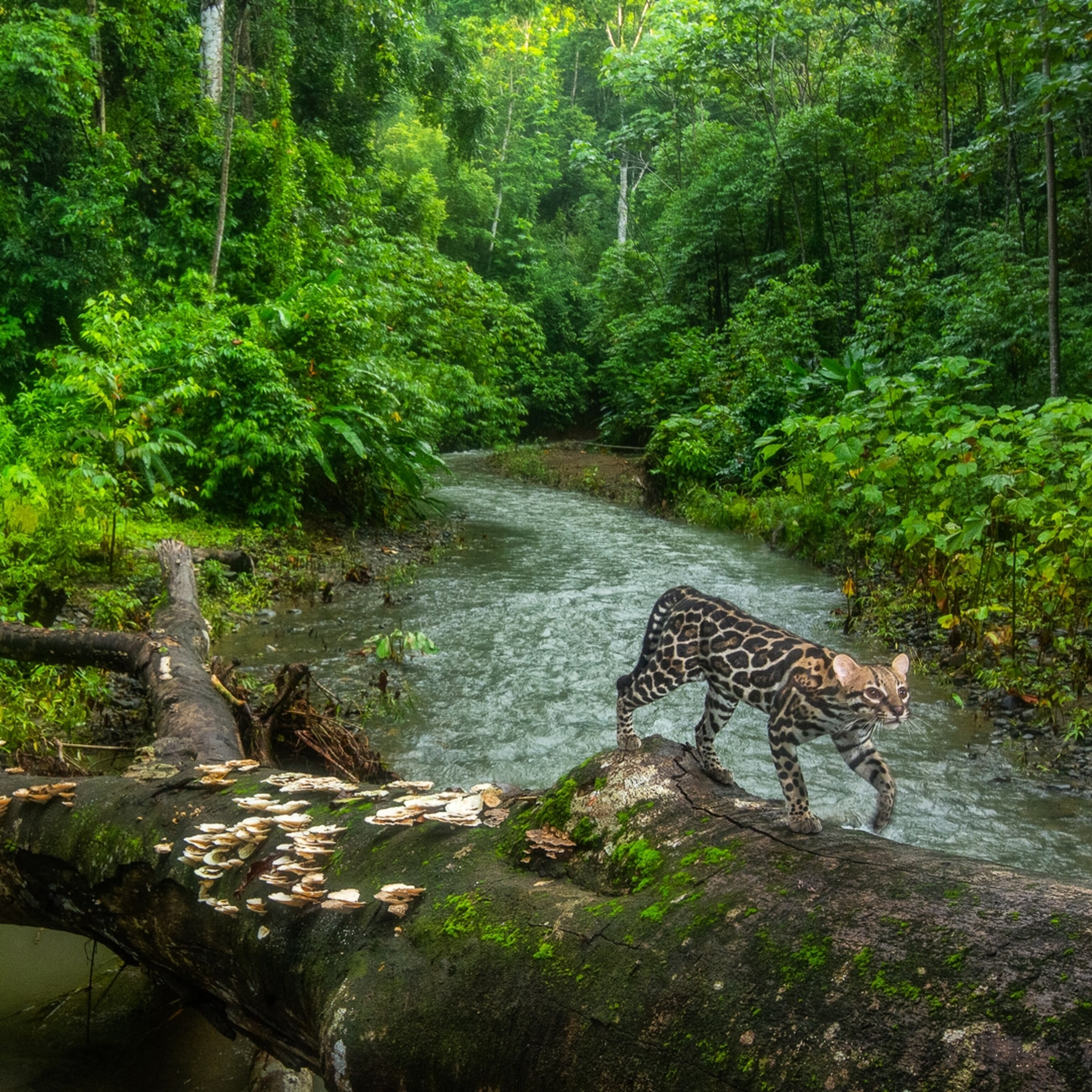
One step at a time: An ocelot triggers a camera trap as it walks across a tree that bridges a river in the rainforests of Costa Rica's Osa Peninsula. Ocelots hunt small mammals and birds in the forest, both on the ground and in the trees.
Related: Nat Geo's best animal photos of 2019
Are you one of our 127 million Instagram followers? (If not, follow us now.) +
Today in a minute
The species we lost: 467 species have been declared extinct in the past decade, says Vox’s Brian Resnick. He begins his story with Toughie, the last Rabbs’ fringe-limbed treefrog, which died in an Atlanta zoo in 2016.
Super-grannys: Female orcas live up to 90 years of age, and they play an important role in their advanced years, research indicates. The grandmothers boost the survival rate of grandcalves by knowing and guiding the young ones to food sources, says evolutionary ecologist Dan Franks. The elder whales’ “greater knowledge and their leadership, especially when times are hard, are helping calves,” Franks says.
Watch your livestock: Antibiotics, antiparasitic medication, and even painkillers are being transferred from cows, pigs, and poultry to other insects and animals, wreaking havoc with wildlife worldwide. Among the insects dying: the useful dung beetle, which eats pests and redistributes nutrients in the soil of cow pastures.
Cat whisperers: Yeah, it’s a thing. A new study says people who can decode cat facial expressions are usually young and female—but don’t necessarily own a cat. "Cats are expressive," says behavioral biologist Georgia Mason, "even though they’re usually regarded as inscrutable." Are you a cat whisperer? Take this quiz.
Related: Where cats get their own staircases
The big takeaway
My cats are a big part of my work life. They're in and out of here all day long.Jennifer Egan, Pulitzer-winning novelist, cat owner
Did a friend forward this newsletter to you?
Come back tomorrow for Whitney Johnson on the latest in photography. If you’re not a subscriber, sign up here to also get Victoria Jaggard on science, Debra Adams Simmons on history, and George Stone on travel.
One last glimpse

Save a fox: That’s the name of a Minnesota refuge where Mikayla Raines (pictured) does exactly that. Raines keeps red foxes and Arctic foxes, as well as other animals that can’t be released to the wild, including minks, a bobcat, and a coyote. Most come from fur farms or from people who sought to take them in as pets—but discarded them.
Read: Rescued foxes find a sanctuary in Minnesota