
Taking Data Visualization From Eye Candy to Efficiency
Sophisticated data visualizations are pushing the bounds of what we can process, sometimes to the breaking point. What are the signature styles of contemporary data vis, and will they stand the test of time?
Data Points is a new series that explores the world of data visualization, information graphics, and cartography.
Some information visualizers, especially those working at newspapers and magazines like this one, worry that complex visualizations make beautiful data art, but that they risk confusing readers instead of enlightening them. I asked several people in the field what they think of the styles that epitomize "data vis" today – and how to use them well.
Lots of Thin Lines
How effective are charts originally designed for dozens of data points when you have 100,000? Or three trillion?
One of the most common characteristics of recent data visualizations is a huge number of thin, overlapping, and semitransparent lines. From GPS traces to national development statistics, computerized information visualization enables us to plot hundreds, even thousands of points instantly and to use partial transparency to let readers "see through" points to others behind. Probably not what William Playfair had in mind when he introduced the line chart in 1785. How do we tease these data points apart?
Often we don't need to, when grasping the overall pattern is more important than seeing the specific data, as in a popular map showing global connections on Facebook. But when it's important to understand the specifics, interactive formats with filtering and selection controls can save the day. For this plot of rising life expectancy in nearly 200 countries, Nathan Yau included the ability to highlight continents and individual countries, enabling users to pick them out of the clutter. That lets you see how an individual story fits into a larger picture, one drawn with nearly 10,000 points.
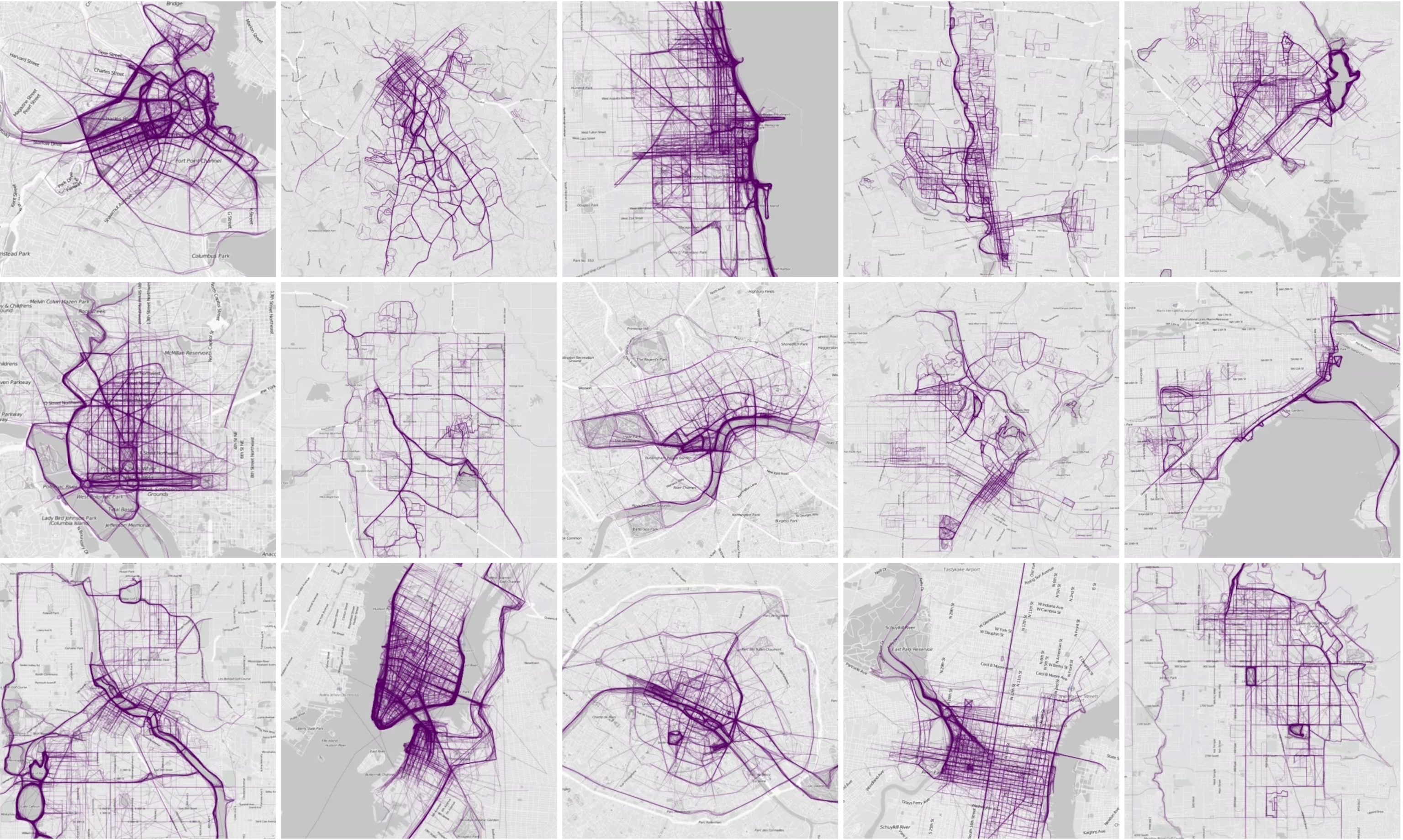
Wes Grubbs, founder of the visualization design company Pitch Interactive, says "I feel strongly that the use of lines is a very powerful technique in data visualization, and we use them a lot. With lines, you can see trends, connections, and paths (as in prediction)."

Conclusion: Effective, if you tread the line carefully.
Swooshing Arcs
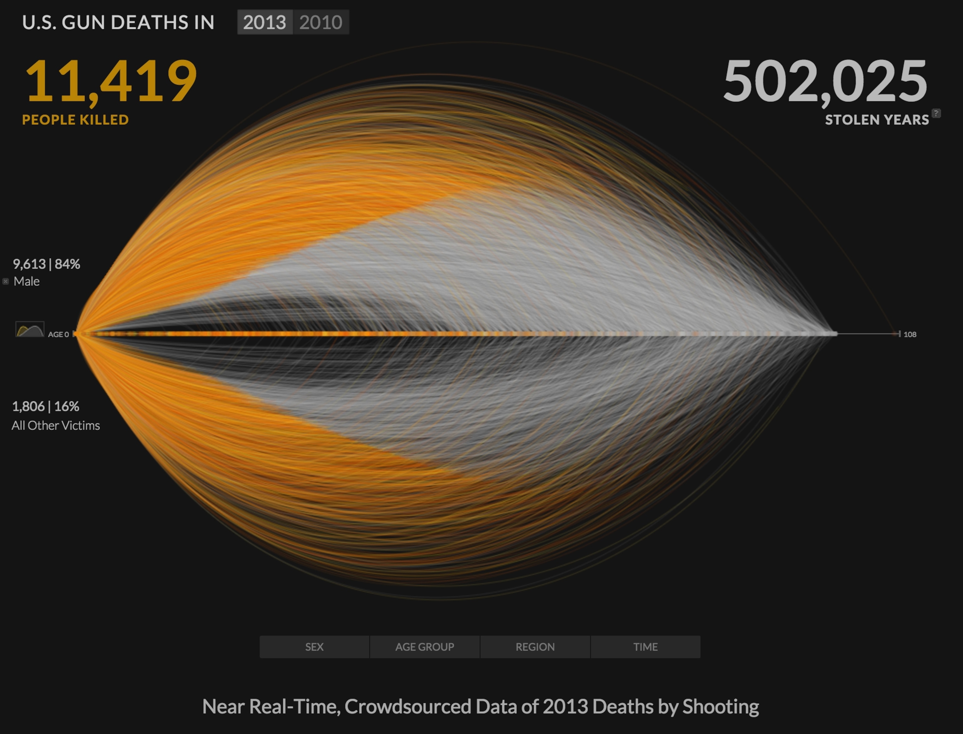
Long sweeping arcs, often layered in dense nests of overlapping curves, are another hallmark of information visualization in recent years. Sometimes they can be baffling, but two recent works show that they can also be visually striking as well as powerful in their ability to explain. "More than 400,000 Stolen Years," by the visualization firm Periscopic, ponders the premature deaths of over 20,000 Americans by gun violence in 2010 and 2013.
Dino Citraro, one of the creators, told me that a simple chart "might be the best way of conveying the information, but it isn't effective at generating empathy or a deeper understanding of consequence." A data visualization that resonates, he argues, works on the level of metaphor: "We map the data to a metaphor and use interactivity to reveal information at a self-directed pace."
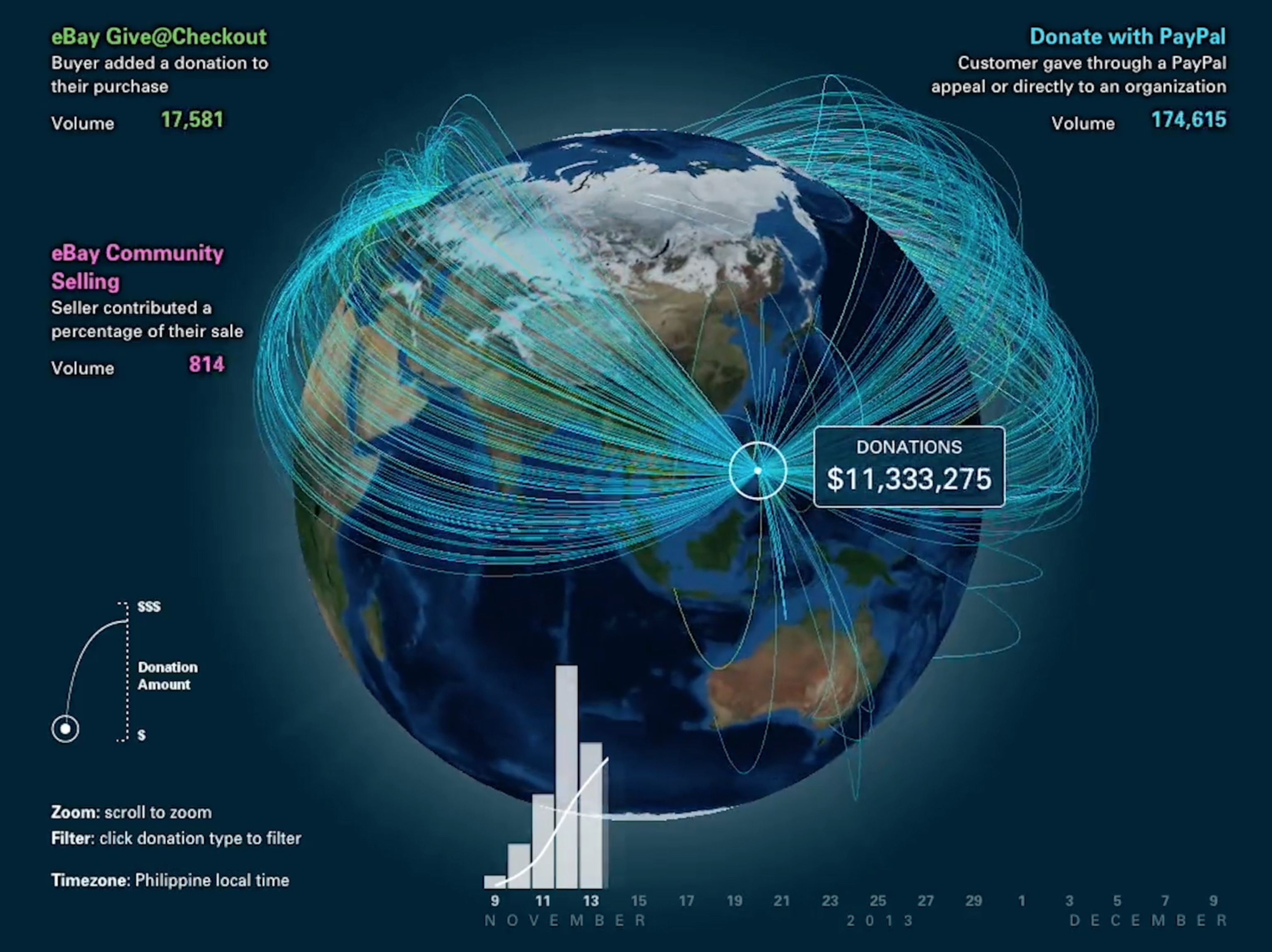
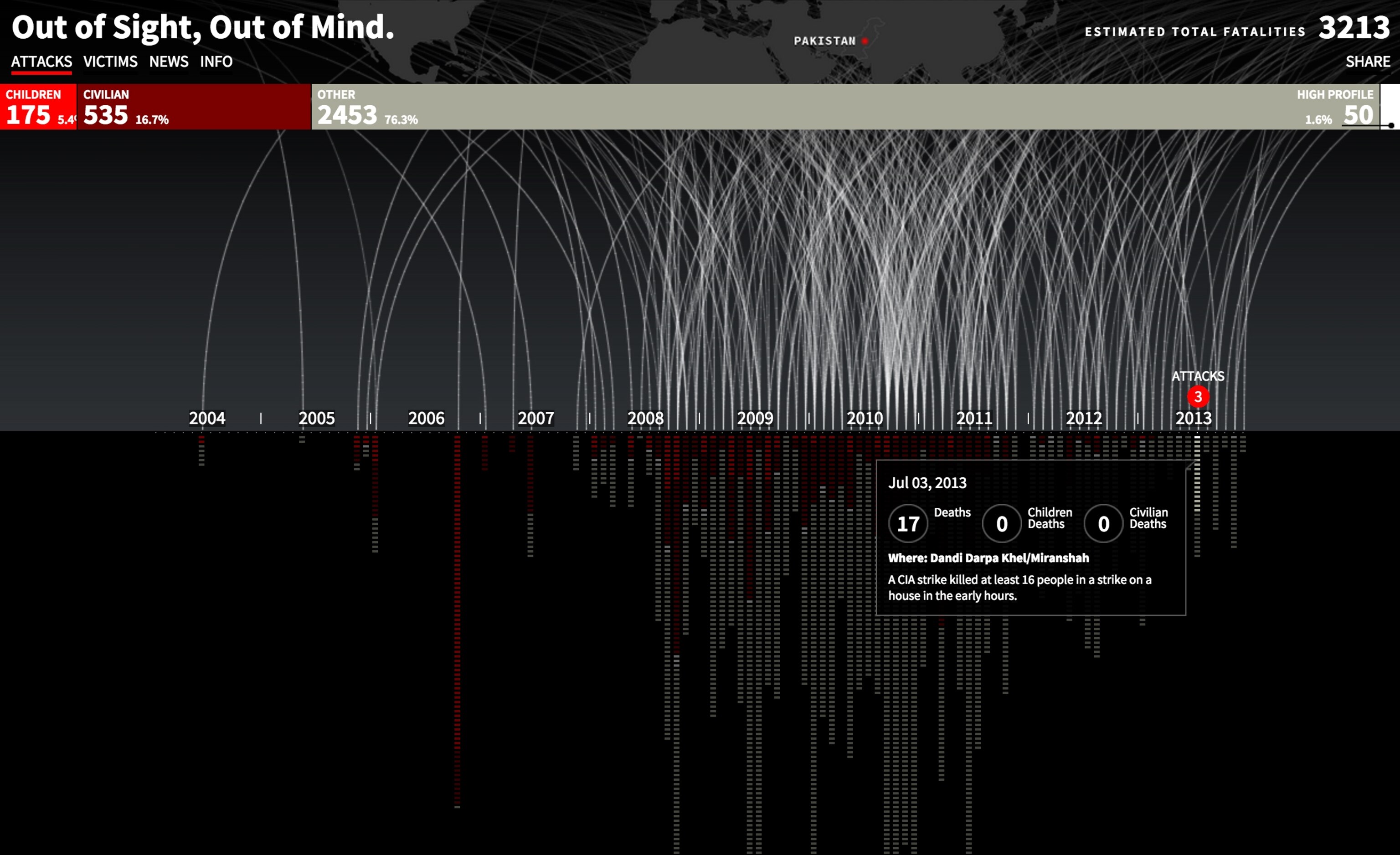
Pitch Interactive's Wes Grubbs used a similar approach to document the dramatic increase in drone strikes on Pakistani territory after the beginning of the Obama Administration, one that has led to more than 3,200 deaths—and barely 2 percent of them were of "high-value targets."
Two aspects make these visualizations successful: the slow "builds" that construct the graphics before the user's eyes and the filtering and selection tools that let the user sift through the data after they've loaded.
"Periscopic's gun-death graphics is one of my favorite things ever," writes Sarah Slobin, a graphics editor at the Wall Street Journal. "The lines work because the storytelling is strong and smart."
Conclusion: Find a metaphor, start simple, and build up from there.
Circular Charts
Circular data visualizations seem most liable to cross the line between practicality and gratuitous ornamentation. Though an attractive contrast to the rectangularity of most Web content, they can be hard to read. "Way too many of them can only be read if one is doing a cartwheel in slow motion," writes Slobin. "You need a specific type of data to make these successful."
The chord diagram is a circular layout that plots data along the perimeter of a circle and then shows connections among them with sinuous flow bars. Like most visualizations plotting "many to many" relationships, chord diagrams can be challenging. But at least one example shows how they can be successful, by using data with a limited number of sources and destinations and making judicious use of interactivity.
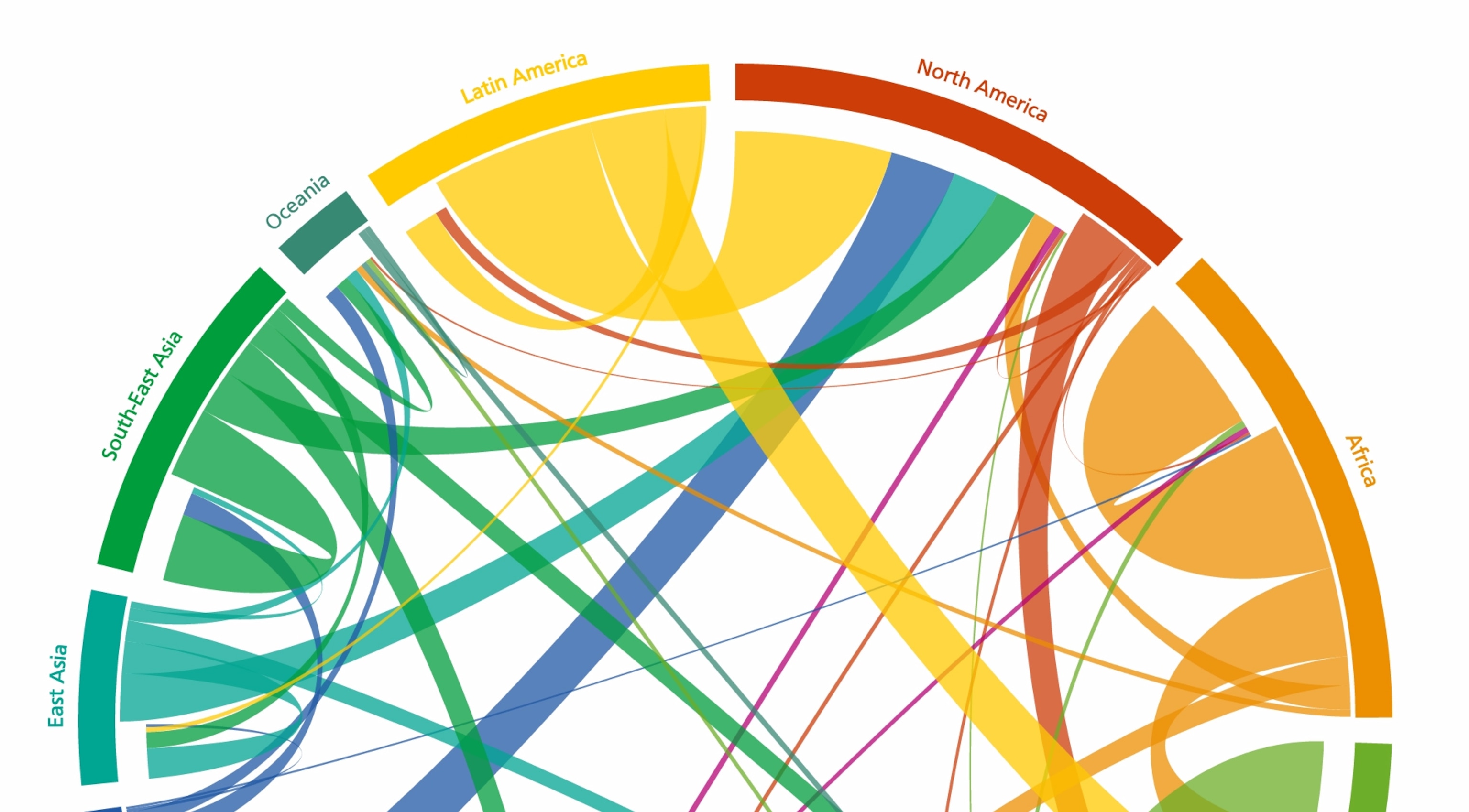
An Austrian research center's diagram of global migration patterns works because it rolls individual countries into regions symbolized by bright, contrasting colors. These colors are repeated in the flow lines that extend outward, so that you know which is the origin and which the destination. Latin America, for example, extends a long yellow arm to Europe and a shorter, thicker one to North America. The graphic also has prominent, clear instructions on "how to read this plot," which is essential.
Conclusion: Beware the temptation of eye-candy. If you must use a circular chart, don’t make people do cartwheels to read them. Best use: for cyclical or “periodic” data, like seasons or repeating processes.
Bubble Maps
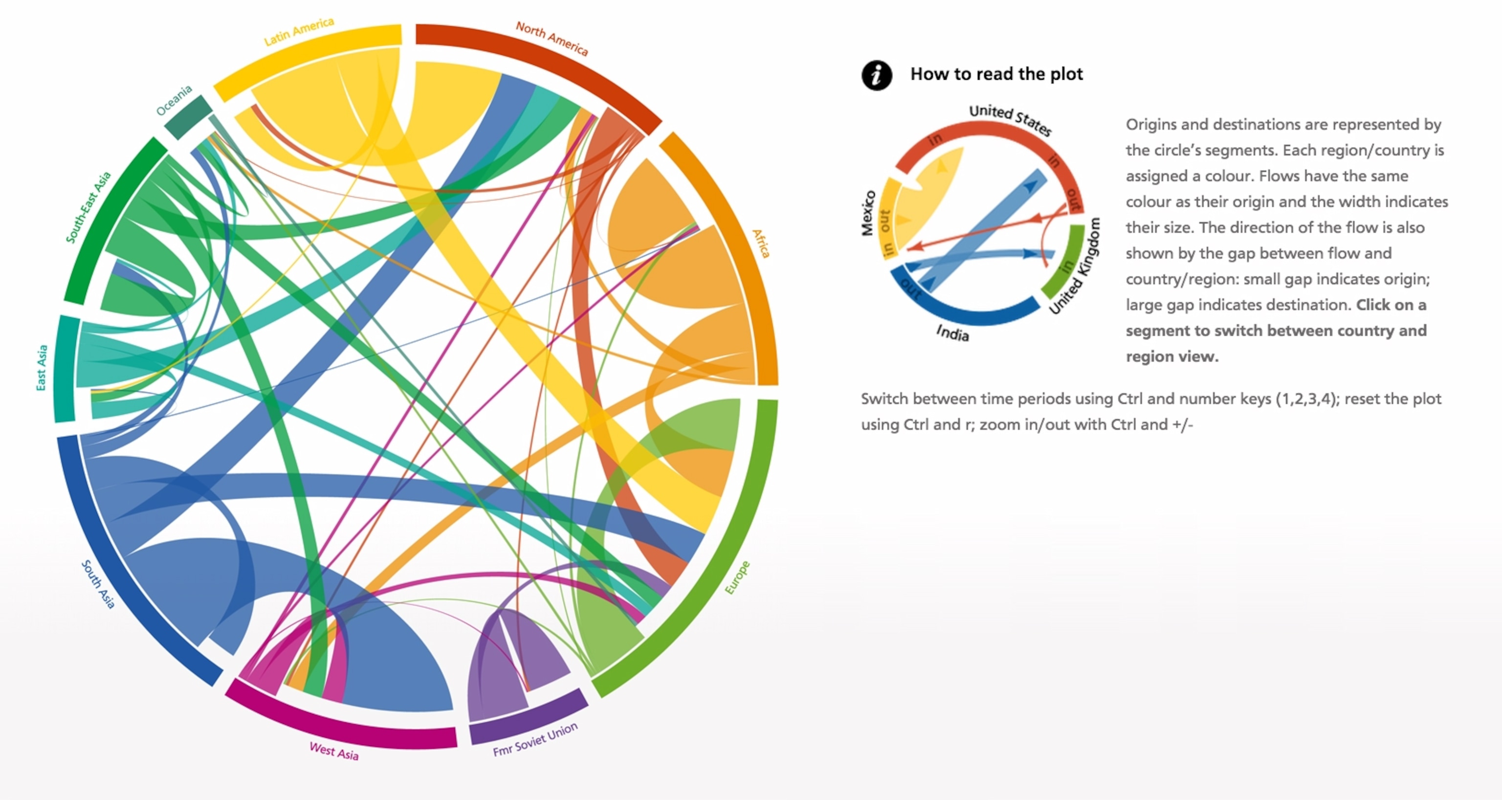
Bar charts are very effective for comparisons, but they don't often work well when you have a wide range of values. Circles or squares that plot those values by area instead of width or height provide a more compact display. One example is my group's map of U.S. wildfires, which range from a few dozen acres to a quarter of a million or more. These "bubble" maps are common in cartography, so common as to verge on cliché. "My sense is that bubbles (especially on maps) and thin lines (lots of them) will be hallmarks of this decade of data vis," writes Scientific American's Jen Christiansen. The University of Miami's Alberto Cairo notes, "Bubbles, for instance, may work well on maps, but they aren't appropriate when the purpose is to allow for very accurate estimates." Moreover, densely packed, overlapping bubbles can be hard to tease apart, though using thin hollow rings instead can help.
Conclusion: Good for seeing overall patterns but not for comparing precise values.
Points Grouped in Rows or Bins
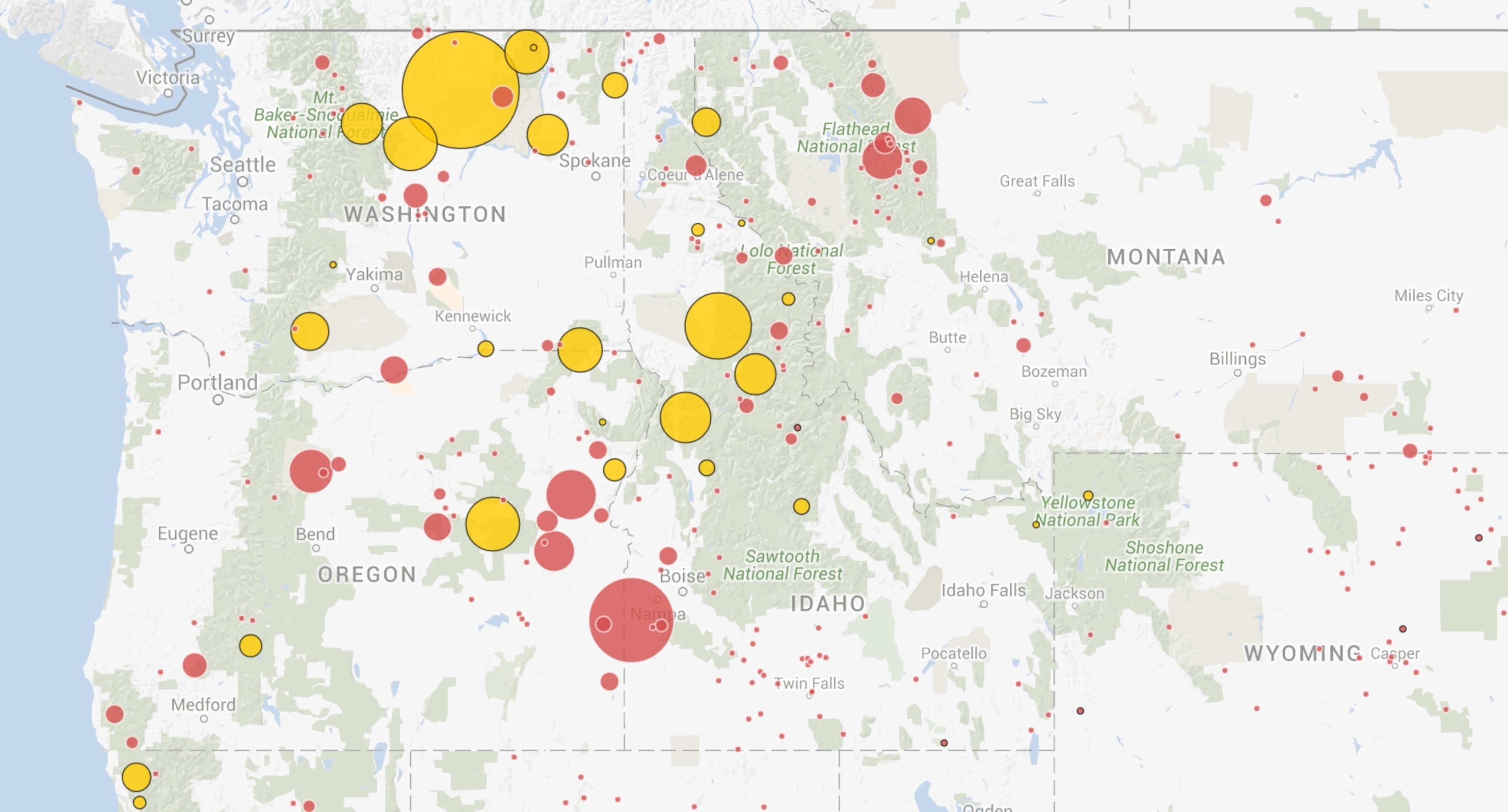
Rather than showing every single data point, you can explain information by summarizing it—an important part of data visualization. This can result in some of the most quintessentially "sexy" data visualizations, since the result is so artful and since it takes a computer to calculate them.
Grouping, or "binning," is a commonly used technique. In maps, points are often clustered into larger shapes—bubbles, squares, hexagons—that are colored or sized by the total value of the points contained. Hexbins, for example, are created using a tile pattern of hexagonal "bins." This National Geographic map of landslides in the United States is a good example.
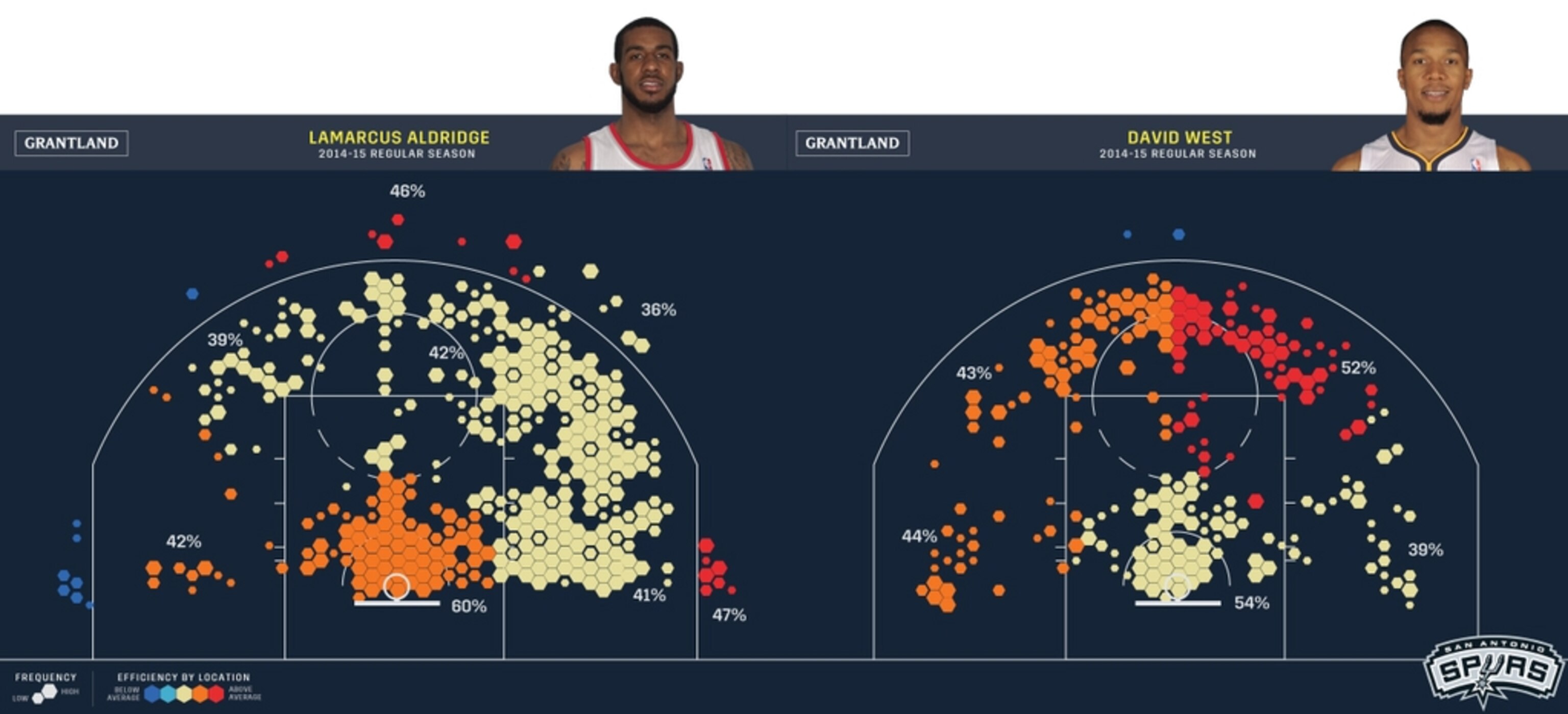
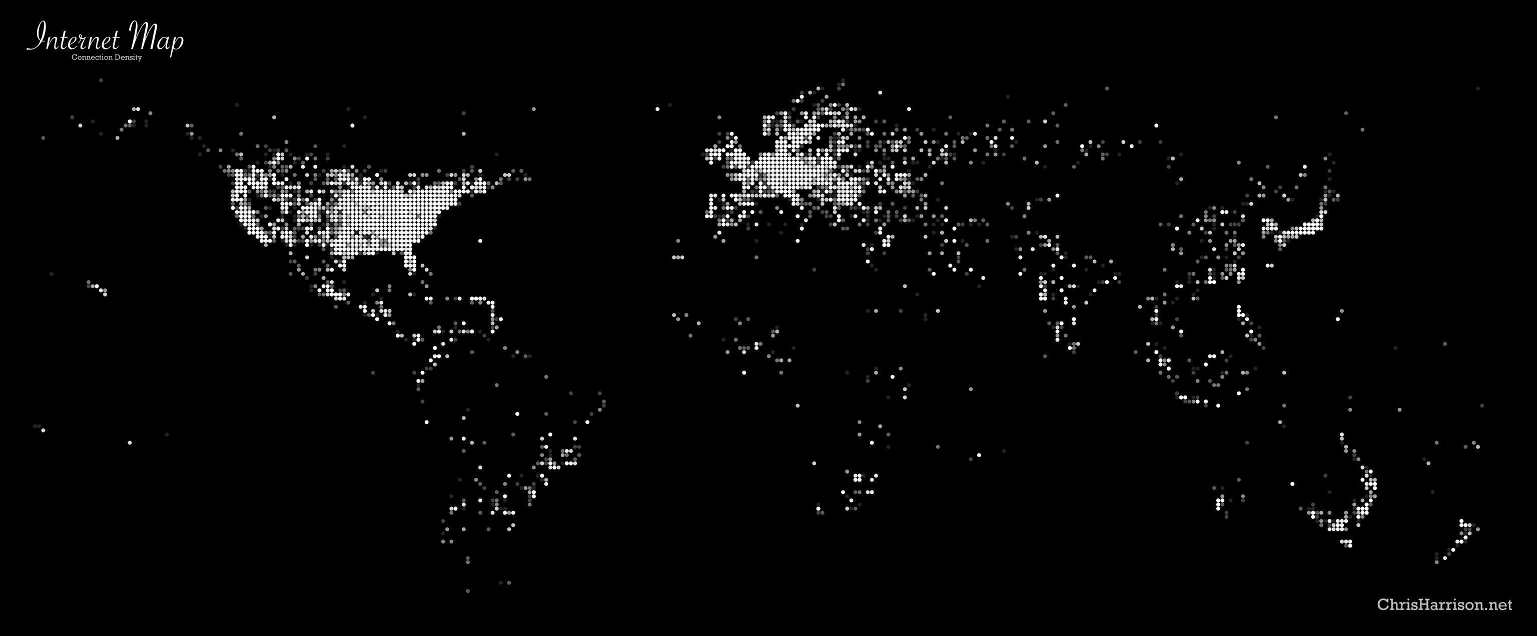
Another way to condense and simplify data maps is by rounding off the latitude and longitudes of geographic points so that they "snap" to a common grid. Though that loses some precision, it can create a beautifully patterned summary of values.

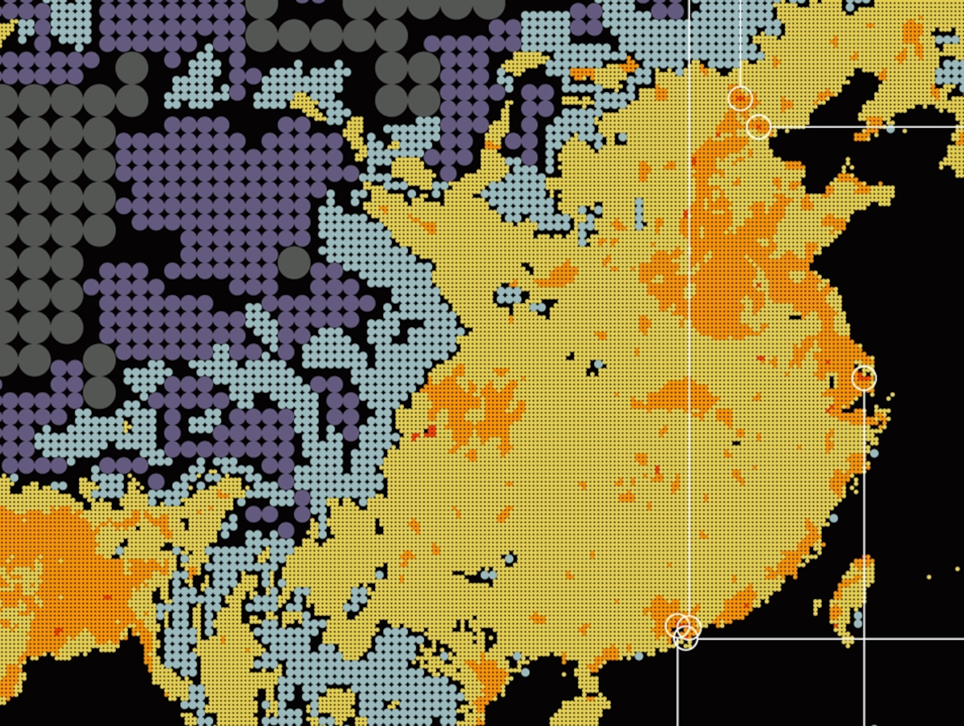
The data visualization firm Fathom took this one step further with the population map Dencity by imagining the Earth's land mass as a giant grid and by inverting the typical larger-is-more-numerous symbology. The designers showed the most densely populated areas as tiny dots half the size of the next largest set and so on, and they made the open spaces in central Asia giant gray dots. The result is pleasantly disorienting, like an "upside down" world map or a fun house mirror.
Conclusion: Artful, if imprecise.
Small Multiples
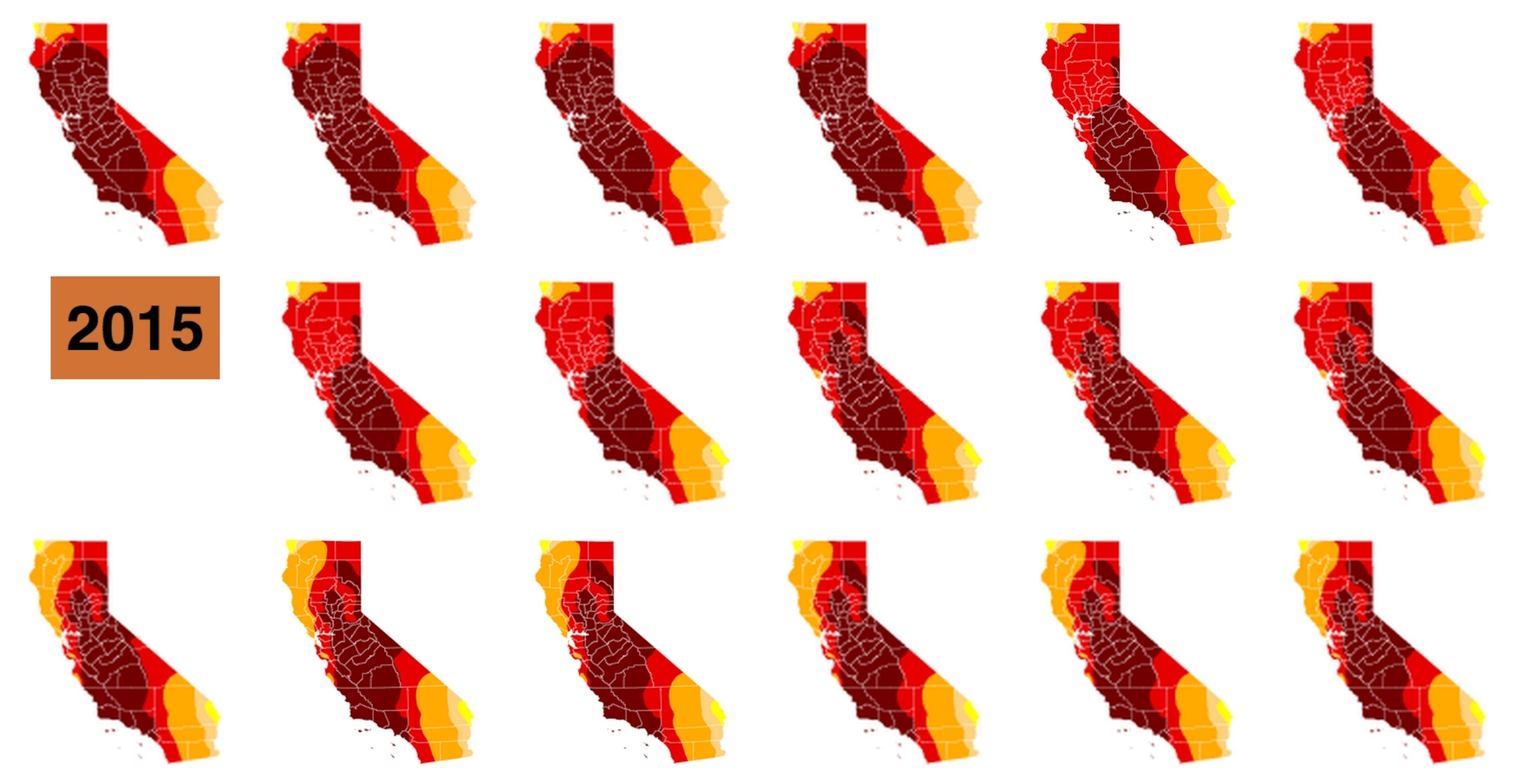
On the other end of the glamor spectrum are humble "small multiples," which repeat data in many small renditions of the same graphic—it's like taking the frames of a movie and reprinting them side by side.
By being visible at the same time, these graphics can offer a clearer 1:1 comparison than time-series maps such as my group's U.S. drought tracker. Still, the rise of small multiples has gotten a little out of control lately, as seen in posts that seem to parody the growing journalistic trend of "charticles." The New York Times put 255 charts in a single article; the Los Angeles Times used 194 maps to illustrate the California drought.
Nevertheless, small multiples provide a welcome alternative to larger formats, as ProPublica's Lena Groeger argued in a fascinating post last year. "Yes, please," writes Paul Blickle, an infographics journalist at Germany's Zeit Online. "Sometimes I prefer them over an animation. Best practice: offer a switch between animation and small multiples."
Conclusion: Less can be more when using this inherently modest chart.
Visualizing the Future
So which of these techniques will stick around, and which will go out of fashion? Of course, prediction is very difficult, especially about the future. "Hexbins will be to the teens of #dataviz what shag carpeting was to the 70's of interior design," tweets cartographer Bill Morris, "and I love hexbins."
Perhaps the challenge is less about particular formats than about how they're applied. For what purpose? For which kind of data? A hexbin map can be great for seeing average travel times to many destinations, but you wouldn't want to use it to find your way around.
Jan Schwochow, founder of the German infographics design firm Golden Section Graphics writes of visualization technique, "It's just another toolbox. I think it's much more important to use your own mind to find the right visualization, so that a reader can learn something and make the right decisions from the data you're presenting."
To understand more, Alberto Cairo recommends a research paper from the 1980s that breaks down data vis into building blocks called visual encodings. "William Cleveland and Robert McGill's classic scale of methods of encoding," he writes, "is invaluable."
Indeed, one of the most common reasons a data visualization breaks down is that there's no legend or scale. Without explicit advice on how to decode the visual encoding, the viewer is left to make assumptions based on previous experience or may be misled entirely.
What do you think? Which of these techniques seem like passing trends, and which seem built to last? Post a comment using the link above.
Follow Geoff McGhee on Twitter.