
Slideshow: Seven Sweet Maps of Health Data
When I hear the terms geographic information system (GIS) or global positioning system (GPS), it usually makes me think of government agents spying on us, or of particularly hellish road trips. But these technologies could also be incredibly useful for public health and medical research, as I learned from an interesting commentary in today’s issue of Science.
The idea hasn’t quite caught on yet in the medical research community. “Most health research has yet to take full advantage of the latest developments in geospatial data collection, analysis, and modeling,” Douglas Richardson of the Association of American Geographers told the Science podcastScience podcast. Richardson and the other authors of new commentary gave many reasons why more health researchers should get excited about GIS.
GIS can help manage the ever-growing heaps of health-related data. Like the six billion letters in one person’s complete genome sequence, or the location of methyl groups scattered on that genome, or the medical history (hospital visits, prescriptions, allergies) and daily habits (food intake, exercise, environmental exposures) that can help make sense of that genome. GIS technologies can also help track disease (flu, HIV, or addiction, say) across time and space, to help researchers see how transmission patterns are influenced by social or environmental changes (like hand-washing protocols, antiretroviral access, or unemployment).
This is obviously a field where pictures matter, so I put together the slideshow above to give you a sense of the kind of data mash-ups that are possible with GIS techniques. Here’s a bit more information about each slide:
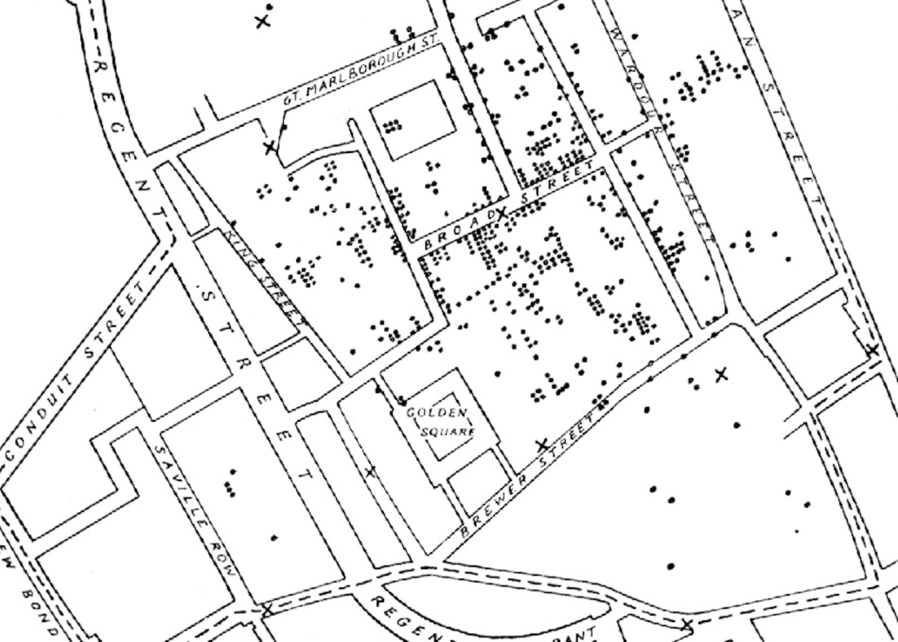
1. This is a remake of a map made by John Snow in 1855 showing the extent of a cholera outbreak in London’s Soho neighborhood. Black circles show deaths; black Xs water pumps. This map showed that the source of the outbreak was a water pump on Broad Street.
2. This is a hypothetical graph showing one individual’s environmental exposures over time (vertical axis) and space (horizontal axis). The blue lines represent an individual’s path over time. The bottom plane represents the transportation network of the study area. The orange horizontal plane represents the spatial distribution of a risk factor (like air pollution or liquor stores, say) for one time point. Image courtesy of Mei-Po Kwan at the University of Illinois at Urbana-Champaign.
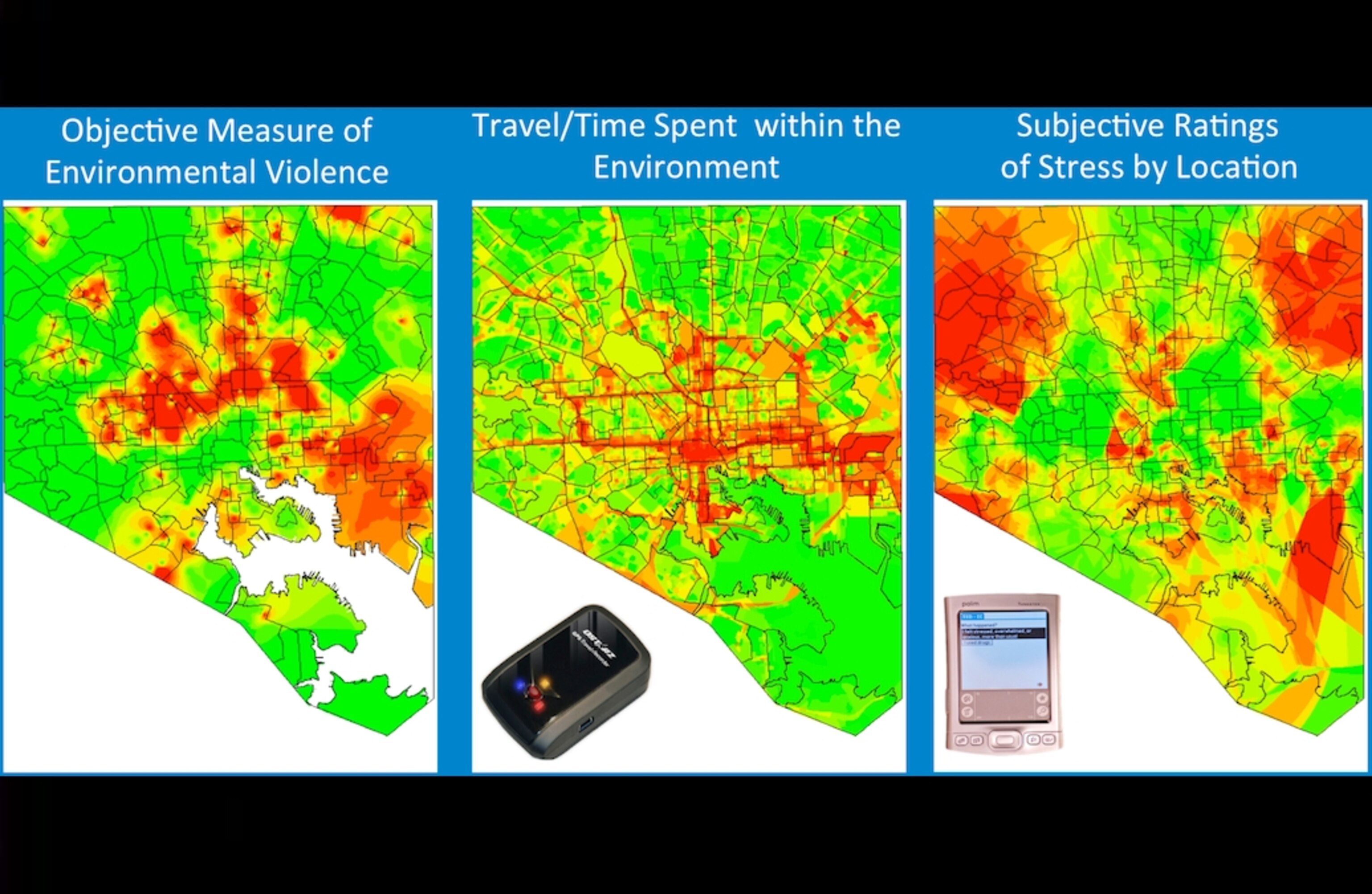
3. This shows data from a pilot study conducted by the Intramural Research Program at the National Institute on Drug Abuse. The researchers tracked 27 individuals over 100 days. The researchers are comparing neighborhood violence (left panel) with individuals’ GPS locations (middle), self-reported stress (right) and urine drug tests. Image courtesy of Bethany Deeds, NIDA.
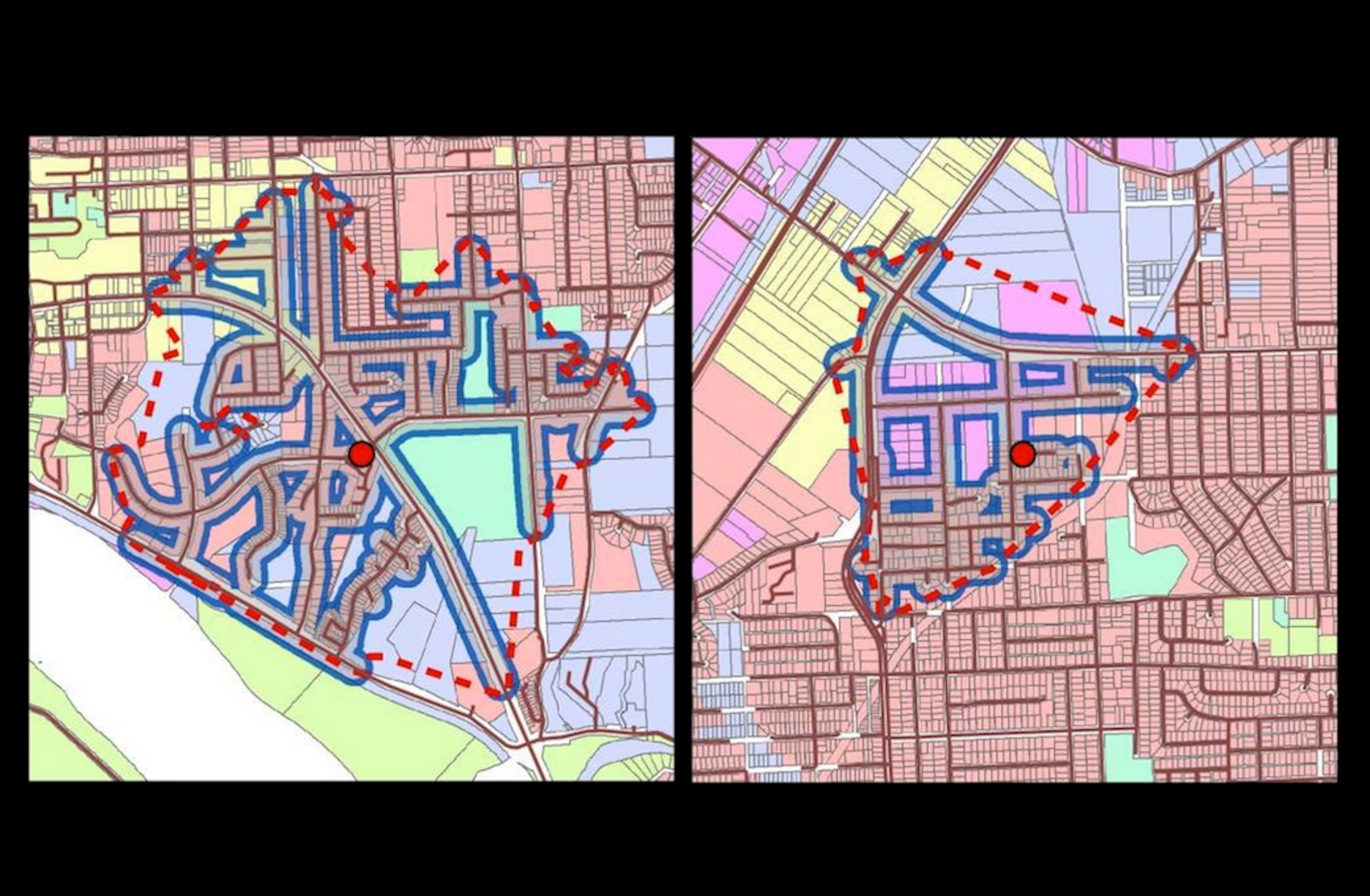
4. GIS data can be used (even without GPS) to define neighborhoods for specific people (red dots). In this 2007 study, Canadian researchers used telephone surveys to ask people about their walking patterns. Based on respondents’ zip codes and the geography and urban layout of their area, the researchers were able to define the boundaries (red lines) of each participant’s typical walking space.
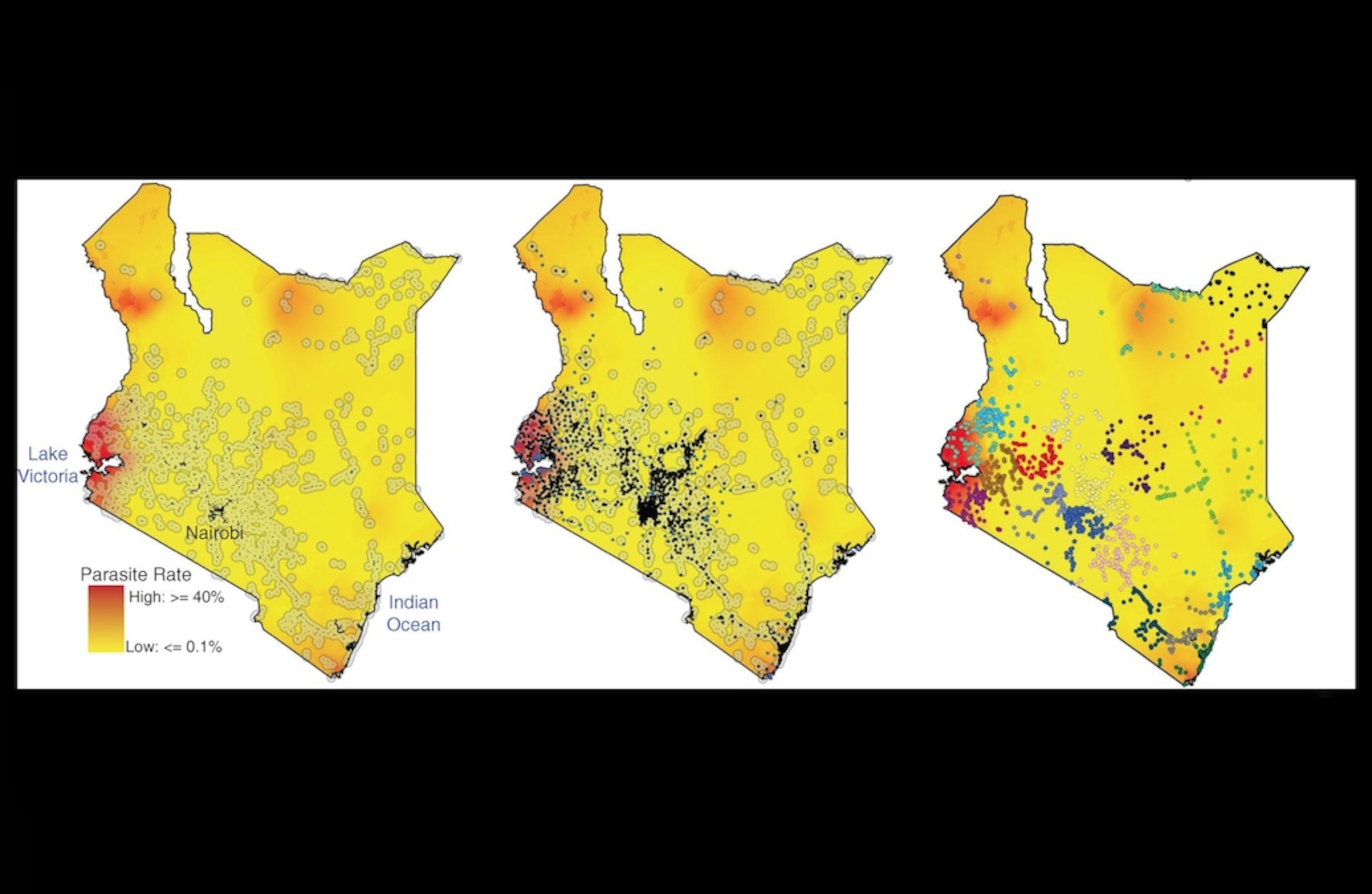
5. Last year, Caroline Buckee of Harvard and her colleagues published a study in Sciencestudy in Science that used GIS to quantify the impact of human movements on the spread of malaria in Kenya. The researchers used maps of malaria prevalence (left map) and cell phone towers (middle) to define regions of interest for further study (right).
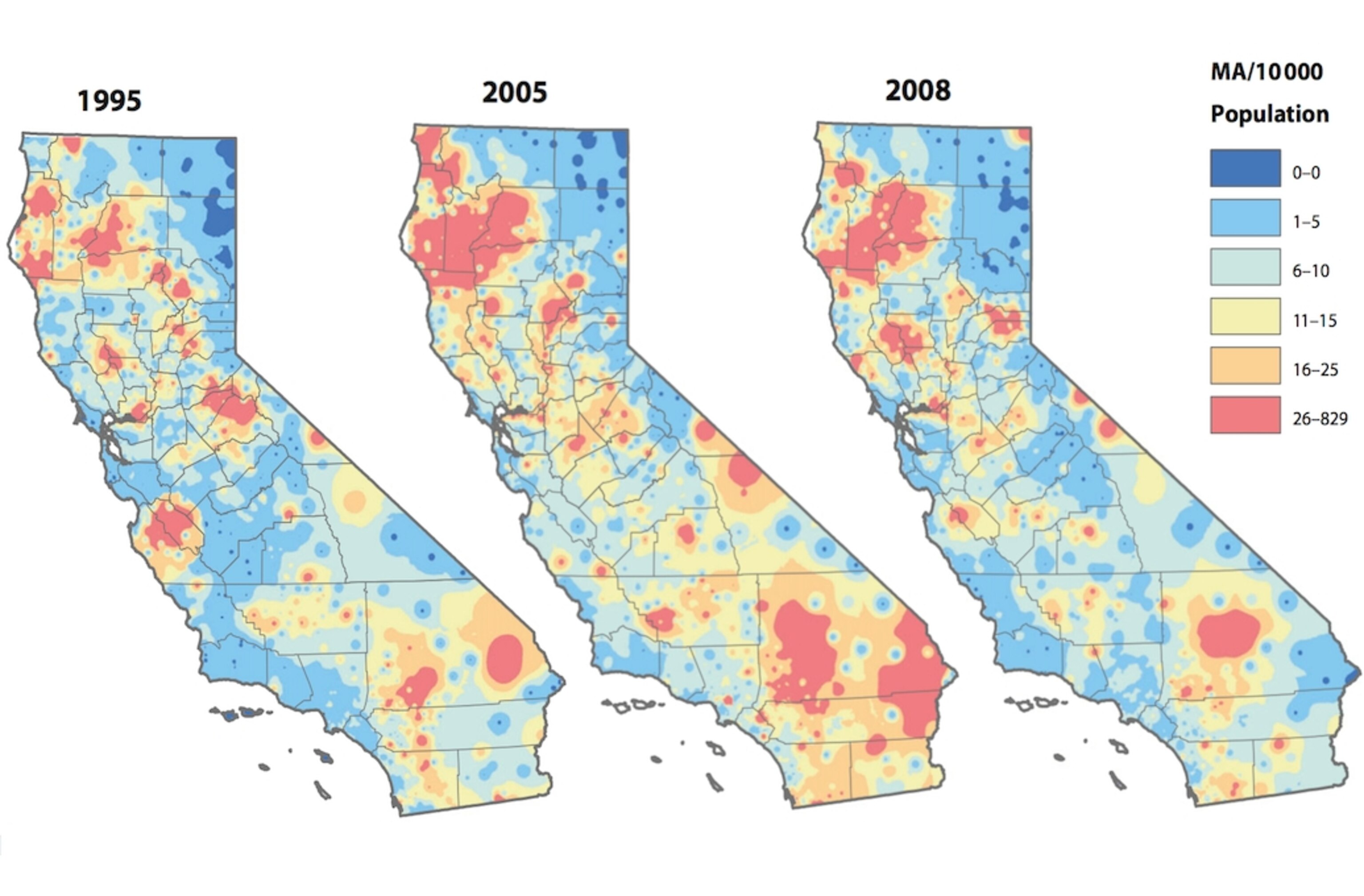
6. These maps of California show the spread of meth abuse over time. As published last year, Paul Gruenewald from the Prevention Research Center in Berkeley, California, and colleagues put these maps together by analyzing hospital discharges for meth abuse by zip code. Image courtesy of Bethany Deeds, NIDA. (Incidentally, when I was working at SEED several years ago, I wrote a story about geographers tracking meth labs that may have the best lede I’ve ever written.)
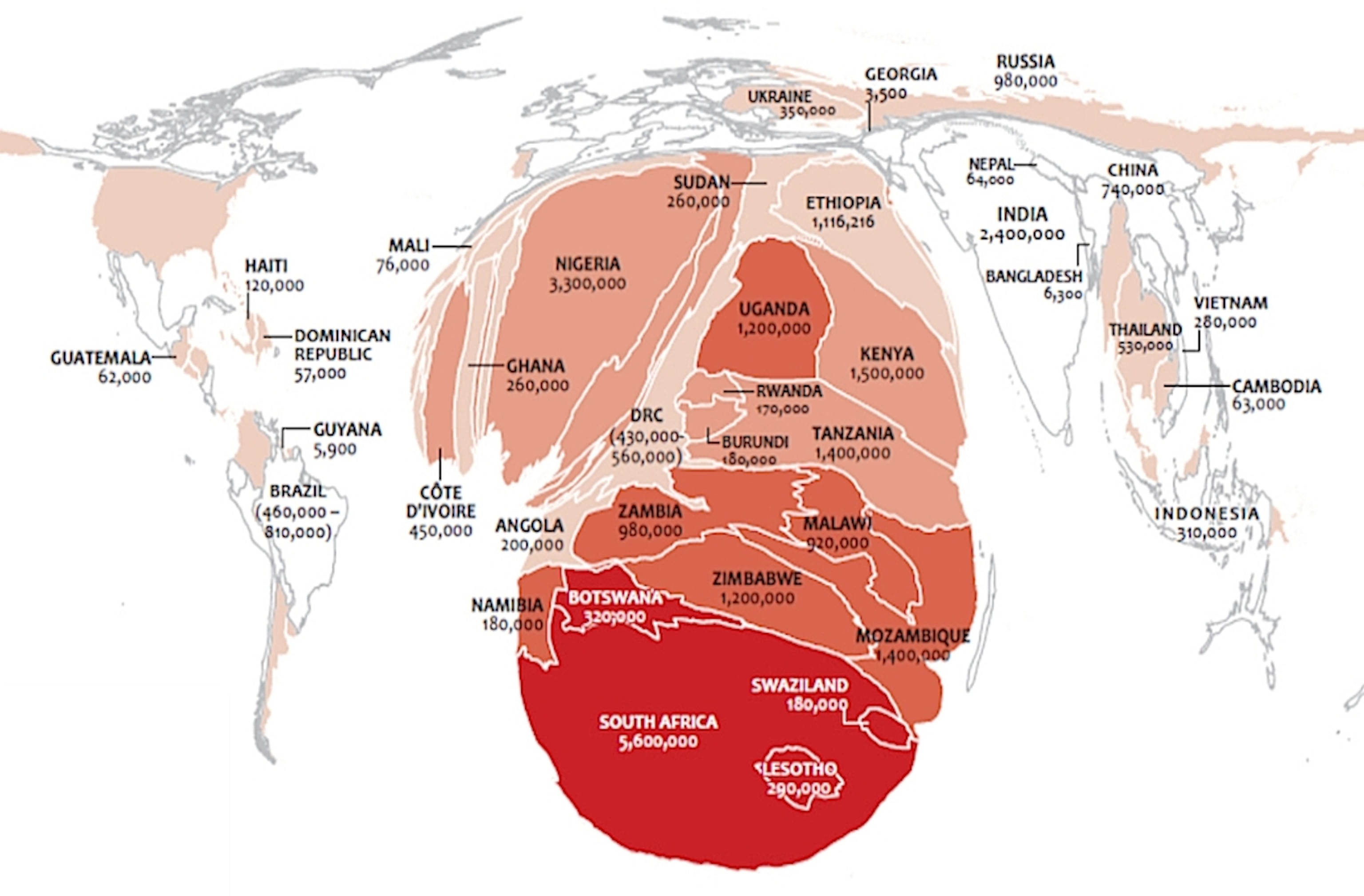
7. This shows the size of countries relative to the number of adults living there with HIV in 2009. White areas have a prevalence of .49 percent or less; dark red indicates prevalence between 17.5 and 26 percent. Data sourced from the UNAIDS Report on the Global AIDS Epidemic; image courtesy of Nate Heard, U.S. Department of State.
*
Interested in becoming a mapmaker, or in learning about what they do? Check out Emily Underwood‘s cool piece on the “new cartographers” in Science Careers.