The “Rules” of Data Visualization Get an Update
What are the rules of data visualization, a practice that draws on research into cognitive theory, graphical perception, statistics and journalism? The journalist and educator Alberto Cairo helps tie together many fields of study into easy-to-follow guides to data visualization and information graphics.
Data Points is a new series where we explore the world of data visualization, information graphics, and cartography.
In the past decade, computer-aided data visualization has migrated from the halls of science and academia into journalism, marketing, political discourse, and many other parts of everyday life. A lively conversation has developed online about data visualization, with blogs and social media accounts devoted to critiquing them. But what are the rules of a complex practice that draws on research into cognitive theory, graphical perception, statistics and journalism?
With his 2012 book The Functional Art, the journalist and educator Alberto Cairo helped tie together many strands into a compelling and easy-to-follow guide to data visualization and information graphics. Cairo, the Knight Chair in Visual Communication at the University of Miami School of Communication and a longtime veteran of news information graphics in Brazil and Spain, is finishing a follow-up book that will be published by Peachpit next spring. I talked to him about his forthcoming book and his thoughts about the evolving art of information visualization.
Through your journalism work, teaching, workshops and books – and now Massively Open Online Courses, you've done as much as anyone I can think of to popularize data visualization and infographics. Why do you think your message has drawn so much interest? You have had thousands of students in your online classes, for example.

Alberto Cairo: Today you have confluence of factors. The first is that more people are buying the idea that words alone are not powerful enough to communicate effectively, that you also need visuals. The second factor is that the tools of the trade are becoming cheaper, and in some cases they are free and easier to use than ever. I am amazed that I can code a complex data visualization in R, for example, with just three lines of code. My favorite tool at the moment is Quadrigram – it does a lot of what Tableau can do, and it's free. It's web-based, and it lets you download the code you have generated with it. Imagine that tool 15 years ago, it would be thousands of dollars. So tools like CartoDB, Quadrigram, Tableau Public, all these tools are enabling more and more people to jump in and start doing visualization.
The third factor is the popularization of visualization, through the popularization of the principles behind creating effective and truthful data visualizations. You have a new batch of books written in a style that is friendlier, much less technical, and much more accessible for the general public. They are easier to read and less technical without being shallower.

In that regard, you're about to publish your second book on data visualization. Your first one, The Functional Art, has very been popular – it's been translated into five languages. How does the new book relate to the first one, and who is the intended audience?
My intended audience is mainly graphic designers and journalists, but also I believe that the principles that I write about can be useful for anybody. Including scientists and businesspeople and so on. But in the epilogue of the book, I come out more honestly and say who the actual audience is: myself, 10 years ago. I try to remember what I didn't know a decade ago, and write a book written like it could be sent in Doctor Who's TARDIS for me to pick up in the past.

The Truthful Art goes much further into the principles of information visualization, but what I try to do is describe some statistical concepts that I believe that are essential for anybody who wants to live in modern society, and also how to use visualization to explain information to the public in an understandable way.
The way the two books relate is that The Functional Art is more about information graphics, it deals a little bit with communicating effectively – but it's more like an introduction. The Truthful Art focuses more on the data, making sure that the data is right, and explaining the data. There's also a couple of chapters about presenting information compellingly and beautifully, but the main focus is the strategies for getting things as right as possible. I believe that The Functional Art and The Truthful Art are part of a trilogy of books. There's going to be a third one called The Insightful Art, which will be about how to make your visualization more beautiful and aesthetically pleasing, and also how to build narratives using that visualization.

From looking at early versions of the book, I feel like you're reacting to the growing popularity of data vis, and seeking to to inject some more caution, to address what you might see as irresponsible uses of the format. It reminds me of someone like Mark Bittman at The New York Times, who has segued from writing recipes to writing about the politics and economics of food, about healthy eating.
[A reader] sent me comment a while ago saying, "I'm reading your book right now, and I am so afraid of doing a visualization again because I know I'm going to make a mistake." So it has that effect on people. And I don't think that this is necessarily bad. I warn against many mistakes, many possible pitfalls when dealing with data. But I'm not writing that to discourage people, making mistakes is important for learning.
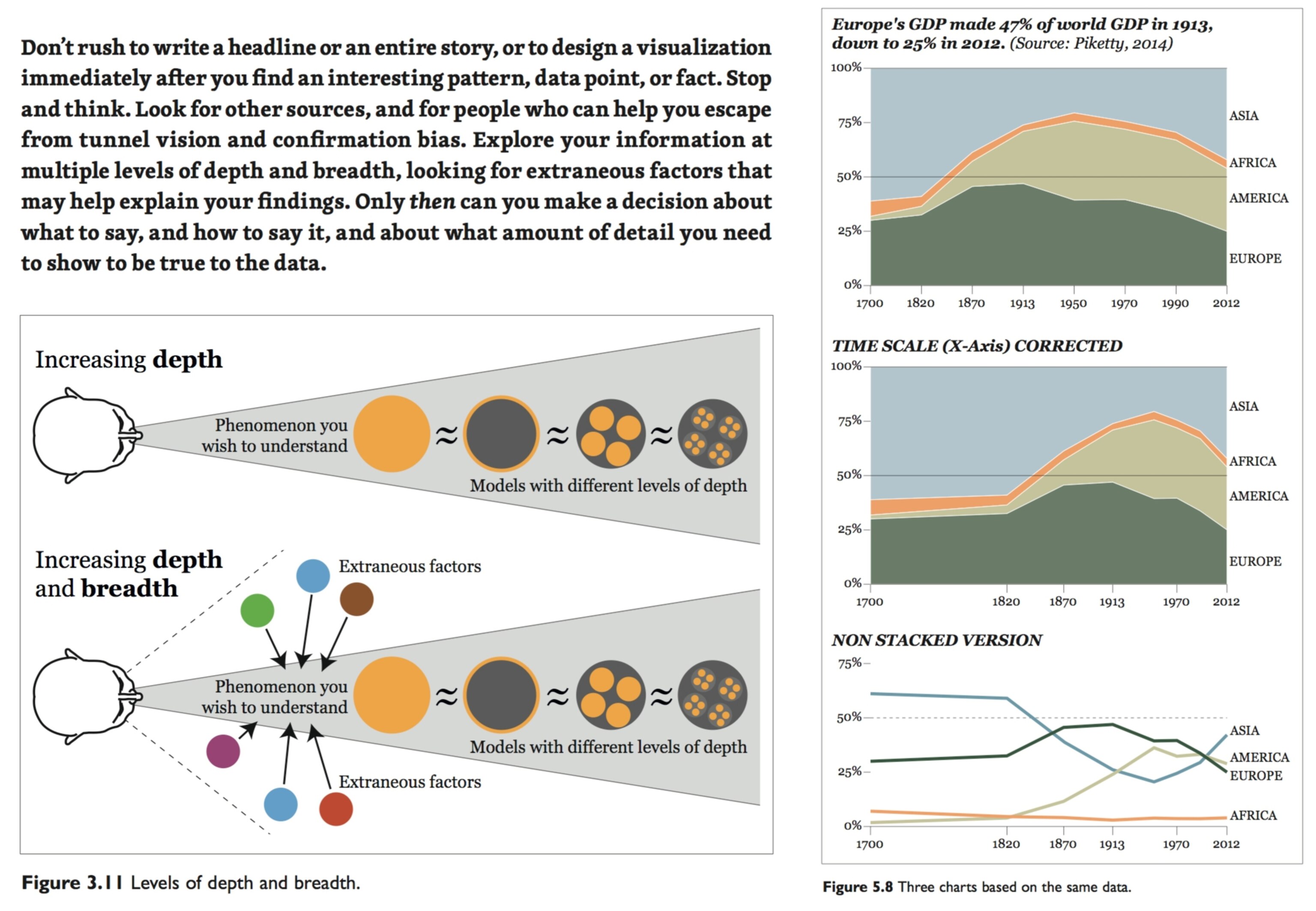
Actually, the mistakes I talk about in the book – I made them all in the past. Remember that I'm writing for myself 10 or 15 years ago. What I am trying to do is to warn people against rushing in, getting some data and say "this is so cool, let's visualize it." And they create a visualization and put it out without taking enough care in going to the sources, reading the documents that accompany them to make sure that the variables are measuring what they are supposed to be measuring. It's not that you shouldn't make any mistakes at all – that's impossible, we are human beings.
You argue that some visualizations fail because the author worked from faulty assumptions or shaky data – and you describe ways to avoid that fate. You warn that "you must not fool yourself—and you are the easiest person to fool," as Richard Feynman famously said. How does that happen, and what do you do about it?
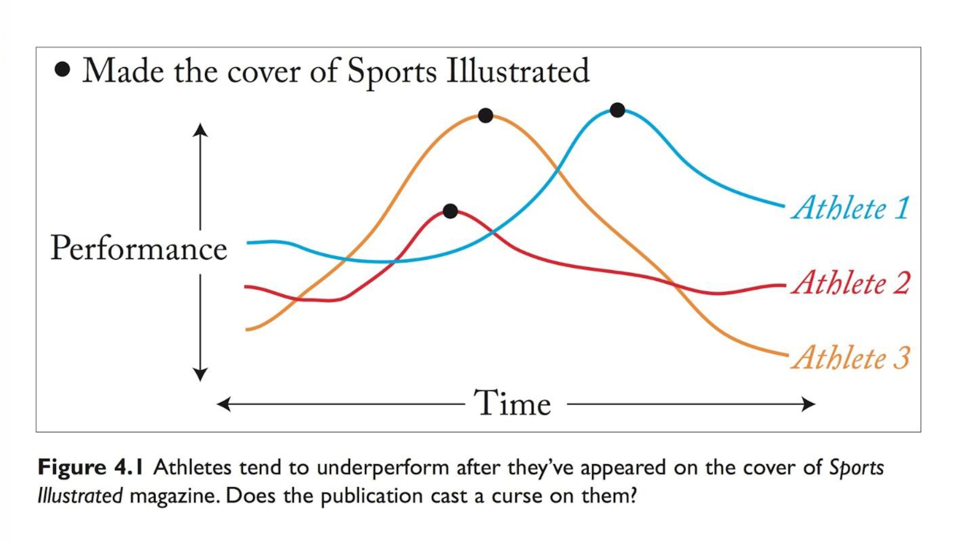
Feynman's quote is a really important one – because the problem is that you have best of intentions, but you end up creating a misleading visualization anyway. And that happens all the time. What really matters is that people become aware of the limits of our understanding, and then learn some elementary statistical, quantitative and data principles.

So what really matters to me is not the intention of the visualization – whether you created it to deceive or with the best of intentions, what matters is the result: if the public is informed or the public is misled. In terms of ethics, I am a consequentialist – meaning that what matters to me ethically is the consequences of our actions, not so much the intentions of our actions.
Even people who have the best of intentions create graphics that mislead just because they don't know about statistics, logic, or the principles of visualization. It's not their fault, just like it was not my fault 10 or 15 years ago. Nobody had educated me. It was only through the process of reading books, studying, and learning from other people that I discovered the many mistakes that I'd made in the past, for example, creating 3D pie charts.

Yet at the same time, you hold that some visualizations are designed to make a point, not to just objectively lay out the facts, and that in some cases those visualizations are actually designed to mislead or confuse people. Are we seeing "weaponized" data visualization, and what can we do to cope with a dangerously persuasive misuse of the format?
In general, there's nothing illegitimate about strategic communication (strategic communication is basically advertising, PR, or crisis communication), it's absolutely necessary for a market economy, but it's not the kind of communication I'm interested in promoting. I'm interested in promoting the other side of communication, which I believe could be called journalistic communication – to convey our understanding of what truth is. I call this "candid communication." I believe that the values of journalism can be extended and embraced by anybody and everybody: being honest, double-checking the information. You will never able to approach information in a completely neutral manner, but you can still try, and we should try. That is what journalism is.
But yes, there are also people out there who are using visualization to mislead. And why are they doing that? In part, I believe it is because we know intuitively that when you publish a chart or a graphic in a document, it makes the document look more serious and more scientific. I cite a couple of small studies in my new book that have tested that idea that a message looks more scientific when you put charts in it.

On one hand, you talk about the danger of people learning as they go, maybe making elementary mistakes, but on the other you talk about the shrinking number of journalists, and ask "who’s going to do original visualizations and infographics that help people stay informed of important matters?" to which you answer, "all of us." How does that work, how do you see that happening?
I see that happening through the factors I explained in the first question - the fact that the tools are cheaper to use than ever and easier to use than ever. That there are more people writing about visualization every day, so if you want to learn the principles, you can learn them. And the fact that more and more people are embracing the idea that visual communication works – and this it is not so hard.
I envision a future in which citizens in general embrace the most fundamental values of journalistic communication: being balanced, being honest, being candid, and trying not to harm people unnecessarily when dealing with information. I believe that if more people embrace those values, then we can make the world a better place.
The Truthful Art will be published by Peachpit in March 2016.
Follow Geoff McGhee on Twitter