Using Maps and Data Vis to Understand Tennis
These striking visualizations of tennis matches show what we can learn from sports tracking data.
Data Points is a new series in which we explore the world of data visualization, information graphics, and cartography.
Using visualization to understand sports goes at least as far back as when Eadweard Muybridge used photography to prove that a galloping horse completely leaves the ground.
With the rise of optical tracking, biometric sensors, and big data analysis, a new wave of technology is transforming what we know about sports performance. Basketball follows every player with cameras mounted on the ceiling. Baseball tracks every pitch and the speed and trajectory of batted balls. Soccer can tell us where players move, and how far they've run during a match. The professional tennis tour, which is hosting the U.S. Open this month, has been slower to embrace tracking, despite close sponsorship relationships with technology companies like IBM and SAP.
Yet in 2006, tennis instituted an automated line-calling system called Hawk-Eye, which has opened a door to digital tennis analytics. Hawk-Eye data is available to broadcasters to illustrate plays during the match, and it will be increasingly available to players for on-court coaching in the women's tour. But while the data is not open to the public, the master cartographer and tennis data visualizer Damien Saunder didn't let that stop him.
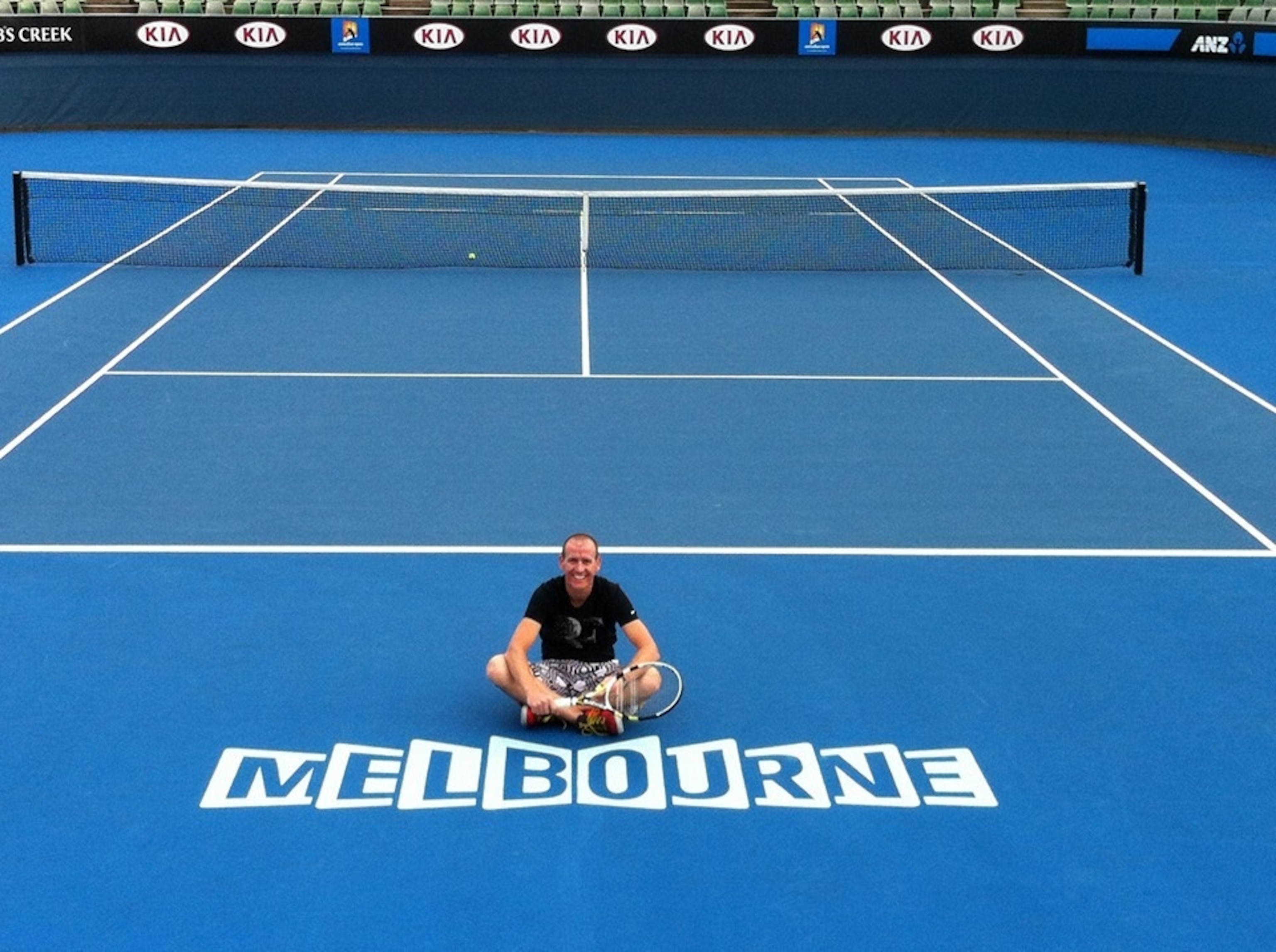
Saunder, who works at the mapping software company ESRI, is an accomplished map maker, leading projects like the world's largest atlas, Earth: Platinum Edition. Trying to follow professional tennis as a boy in Australia, he says the time difference limited him to short newspaper summaries. He longed for a better way to understand how the match went, and why the victor won. Years later, it turns out that cartography and GIS are one of the ways to do that, especially with the help of on-court tracking data. Now running a consultancy to advise players and coaches, Saunder is producing a body of striking visual tennis analyses that are part of a new effort to mine a rich lode of sports data.
I took all the principles of cartography, mapping, and data visualization and thought, why can't we apply that to tennis?Damien Saunder
Question: How did you get started visualizing tennis?
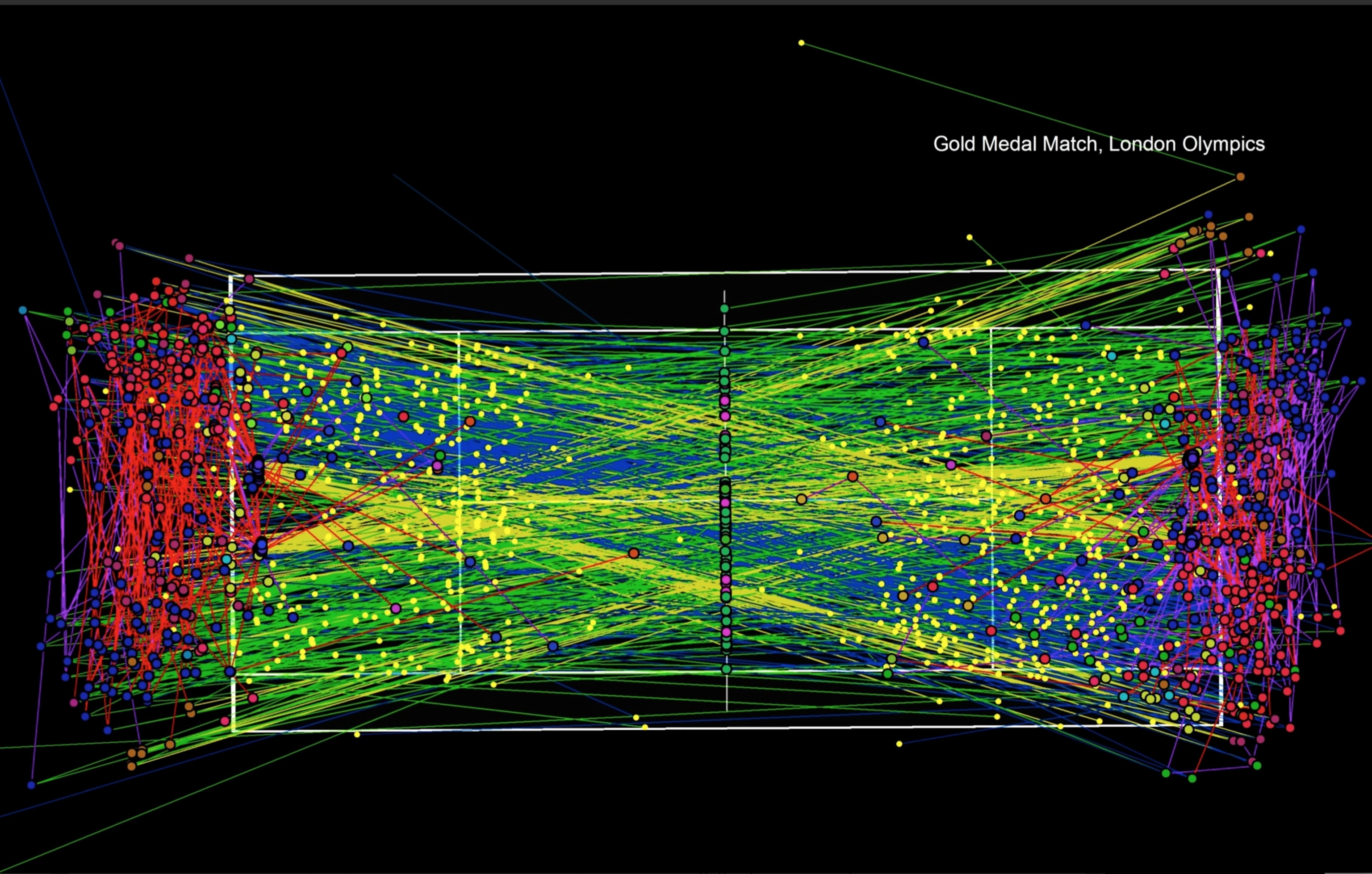
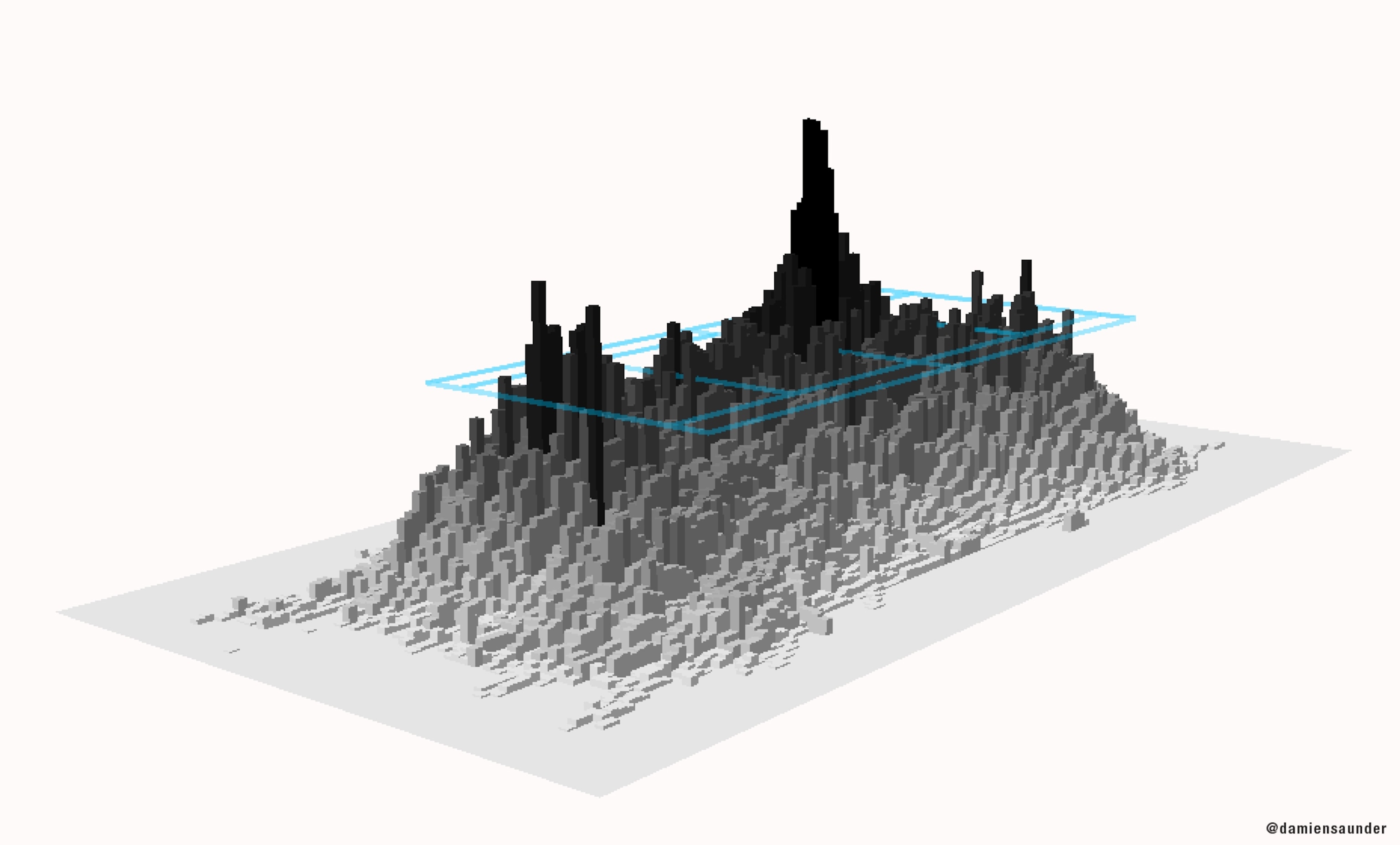
When I came over from Australia, one of my roles at ESRI was to try and find new ways of using our technology, and new industries to work with. I loved sports and tennis, and so I took all the principles of cartography, mapping, and data visualization and thought, why can't we apply that to tennis? When I look at tennis, I see it moving on a grid. I see space and x/y coordinates [position] and I see z values [height], and I see trajectories of the balls, and space opening up. I started GameSetMap to try and educate people of the value of mapping where people are on the court, storing the data in a GIS, and visualizing it.
Visualizing Tennis
How would you describe the essence of tennis, in your mind?
It's all about space. I want to get my opponent to a position on the court that makes them vulnerable, either to get an error or so they can't hit a winner. And likewise for me, I'm trying to open up space on the other side by taking my opponent off the court — which leaves me a lot of space to hit a winner. If you can keep your winners up and minimize your errors, you are usually in a pretty good position to win the game.
You said that a lot of post-match analysis misses the point, and that your analysis can help. What do you mean by that?
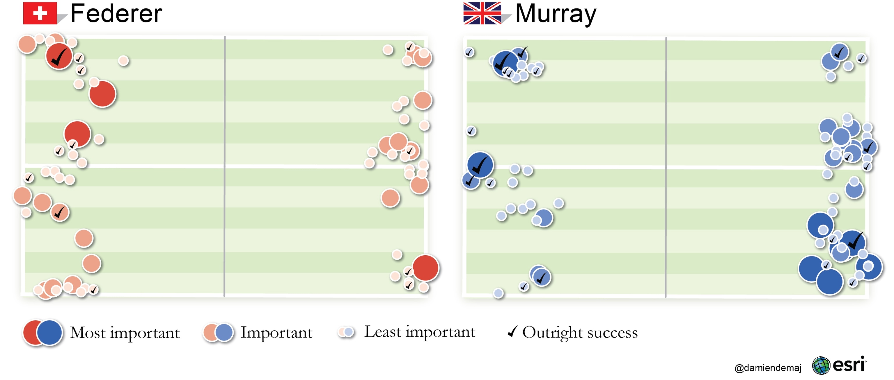
Let's take aces [when a returner is unable to return a valid serve]. It's a raw number — there might be 12 aces by this player throughout this whole match, but we're missing two really important components: the first is where. Where were those 12 aces? Were they out wide? Were they down the T? Were they hit consecutively down one spot? We're missing that geography component.
The second part is time. When were those aces hit? If that guy hit 10 of those 12 aces at love-15 or 15-love ["love" means zero in tennis scoring], then it lessens the impact of those aces. But if the player’s dropping aces at break point or game point, that number is even more impressive. So we lose a lot of context about these numbers if we don't know where and when those events occurred. And that's the fundamental goal of data vis, and of mapping in general.
So where does all this data come from? In your first research paper about GIS and tennis analytics, you hand-traced all the points from a video recording of the match, right?
In our GIS software I overlaid a perspective view of the court so that the 3D camera matched the TV camera. I built a data model to support the data capture, then I captured every bounce and every ball strike by each player. I think it took about 25 hours. Then I was able to compute player movement roughly between where one shot was taken and the other.
When you did a project with Japanese television on the highly ranked player Kei Nishikori, you got access to the Hawk-Eye data. What is Hawk-Eye, and how did it change your approach?
It's an optical tracking system, there are ten cameras on court, and they basically track the ball and model its flight in real time. Then they have some data capture people who are there on court tagging [the stroke type] and they are tagging manually whether it was an unforced error and so on.
If we look at the Nishikori project, we had many, many dozen matches from Nishikori that were supplied to us [as Hawk-Eye data], and that was a real breakthrough. It took away all that data capturing time, and now we had the data and we could get straight into the analysis. We've got speed, we've got velocity, we've got a model to calculate spin. And we can connect the player movement with trajectory and work out how movement is affecting the match.
Is this the “moneyball” moment for tennis, where computer analytics will change the way coaches assess players strengths and weaknesses, and how they develop game strategies?
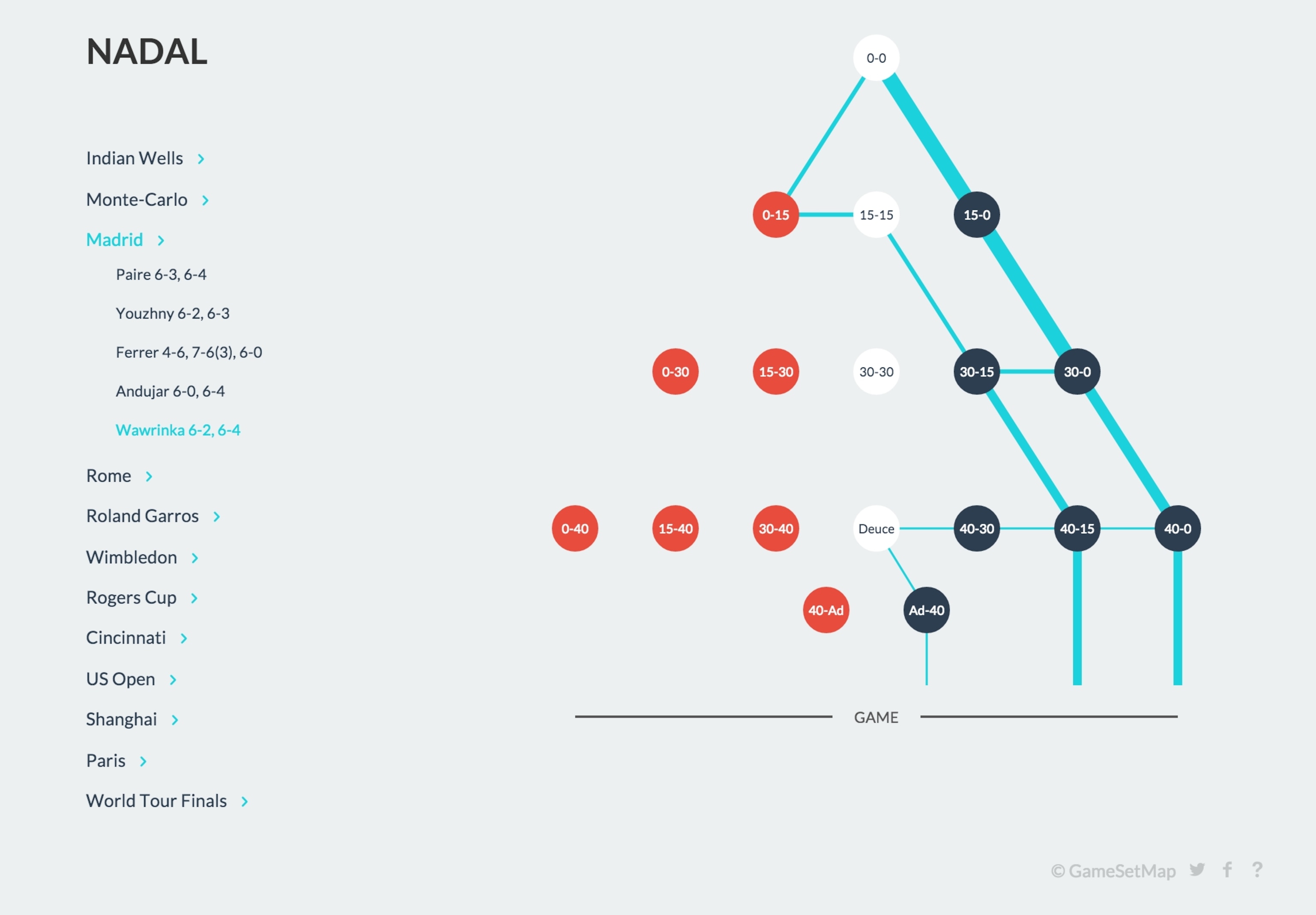
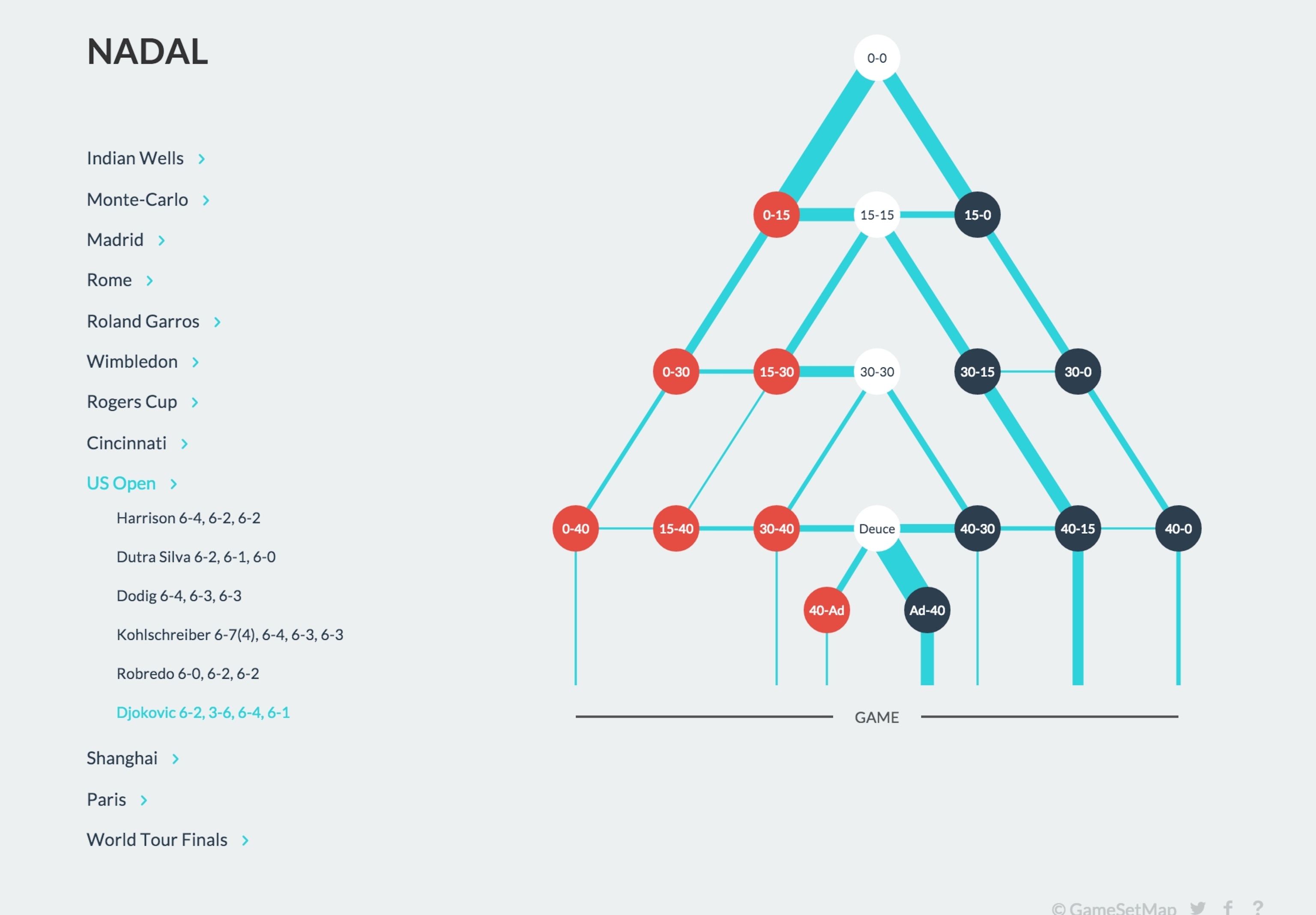
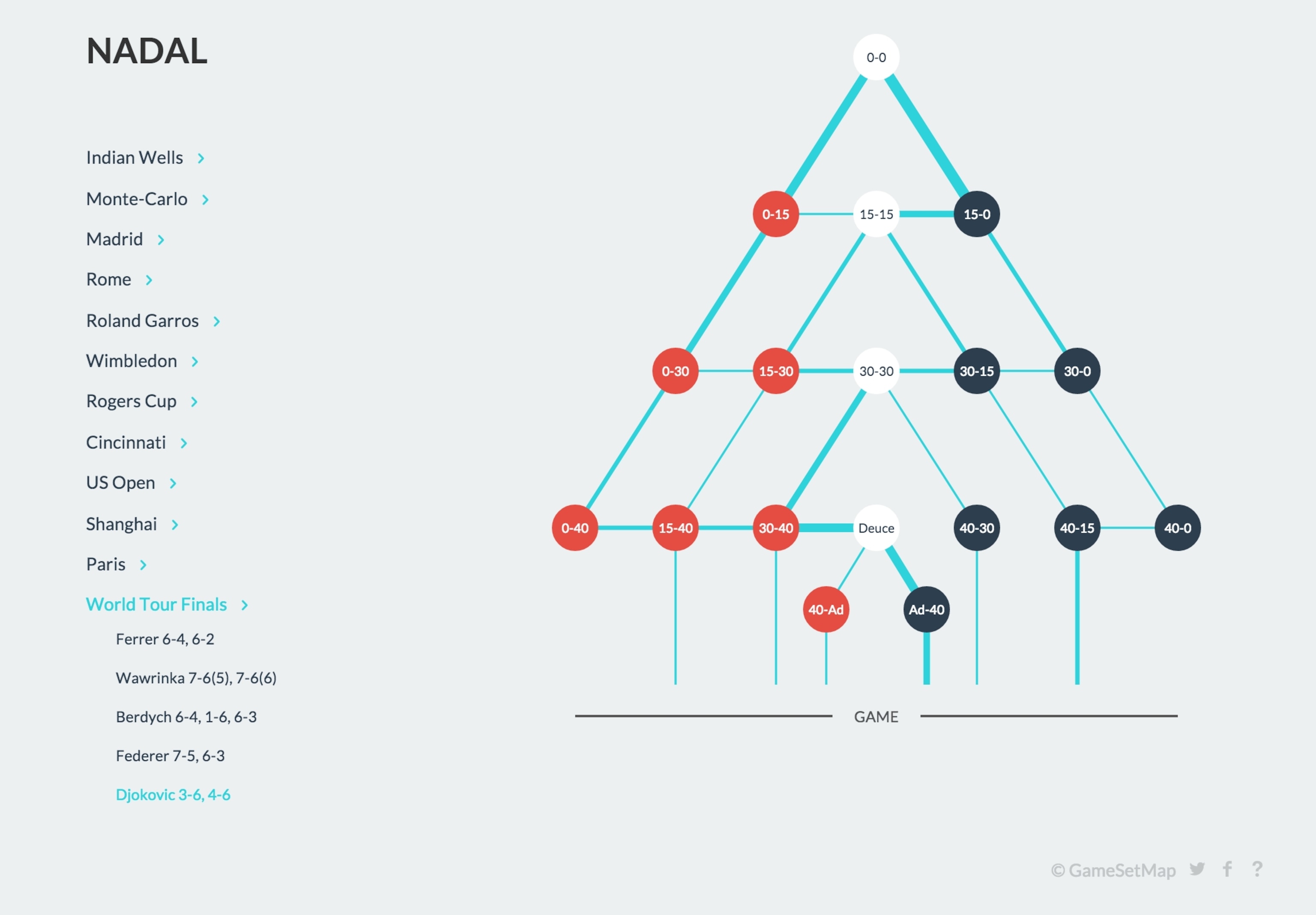
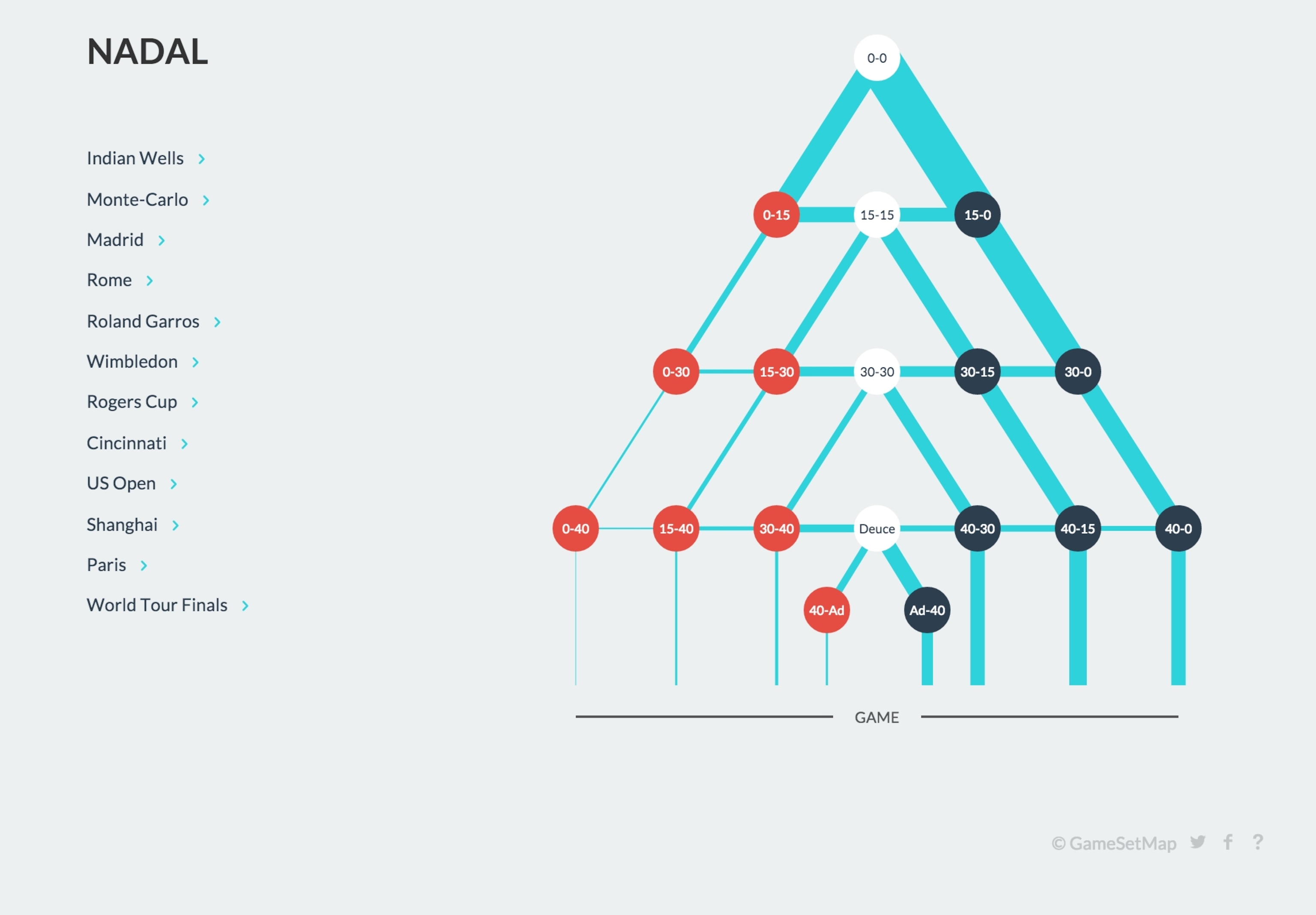
Actually that's the whole bottom line, there's so many points and so many actions in a tennis match there's no way the human eye can collect, memorize, and summarize that in an unbiased judgment of the game. It’s just impossible, and likewise with the score. Until you plug that score into the game tree, you have some assumptions that you bring in, but you never really know until you see the data visualized.
And that's what I love about it, that real challenge, and our role is really taking the very the complex geographic world that we live in — and this is the cartographer’s role – basically we are simplifying that into a map form that people can digest. And that's what we're trying to do with this data, it's the same principle.
Follow Geoff McGhee on Twitter.


