These Colorful Propaganda Maps Fueled 20th-Century Wars
Maps made to persuade the public during times of conflict can be beautiful, terrifying, funny, and informative.
Maps often have hidden agendas, conveyed through subtle choices made by the cartographer. That is not the case for these maps.
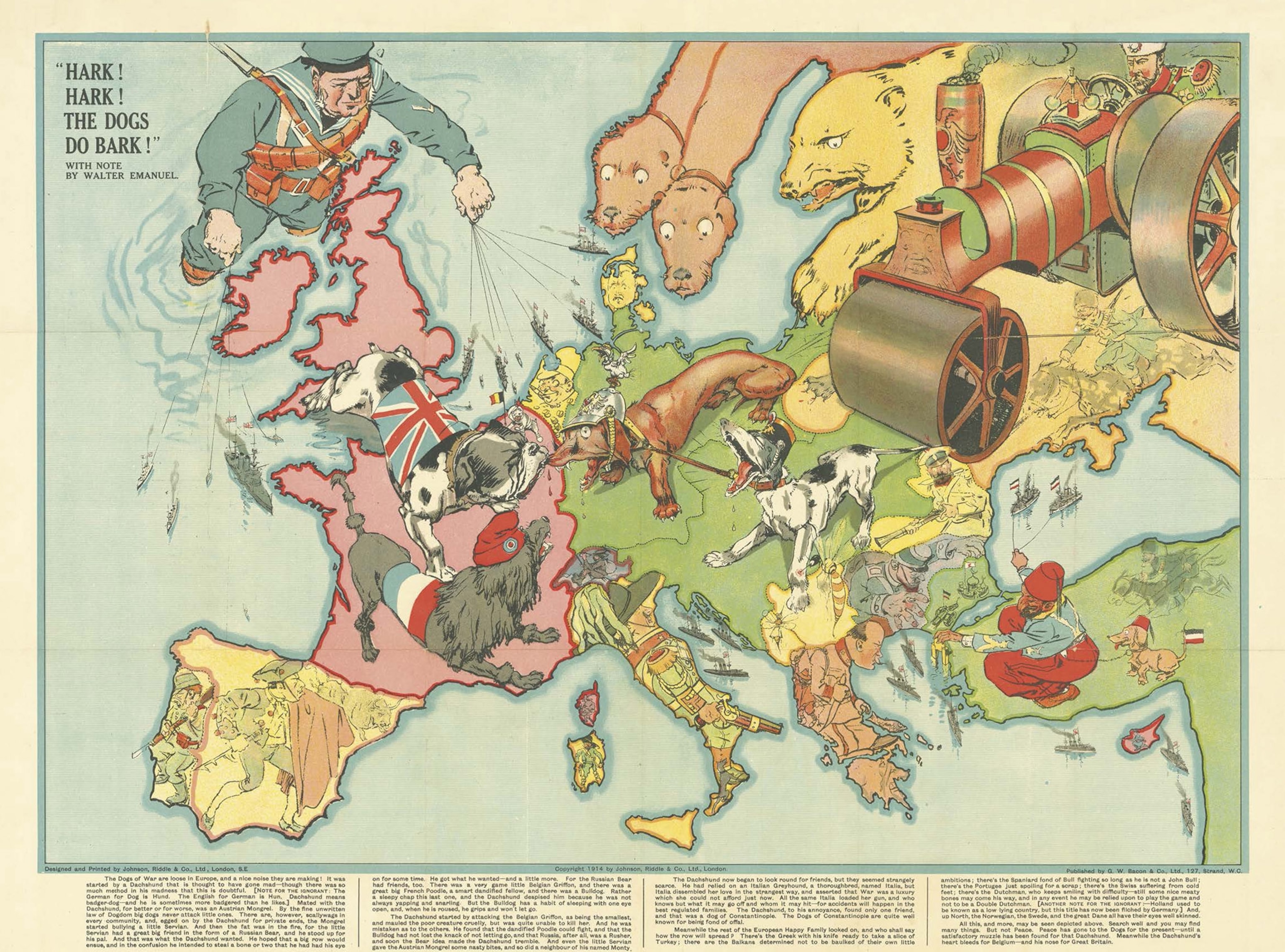
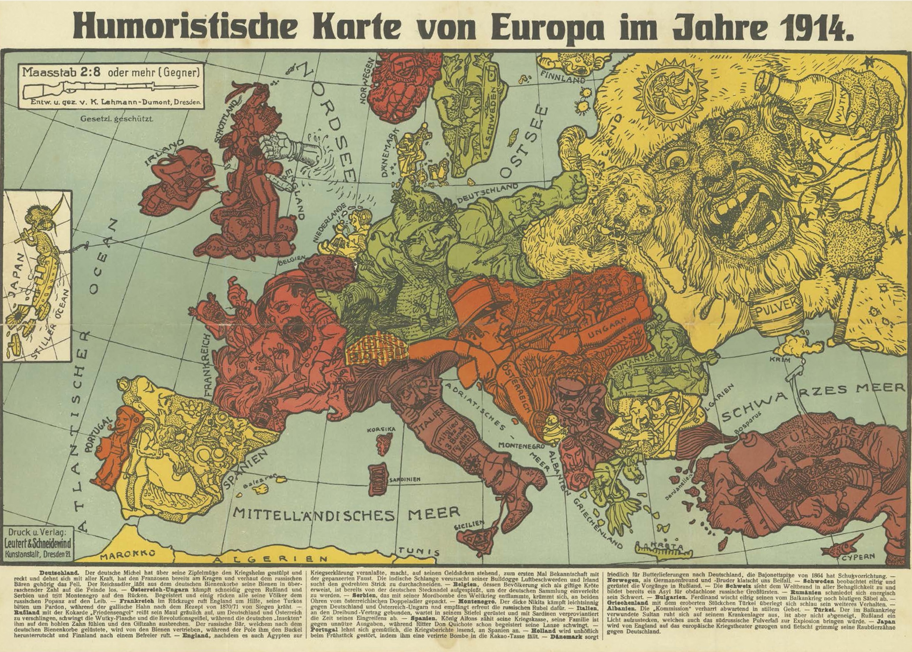
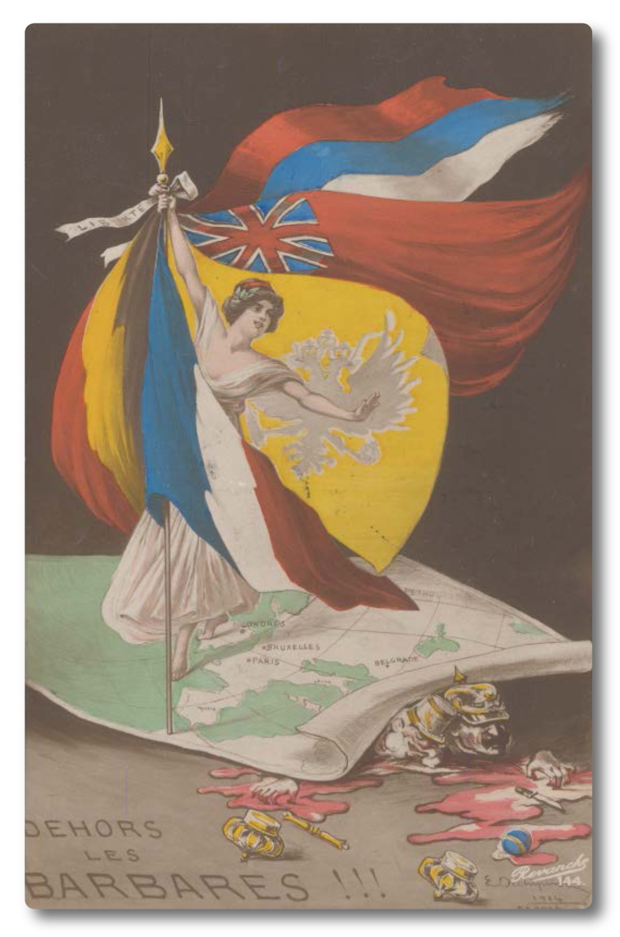
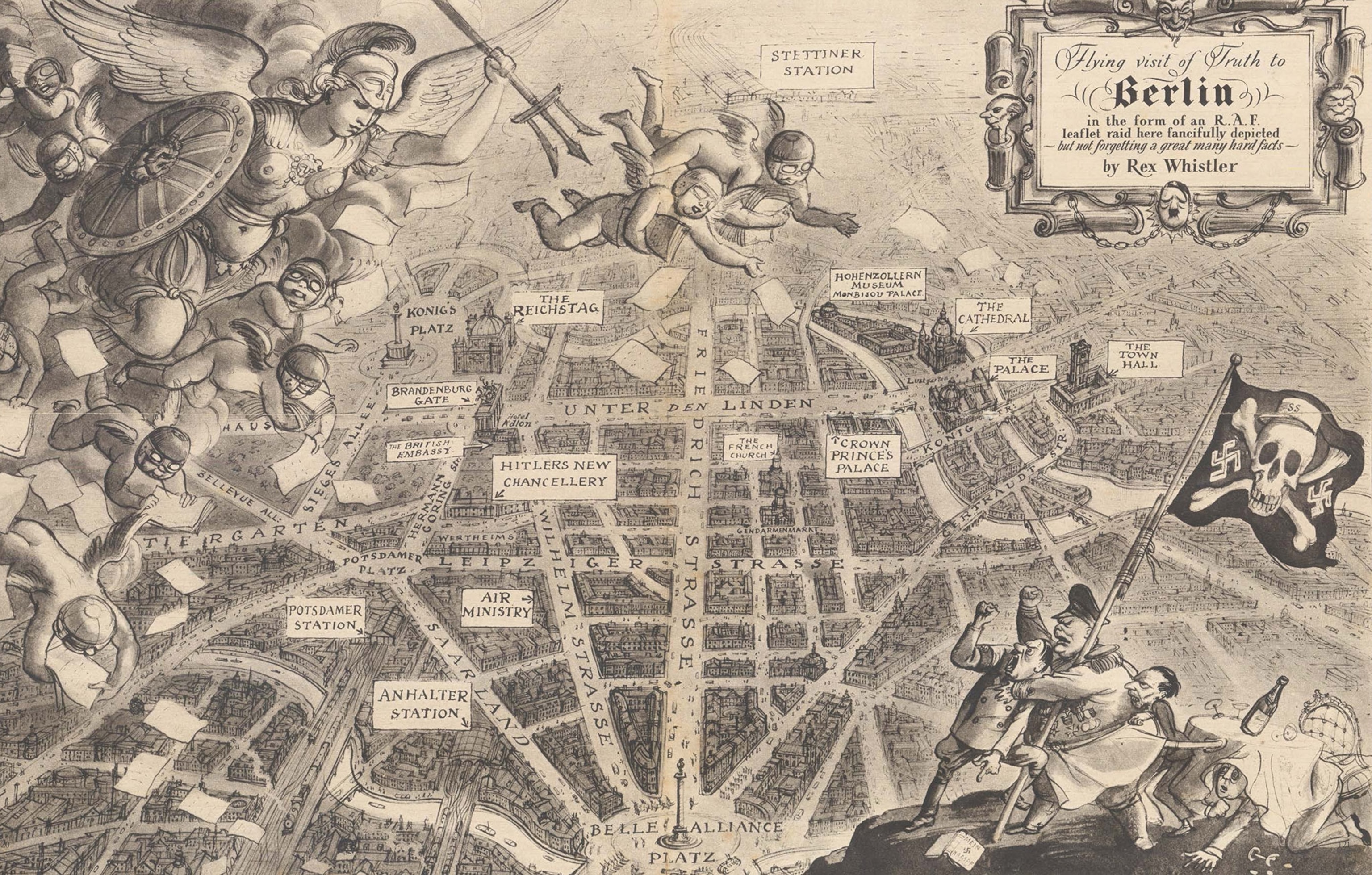
The maps—which are currently in an exhibition called “War Map” at the Map House in London—have very clear messages. They’re war propaganda, meant to convince the public of an enemy’s evil tendencies, or that a conflict is winnable and worth the sacrifice. The exhibit and an accompanying book are filled with colorful maps that reveal details about the politics, culture, and art of countries involved in conflicts in the first half of the 20th century.
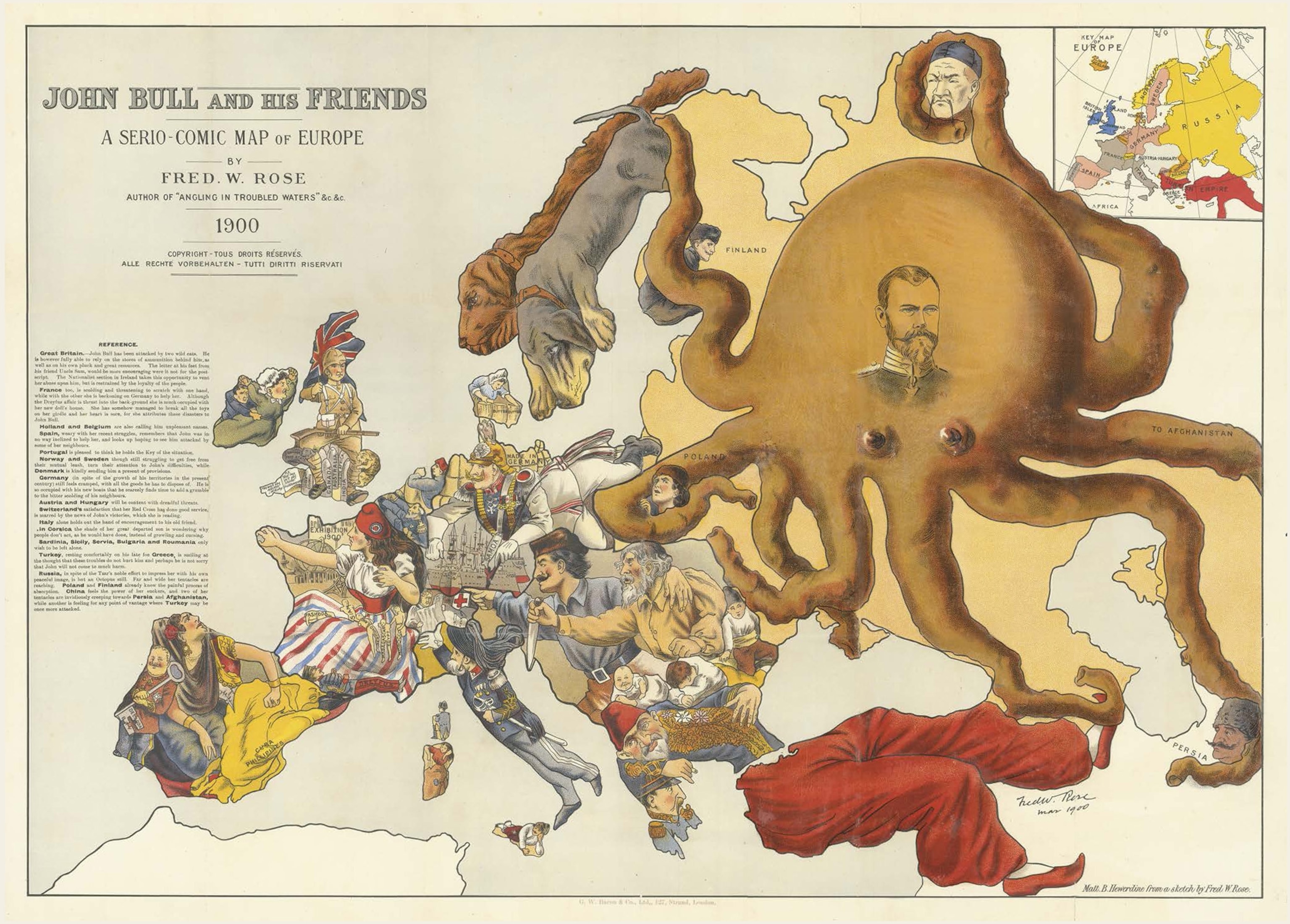
The map above is a great example. Made in 1900, it portrays Russia as an octopus with tentacles reaching out in all directions, strangling Poland, Finland, and China, and reaching toward Turkey, Afghanistan, and Persia. The map’s creator, British cartographer Frederick Rose, was, in his time, perhaps the most influential maker of what are known as anthropomorphic maps. Though the octopus is the main character of this map, most European countries are depicted as various people, which is where the style gets its name.
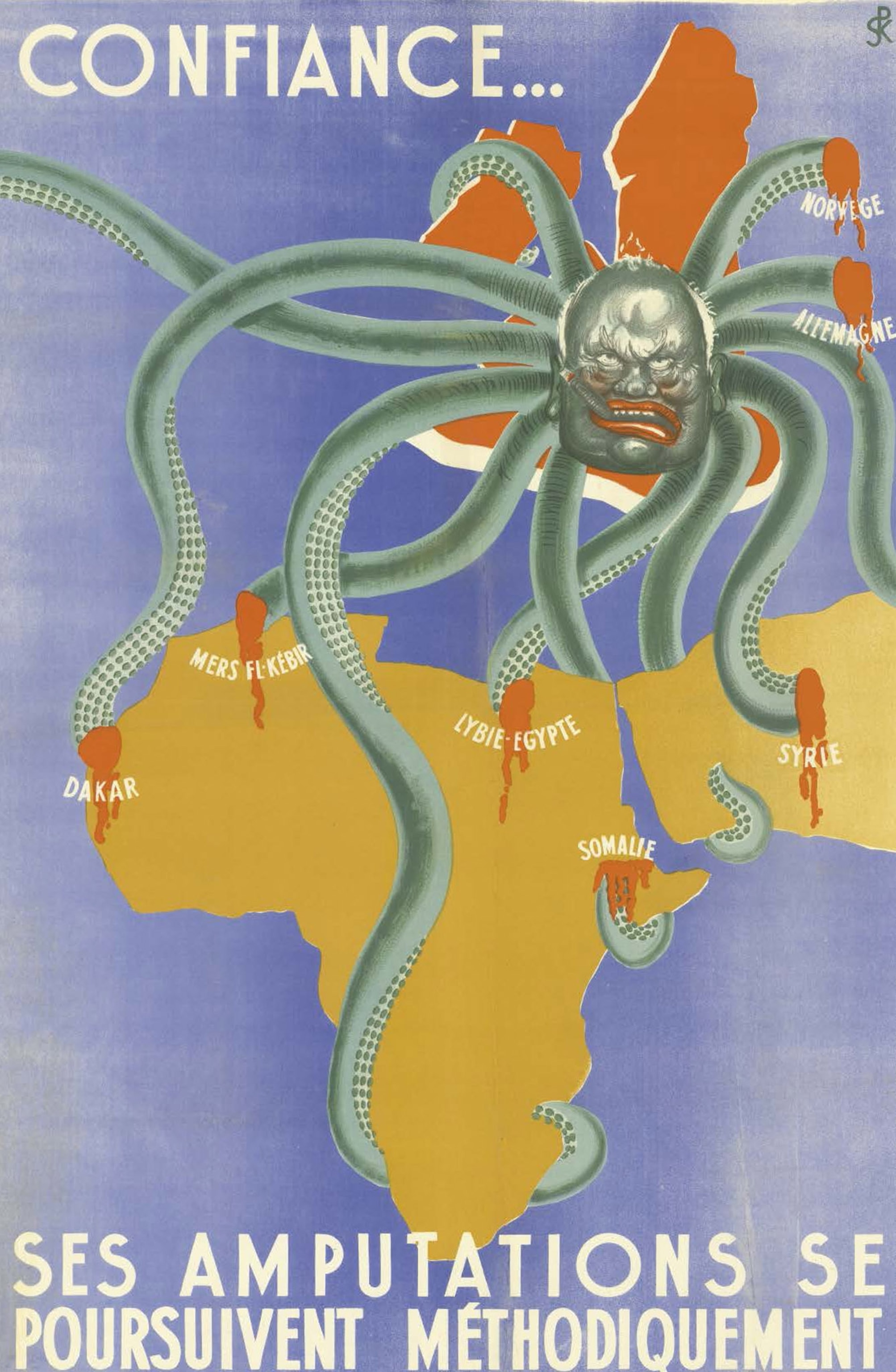
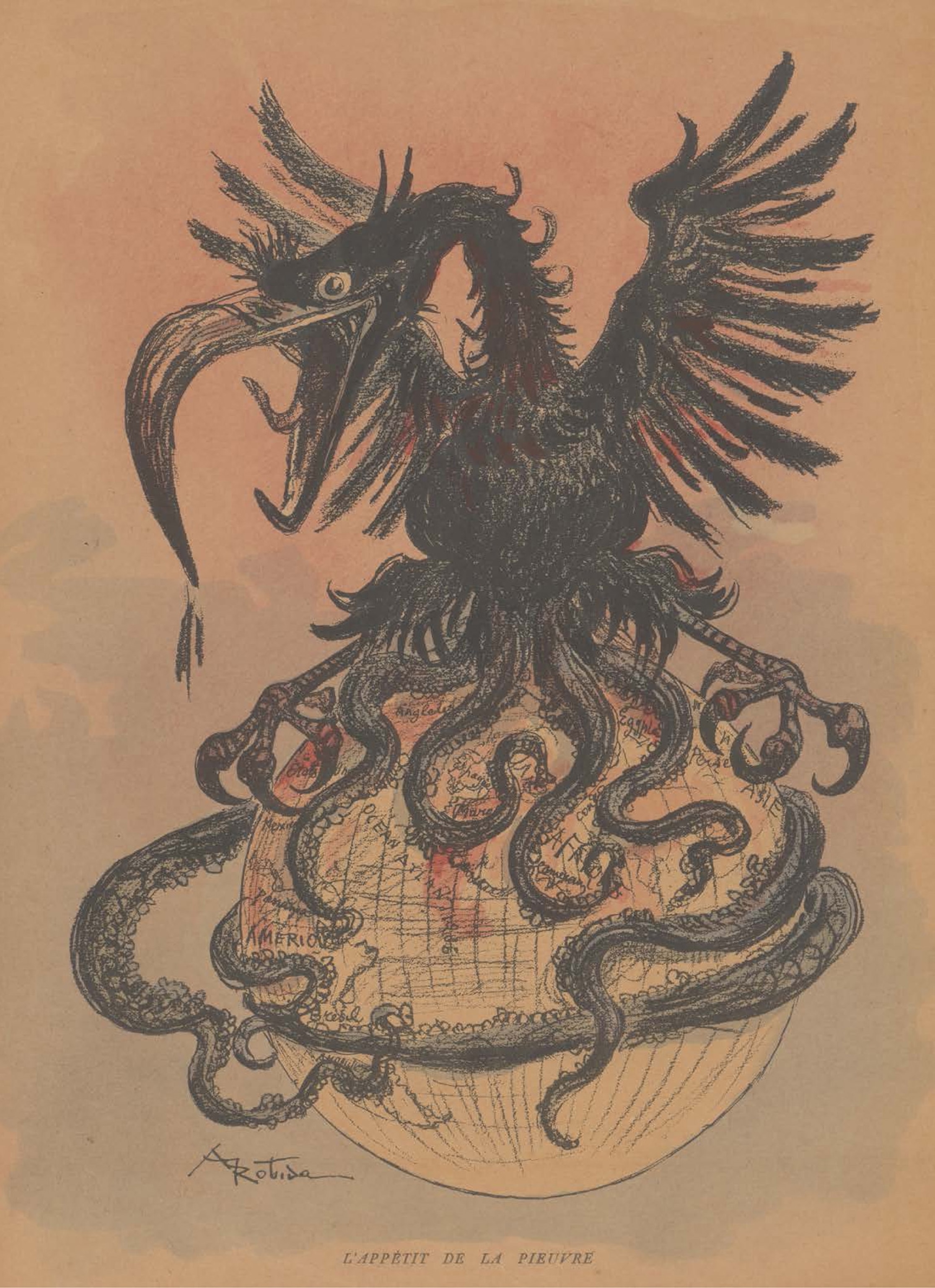
Rose’s iconic image of the octopus as aggressor, first used in a map he made in 1877, was picked up by many others, including French, Japanese, and Nazi cartographers. In one map made by the French (and included in the gallery below), Winston Churchill is depicted as the octopus.
The exhibition and book cover several wars, including the two World Wars, the Boer War, and the Russian Civil War. It’s the result of 15 years of collecting by authors Philip Curtis and Jakob Søndergård Pedersen, and several of the maps are the only known copies in existence.

One of these potentially unique pieces is an anti-Bolshevik map (below) made in Bulgaria that shows Soviet soldiers engaged in horrendous acts all across Europe. The caption translates to, “This is what can be expected if Europe succumbs to Bolshevism.”
“This would have been drawn and printed and distributed when the Soviet army was on the very borders of Bulgaria,” Curtis said in a radio interview with Monocle on September 25. “Now, this is not a piece that you would want in your house with Soviet Red Army soldiers kicking your door in. It would have be an undoubted death sentence to possess this thing. [These maps] would have been destroyed. How this one managed to escape, we don’t know.”
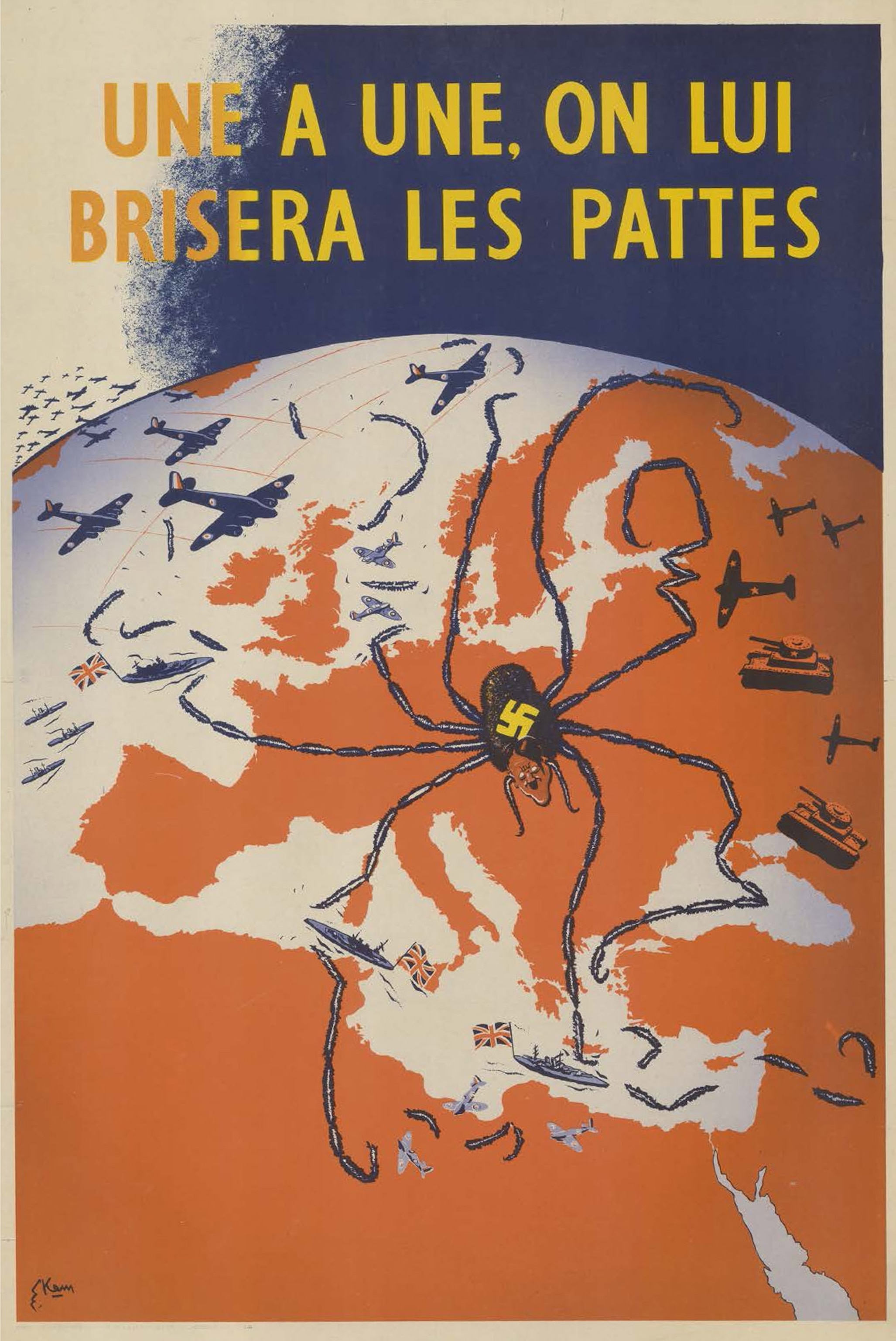
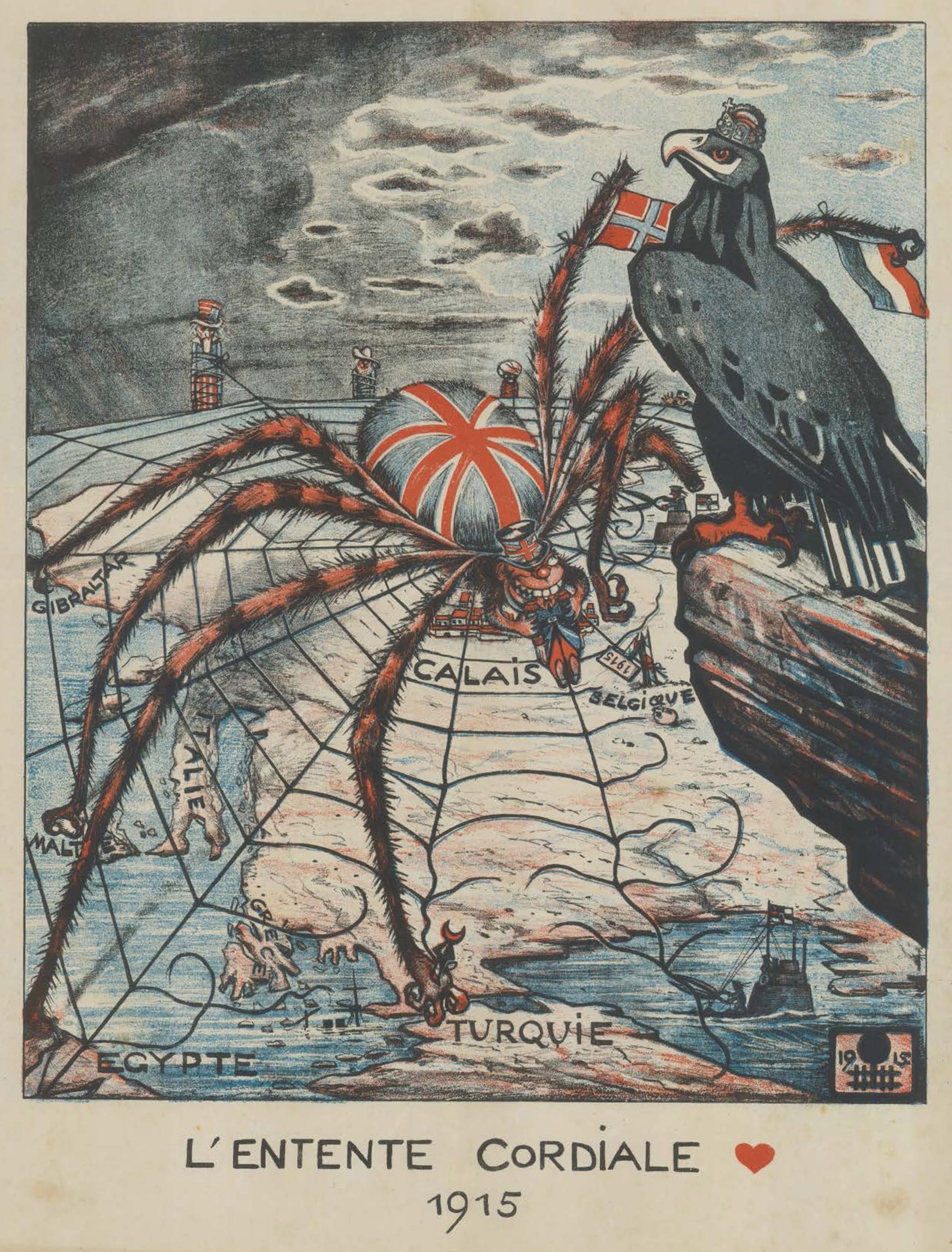
Some of my favorites in the collection use animals as shorthand for the characteristics of various countries and leaders: England’s colonial activities are represented by a lion, Turkey is shown as a lethargic elephant, Italy as a half asleep dog, Switzerland as a tortoise hiding within its shell of neutrality. In addition to the octopus, spiders made for popular cartographic aggressors. Nazi Germany is depicted as a long-legged black arachnid with Hitler’s face and a swastika on its back on the ominous British propaganda map below, aimed at French-speaking former colonies in Africa with the caption, “Une a une, on lui brisera les pattes” (“One by one his legs will be broken”).

