There’s More Than One Way to Map an Election
Electoral maps have been around since the 1800s. Maybe it’s time to try something new.
Our greatest national map obsession comes every four years. In the weeks leading up to a presidential election, practically every major media outlet creates maps to show the latest polling data. Then, on Election Day, millions of Americans turn on the TV and watch with anticipation (or dread) as maps of the country turn red and blue, one state at a time, in a wave that sweeps from east to west as the vote is tallied.
But despite their persistent presence in news reports, these red-state, blue-state maps are cartographically questionable.
For one thing, the maps distort the influence of large, sparsely populated states, says Andy Woodruff, a Boston-based cartographer with Axis Maps. “You see this large sea of red in the middle of the country that’s much more prominent than what it represents in terms of the election.” Gigantic Montana, for example, only has three electoral votes, while puny Rhode Island has four.
Woodruff and other cartographers have been playing around for years with different ways to map election results, and some of these alternatives have recently found their way into the Washington Post and New York Times. “It’s getting a little more mainstream with each election cycle,” Woodruff says.

The History of Election Maps
Election maps go back more than a century. The work above is the oldest known map of a U.S. presidential election, according to Susan Schulten, a historian of cartography at the University of Denver. Schulten has written extensively about this map, which appeared in a statistical atlas published by the U.S. Census Bureau in 1883. It’s a superb early example of data visualization, Schulten says.
The map depicts results from the 1880 election at the state and county levels, and accompanying bar charts show which states had the biggest turnout and largest margins for one side or the other. The overall color pattern on the map may look familiar but it’s actually the opposite of what’s used today—Democratic areas are red, Republican areas are blue.
It’s possible that an earlier electoral map was published in a newspaper, but custom graphics were rare in those days, says Ryan Cordell, who studies information exchange in 19th-century newspapers at Northeastern University.
“Images were not very common in newspapers until late in the 19th century, save the stock images used for advertisements and some particular kinds of stories,” Cordell says. “The same image block of a ship might be used for lots of stories taking place at sea, for instance.” Custom woodcuts or engravings were just too expensive to do on a regular basis.
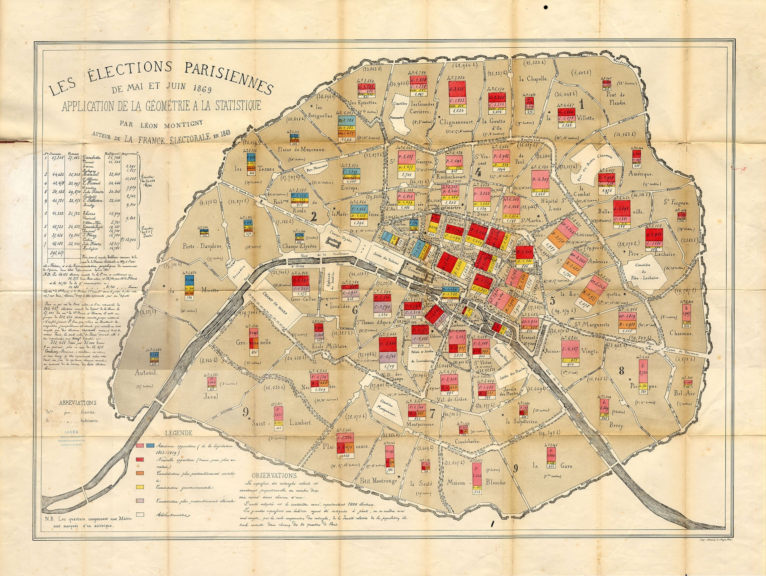
Cordell hasn’t come across an earlier electoral map in a U.S. newspaper, but he did find the map of Paris below, which shows results from an 1869 parliamentary election that undermined the power of Napoleon III and marked a turning point in French history.

A New Wave of Election Maps
Despite their long history, election maps only became a popular fixation in the last 20 years or so. Skim through cable and network news coverage of the 1996 presidential election, for example, and you’ll spot a map here and there, mostly as a break from bar charts and talking heads. But by 2012, glitzy maps were a near-constant backdrop on news programs, with anchors poking at touchscreens as results came in.
But if all you really care about is who is winning, it’s probably best to look at a bar chart, says Ken Field, a cartographer at Esri, a mapping software company based in Redlands, California. That’s because our brains are better at comparing the lengths of two lines than estimating the total area taken up by splotches of red and blue.
However, there is still something to learn from election maps. “An election is inherently a spatial phenomenon, and we want to know how we voted relative to our neighbors and relative to people across the nation,” Field says.
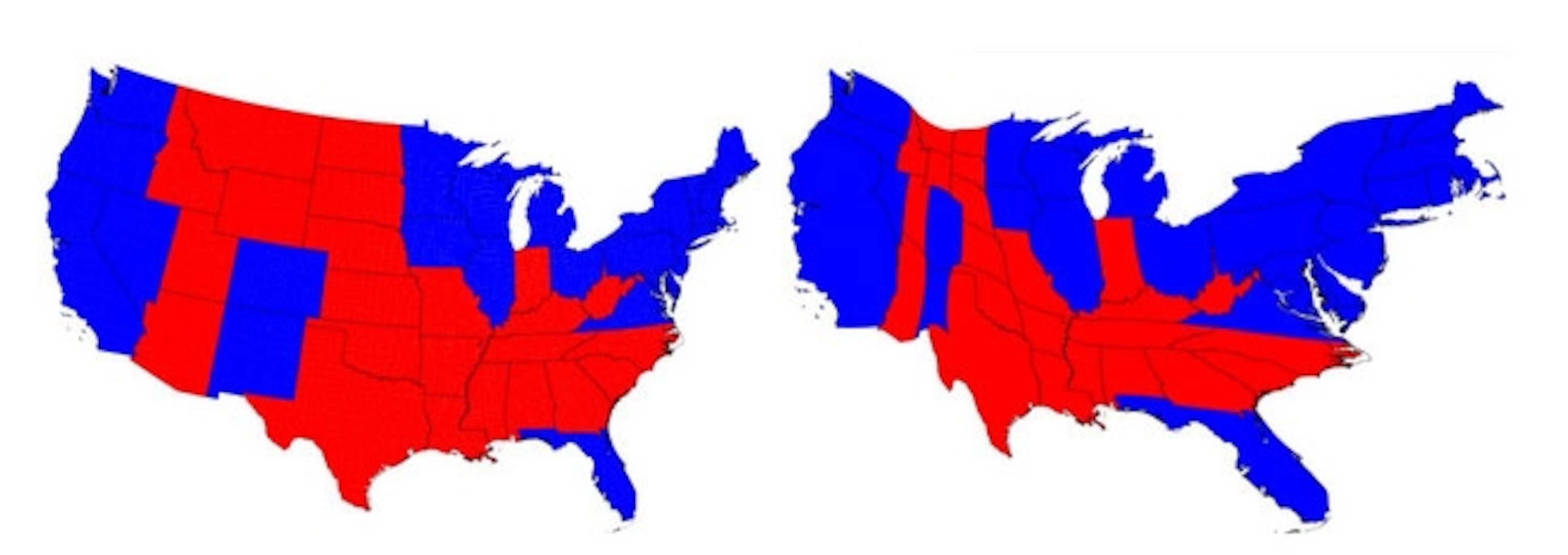
That’s why he and other cartographers have been looking for ways to improve on the traditional election maps. One alternative is something called a cartogram. You can see an example below on the right. It distorts the area of each state to correspond with its influence in the election, in this case its number of electoral college votes. All that red on the traditional map on the left might give you the impression that Mitt Romney won the 2012 election, but the cartogram gives a more accurate view of how states on both coasts and in the upper Midwest swayed the election for Obama.

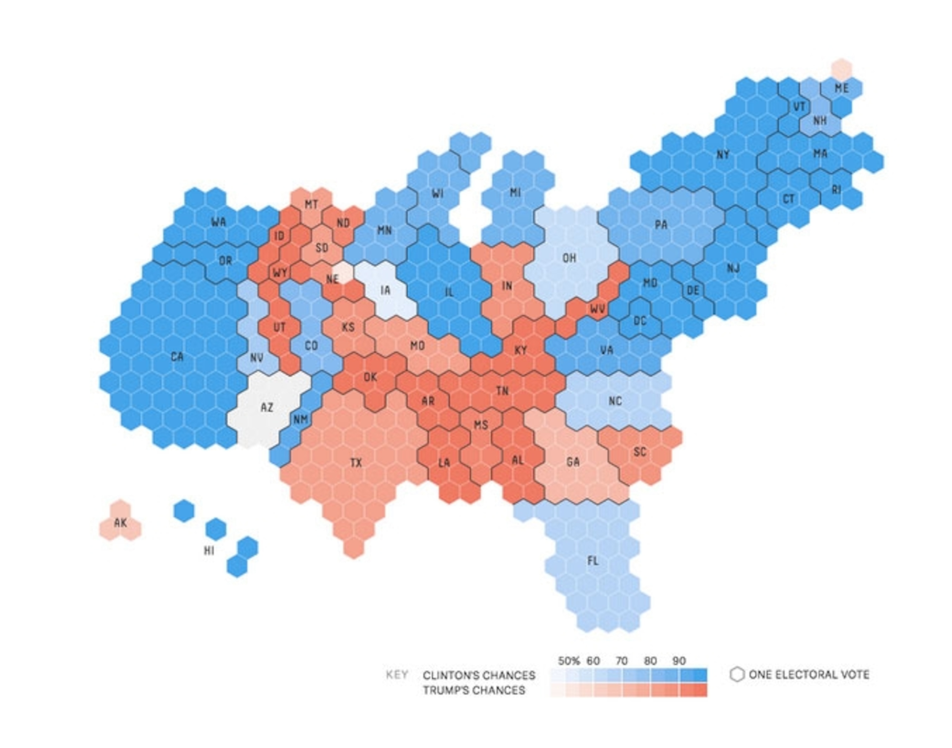
This year, several media outlets have been using cartograms. On the Washington Post’s website you can toggle back and forth between a cartogram with diamond-shaped tiles and the more familiar red-blue map. FiveThirtyEight uses hexagonal tiles to create the cartogram below.

Cartograms do a good job representing the influence of each state on the outcome of an election, but they do it at the cost of geographic accuracy. And some people think they’re ugly. After a fit of what he calls “ranting and experimentation” in 2008, Woodruff developed an alternative method called “value by alpha” to create the map at the top of this post. He took county election records from that year’s presidential election and adjusted the transparency of each county according to its population. The result is a more nuanced picture of the vote, with urban areas lighting up bright red or blue and sparsely populated regions remaining nearly black. In the detail below, for example, Pittsburgh and Philadelphia show up as bright blue, but many of the more sparsely populated rural counties between the two cities are darkish red.

Another approach uses red and blue dots to represent individual votes (or hundreds or thousands of votes, depending on the scale). Several of these “dot density maps” made the rounds on cartography blogs after the 2012 election. Ken Field made the version below during his own bout of experimentation with election maps—you can see all 21 experimental maps he created in this gallery, including an interactive version of his dot density map where you can zoom in on cities to see how different neighborhoods voted. The dots don’t show the precise location of voters, though, they’re randomly distributed throughout each populated place.

You probably won’t see maps like these on election night, however. It takes too much time to count the votes, and even then the numbers aren’t readily available in a format that’s easy for cartographers to work with. “Election data is very frustratingly difficult to find and compile by ordinary citizens,” Woodruff says.
Cartograms are easier to create on the fly, but you probably won’t see Wolf Blitzer standing in front of one—they’re just too unfamiliar for most people.
And so while there may be good reasons for ditching the old red-blue maps, but it’s still hard to imagine election night without them.