'Steampunk' Infographics Beautifully Combine Past and Present
When information graphics designers look to the past for inspiration, the results say a lot about information visualization today.
Data Points is a new series where we explore the world of data visualization, information graphics, and cartography.
When industrial designers connect iPhones to Victrola horns and turn manual typewriters into bluetooth keyboards, we call it “steampunk,” a genre that combines modern technology with a sputtery, hissy analog past. When information graphics designers also look to the past for inspiration, the result—something I’ll call “steampunk infographics”—tells us a lot about the state of information visualization today.
Contemporary Data in an Antique Wrapper
Aghast that the Census Bureau had decided to stop publishing its decennial statistical atlas, Nathan Yau decided to make one of his own. After all, the Bureau offers loads of data online for anyone to use. And who better than Yau, a stats PhD who blogs at FlowingData.com, has interned at The New York Times' graphics desk and has written three books on statistics and data visualization?
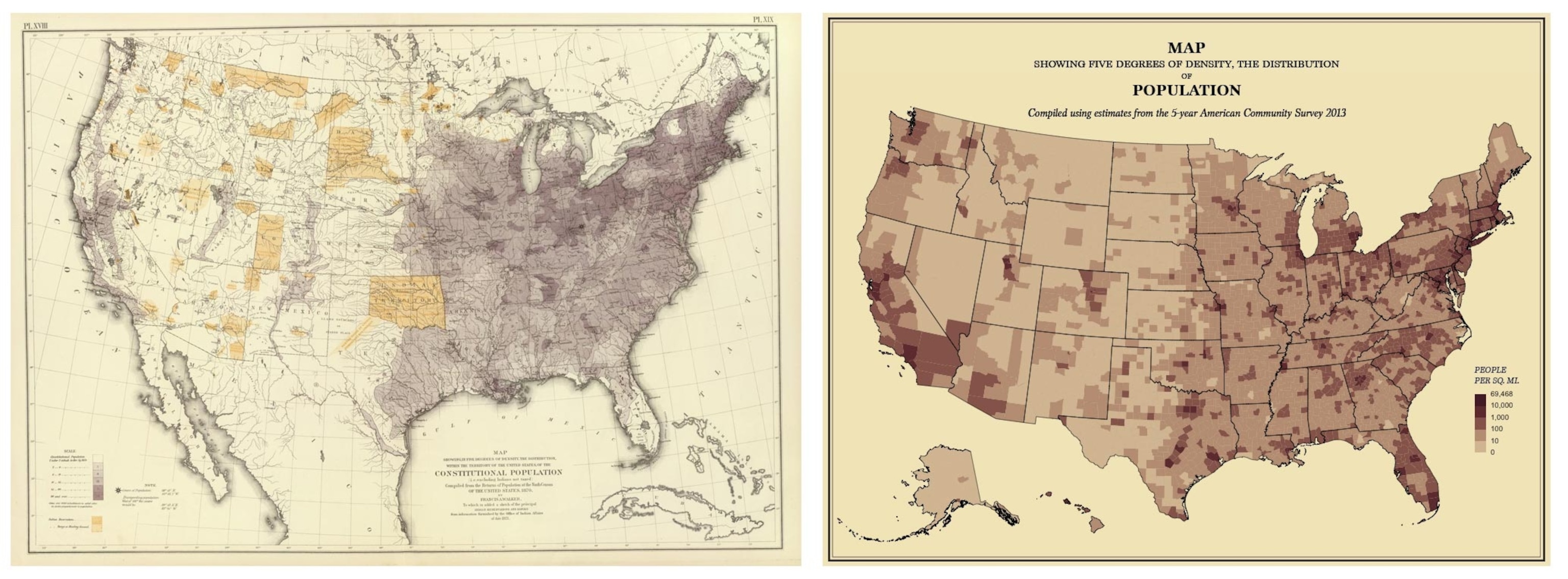
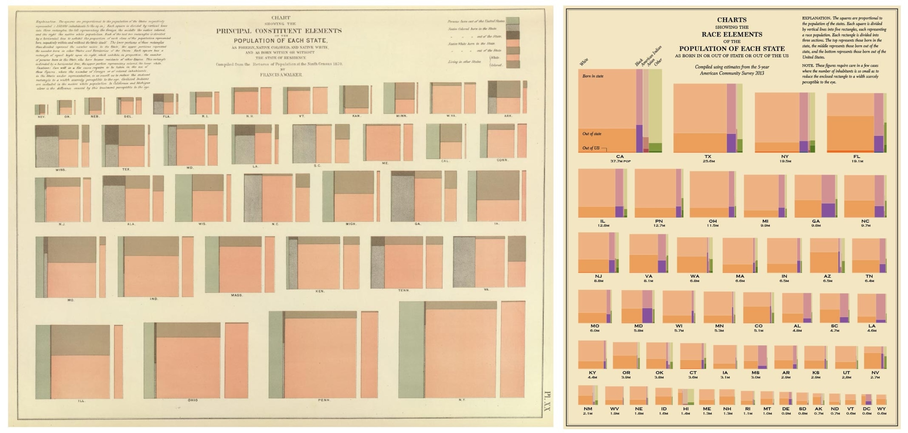
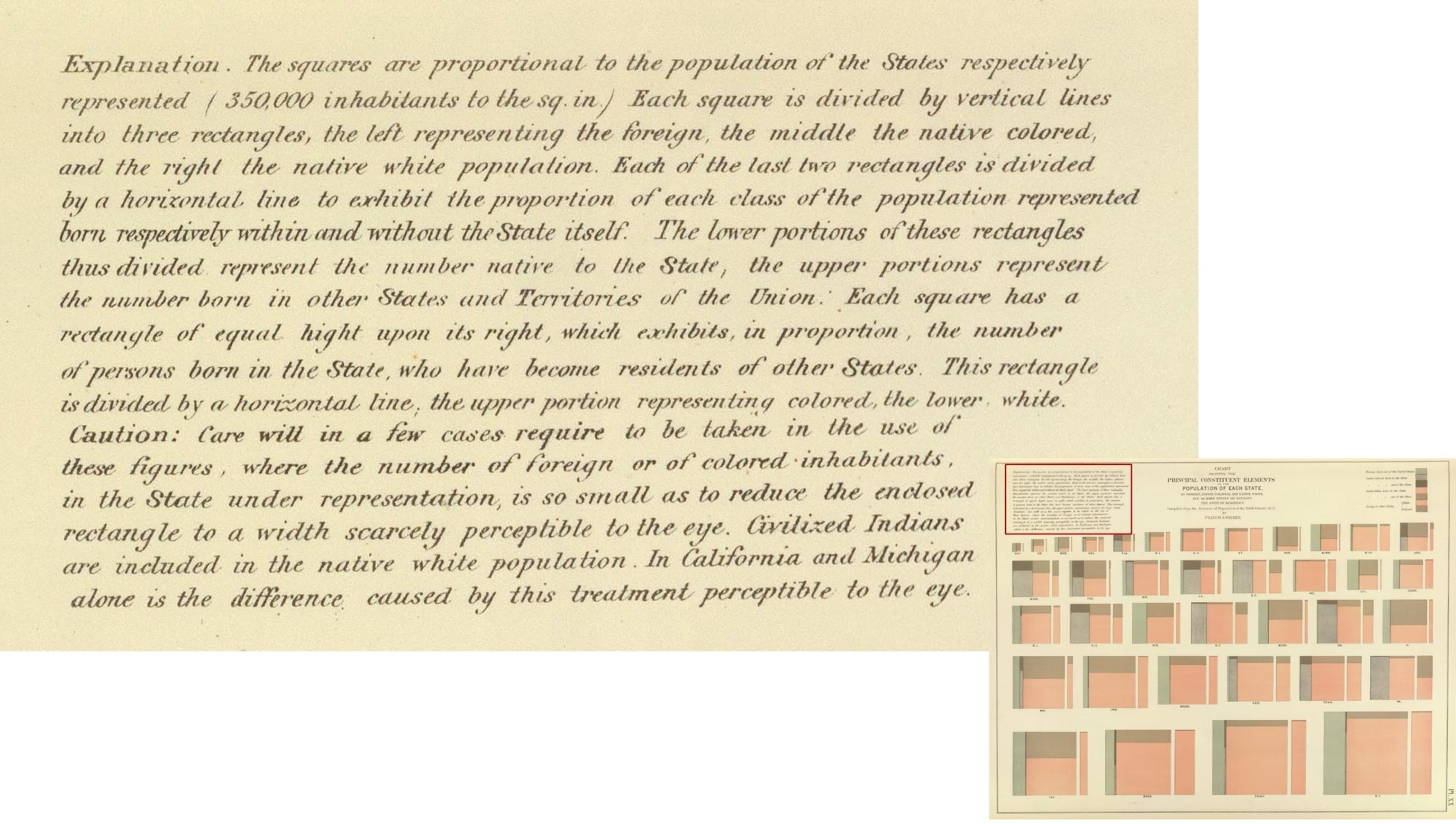
Instead of working from the last edition, published after the 2000 Census, Yau reached back to 1874, painstakingly recreating the Statistical Atlas of the United States, a landmark work made from the 1870 census by Francis Amasa Walker.
“I started with the original atlas, because, well, it felt like something I should start at the beginning,” Yau told me. “There’s a careful quality to them, because they were made by hand and vintage things always seem to carry a little more weight.”
He recreated nearly 60 maps and information graphics from the original book, using similar type and color treatments, and reusing its formally worded captions wherever possible. But with a wrinkle—the data is all from the present day.
An 1874 Atlas and Its Present-Day Homage
Thus Yau's recreation is not only an homage to a lost publication, it is also a “census” of a different kind—one of contemporary public data. In his blog post, Yau describes where he got data, and how much work it took to get it—and it wasn’t always easy. His genial, “Hey, I could do that,” might not be the average person’s reaction to a 56-page statistical atlas, but it’s not unthinkable when software has made it so much easier to produce data visualizations. Yau says that he used the statistics package R to create all of the pages, “with the exception of text” that he set in Adobe Illustrator.
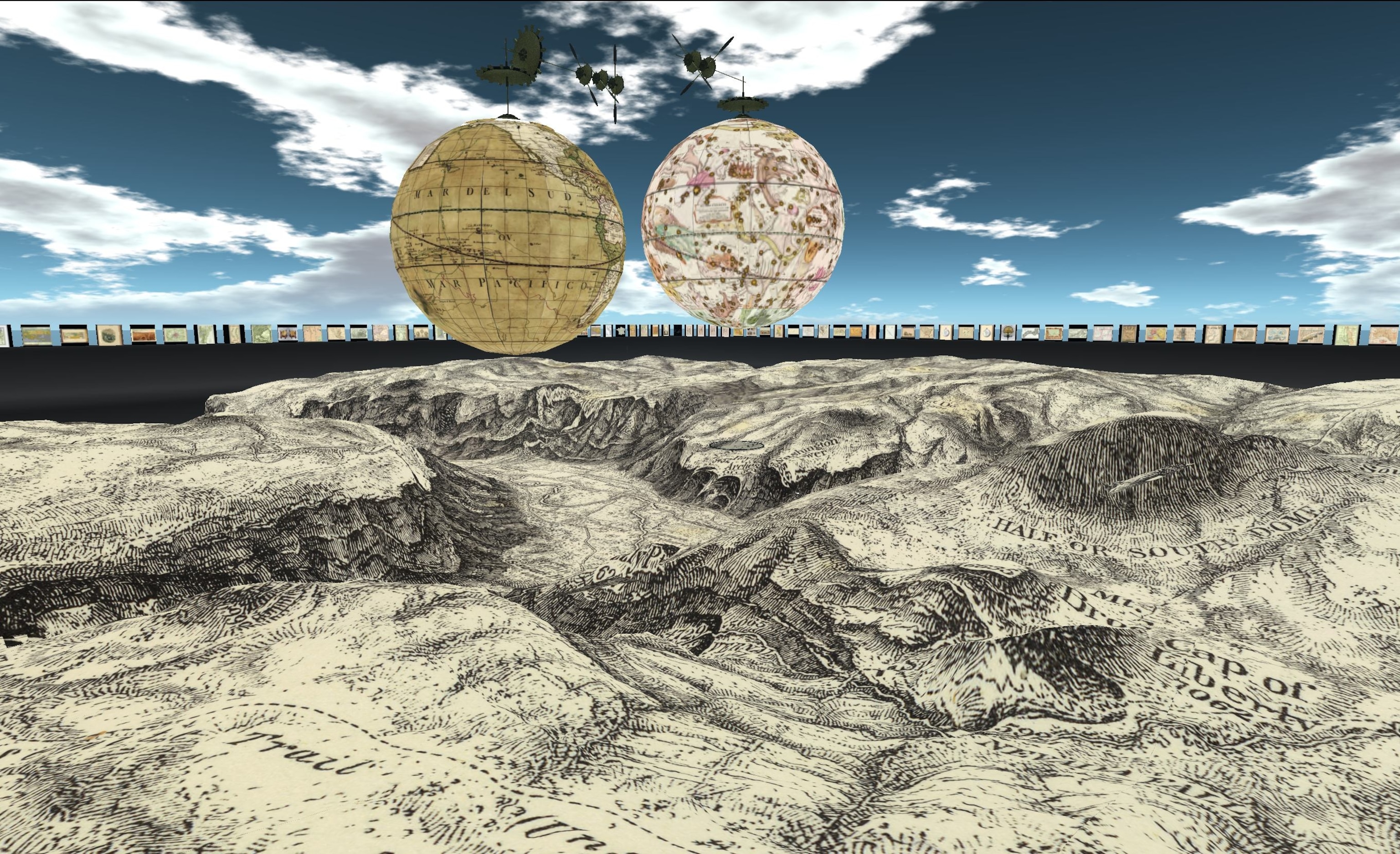
“Very nice work!” says the map collector David Rumsey, whose archive includes the Walker atlas. “My only tweak would be to offer a higher resolution option to enable more zooming in.” Rumsey is no stranger to adapting antique maps for the digital world. Not only are his maps available in Google Earth, but users of the virtual reality environment Second Life can “fly” through and around his collection of antique maps and globes.
That’s another aspect of steampunk—taking something that looks old and adding new functionality, like the typewriter that controls a personal computer. In that regard, another digital atlas project is about as steampunk as it gets.
Vintage things always seem to carry a little more weight.Nathan Yau, FlowingData.com
A Shiny New Interface for a Classic Atlas
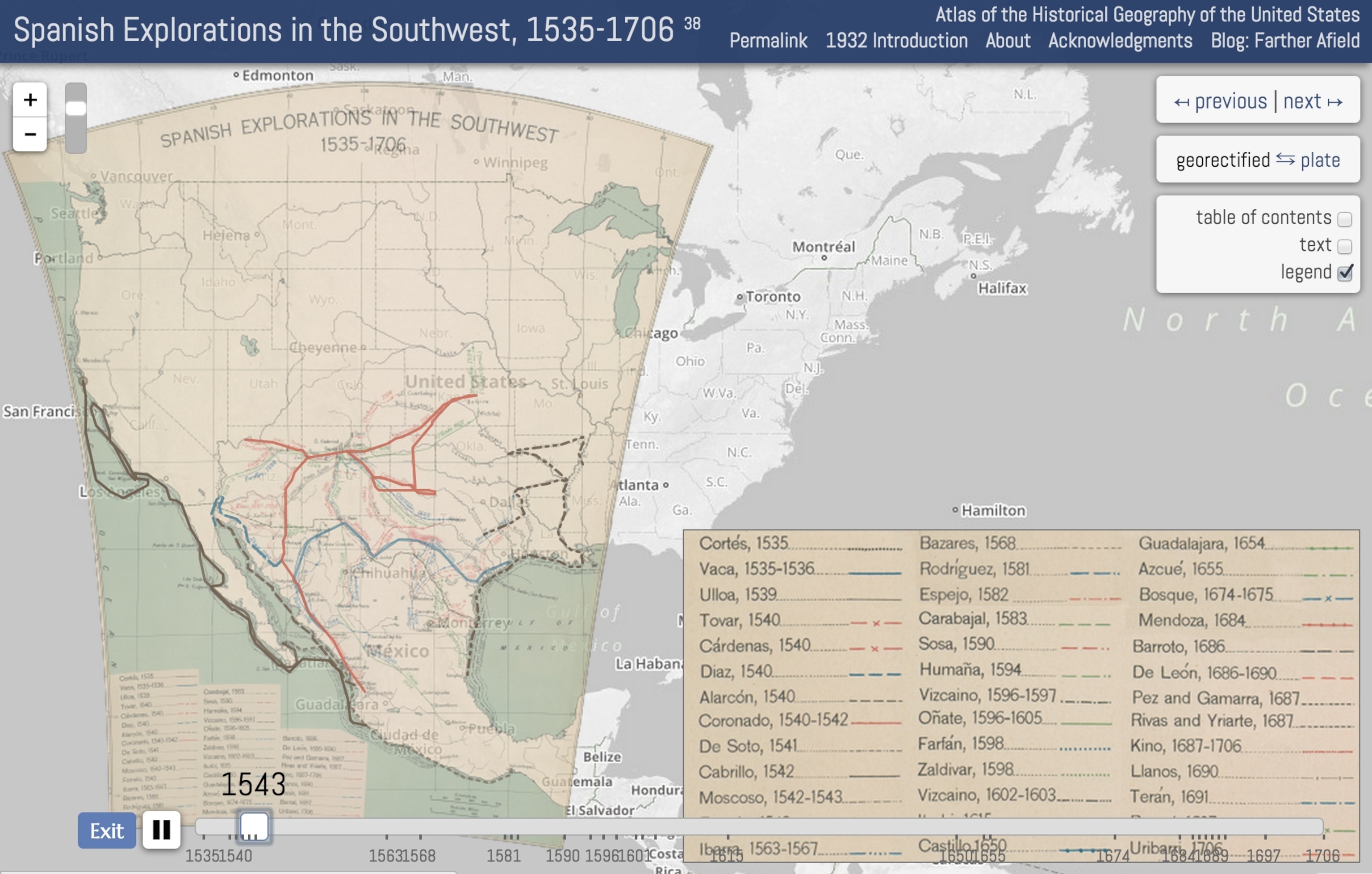
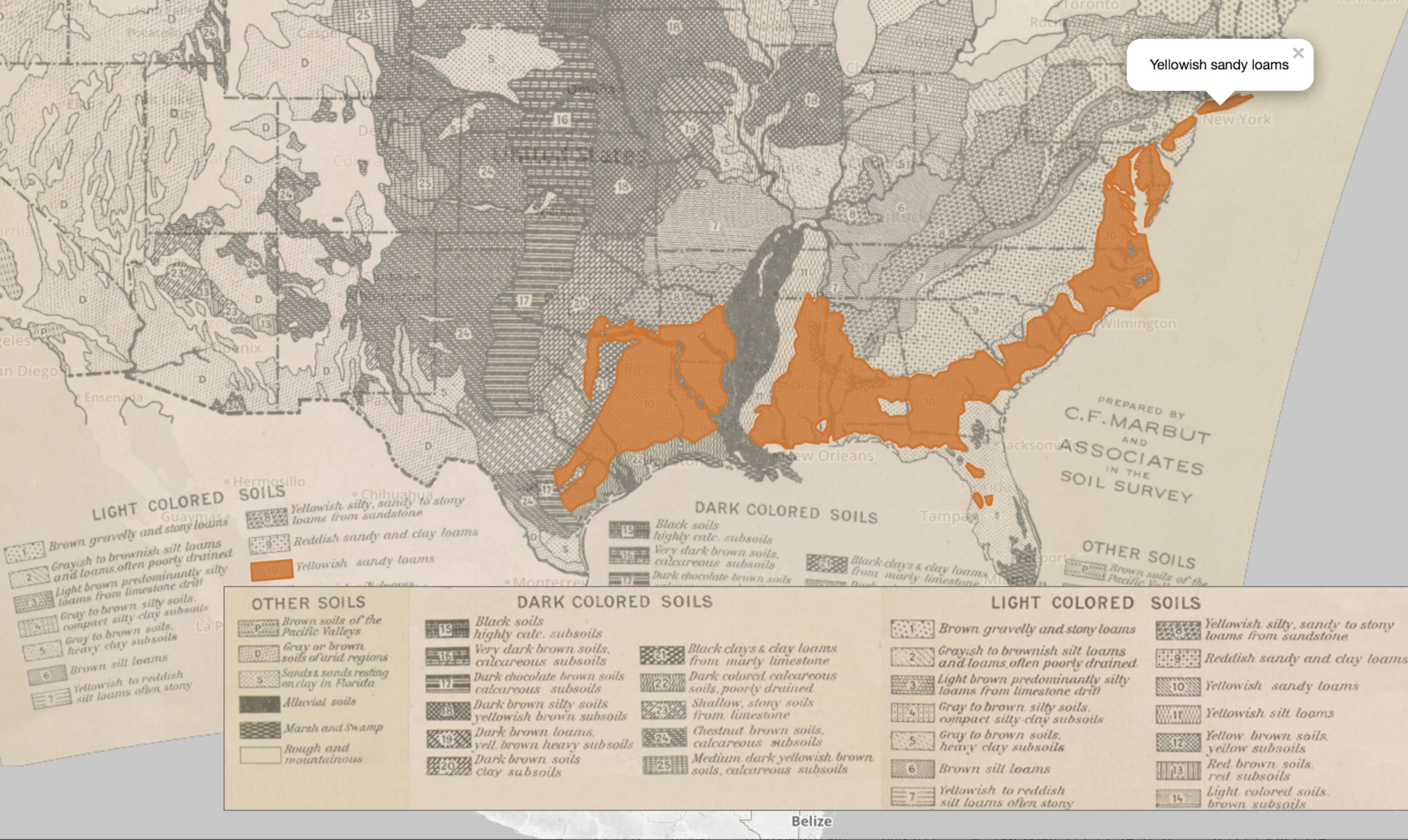
Charles O. Paullin’s 1932 Atlas of the Historical Geography of the United States contains hundreds of maps and information graphics tracing the nation back to its roots. At the time, Paullin’s editor John Wright expressed frustration with the medium of printed books: “The ideal historical atlas might well be a collection of motion-picture maps, if these could be displayed on the pages of a book without the paraphernalia of projector, reel, and screen.”
In 2013, Wright’s hopes were realized when Richmond University's Digital Scholarship Lab unveiled a comprehensively digitized version of his atlas. Taking it apart, page by page, the historian Robert Nelson's team retrofitted the atlas by "georectifying” it onto modern zoomable web maps, added the ability to click on images for further detail, and turned Paullin’s and Wright’s time-series maps into playable animations.
Reimagining Paullin's Classic Atlas for the Digital Age
The ideal historical atlas might well be a collection of motion-picture maps, if these could be displayed on the pages of a book without the paraphernalia of projector, reel, and screen.John Wright in the 1930’s
Nelson says the project occupied his lab for the better part of a year. It was not only a major preservation effort, but a significant upgrade—all while preserving the artwork. In an age when the data could be republished with new software, why put so much effort into keeping the originals?
“The maps in Paullin and Wright’s atlas are aesthetically beautiful maps,” says Nelson. “More than that, they’re really effective at communicating not just data but doing that in a way that conveys knowledge about the past.” So rather than being an obstacle to presenting the data, Nelson found the original maps were an asset. “I thought maps from the 1930s might be a hard sell,” he says. “I could not have been more wrong. Many of those maps sucked people in the same way they’d sucked us in when we first encountered the ‘Atlas’.”
I thought maps from the 1930s might be a hard sell. I could not have been more wrong.Robert Nelson, Richmond University Digital Scholarship Lab
What is it that attracts us to antique maps and data visualizations? Is it the handmade quality, the artisanship of the pre-digital, even pre-mechanical age? Perhaps there is another quality, sometimes described as “expressiveness.”
Antique Graphics and the Search for “Expressiveness” in Modern Tools
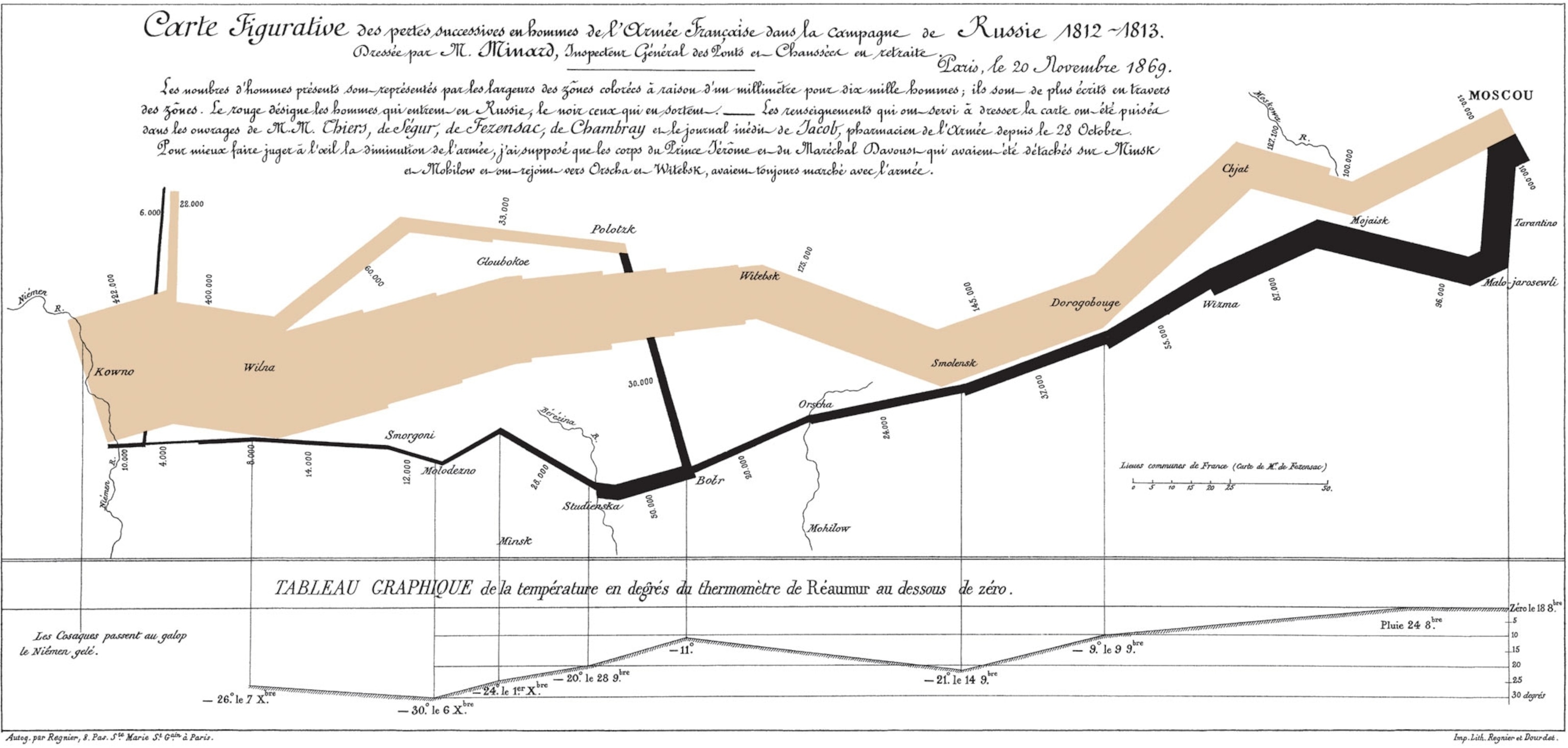
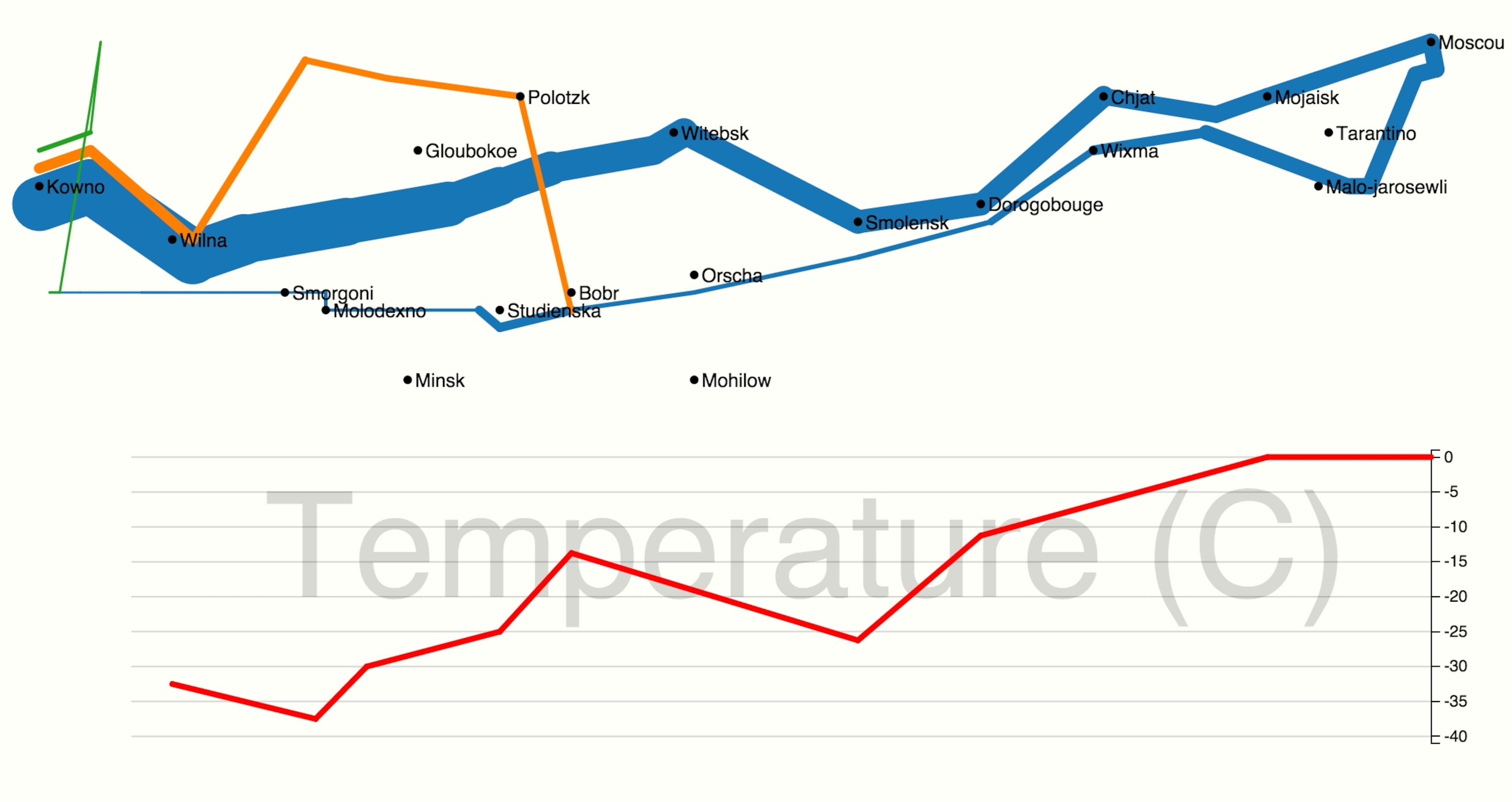
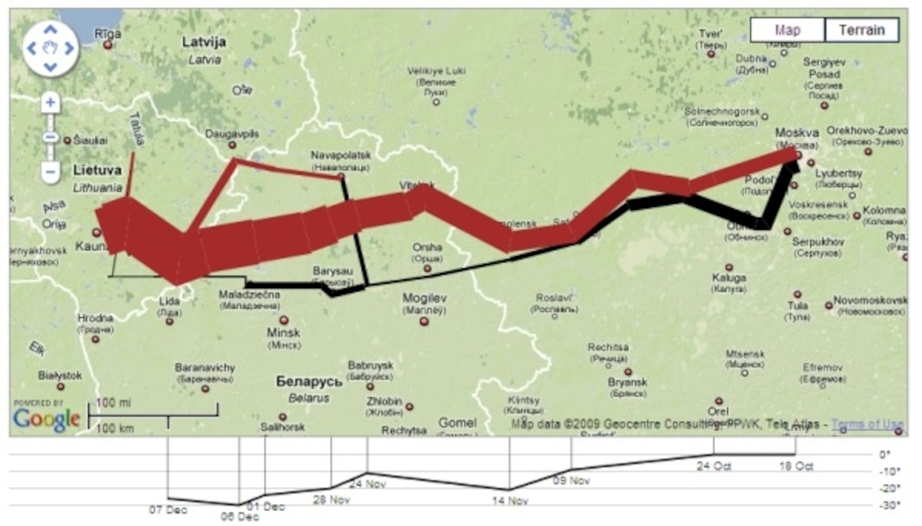
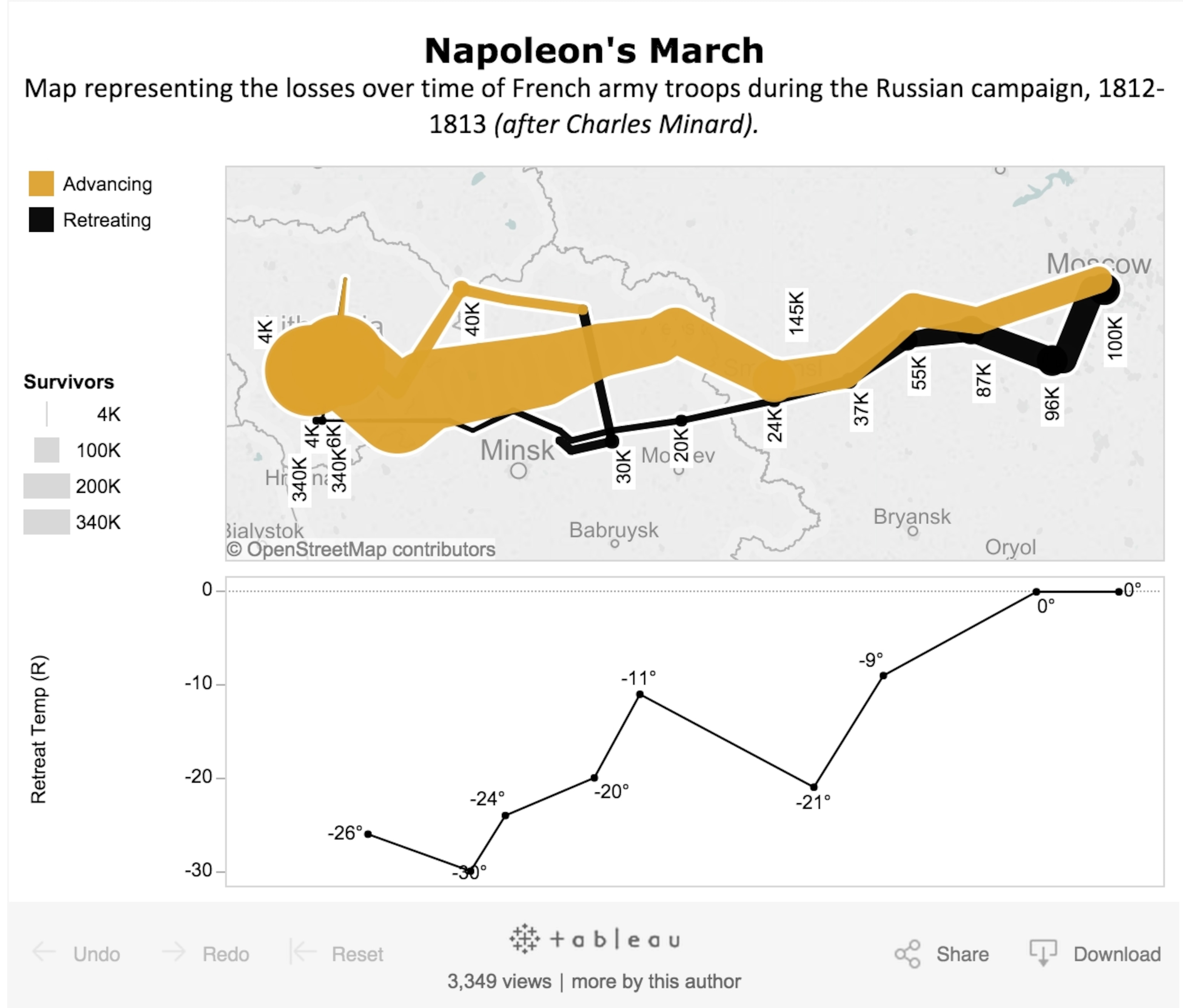
In 1861, the Frenchman Charles Minard published a flow map of Napoleon's march on Russia, showing how his army was decimated by the harsh Russian winter. The data vis guru Edward Tufte has called it “probably the best statistical graphic ever drawn,” combining a map of the troops’ march towards Moscow with a chart of plummeting temperatures, and the dwindling number of survivors who straggled back home.
Minard’s chart has become a kind of a yardstick for modern data vis technologies: it’s been reproduced with business intelligence apps like Tableau and Qlik, the digital humanities tool Neatline and visualization toolkits like Gephi, D3 and Plot.ly. The comics blogger Randall Munroe even borrowed from it to visualize movie plots.
"Re-Visions" of Minard's Napoleon
While filming a documentary in 2010, I asked the visualization researcher Jeffrey Heer why his team had recreated the Minard graphic with their new language, Protovis. “Around the turn of the 1800’s there was a really rich explosion of hand-drawn visualization,” he told me. “That’s when the forms of visualization that we find so familiar today—bar charts, line and pie charts—were invented in their modern form. We figured if our computer language can match the types of designs that people did by hand, it would be a good argument for its expressiveness, or its ability to customize graphics.”
Is this steampunk? From an aesthetic standpoint, maybe it’s the very opposite, taking a well worn machine and placing it in a shiny new wrapper. But it speaks to the interplay between past and present, between the imaginations of long-gone geniuses and the technologies that can bring their work new life.
We figured if our computer language can match the types of designs that people did by hand, it would be a good argument for its expressiveness, its ability to customize graphics.Jeffrey Heer
But something about the concept of “expressiveness” resonates amid the clean and precise—some would even say aseptic—genre of modern data visualization. So what does more expressive data vis look like? Probably not “skeumorphic” textures using fake wood, copper and leather—some interface designs from a decade ago are already starting to look steampunk, and not in a good way. But for examples of more organic and handmade-looking visualizations, one could look to Stamen design’s popular Watercolor maps, or lesser known efforts like Daniel Huffman’s “Project Linework,” which seeks to create maps with more personality—akin to how we choose different typefaces.
But it remains to be seen if today’s digital visualizers can create work that has the same longevity as work from the past. “A lot of maps and charts we see these days feel like throwaways,” says Nathan Yau, “whereas the handmade atlases are meant to be kept.”
Follow Geoff McGhee on Twitter
