
How to Make Maps and Influence People
Maps are one of the most trusted forms of communication – which makes them great for getting your point across. A look at the dark art of cartographic persuasion.
Data Points is a new series where we explore the world of data visualization, information graphics, and cartography.
We depend on maps every day—to navigate, to check the weather, to understand the world. Perhaps because maps typically depict the real world, they are one of the most trusted forms of visual communication.
"Maps have inherent credibility. We are trained since childhood to rely on maps," says Paul "P.J." Mode, a collector and amateur map historian. But that trust can be taken advantage of, he says, by people who use maps to promote their own point of view.
Mode, who uses infographics extensively in his law practice, has spent the past three decades collecting examples of what he calls "persuasive cartography," which range from satirical cartoons with geographical elements and politically loaded schoolroom maps to vintage data visualizations that would not be out of place on the Internet today.
This genre of cartography is often called "propaganda maps," says Mode, but he prefers the less pejorative label "persuasive cartography." Just because they’re persuasive, he argues, doesn't mean they’re inaccurate. "I collect both—there are some pieces that are persuasive because they are completely accurate and that marshal facts in a way that is very powerful.” He adds, “There are others that use maps that are not at all accurate, but what is powerful is the imagery. And then there are maps that are incredibly deceptive."
Mode donated his collection of over 700 maps to the Cornell University Library in 2014. In September, the university’s Division of Rare & Manuscript Collections launched an online archive of images from the collection. About 300 works have been digitized and published so far, dating from the distant past to as recent as 2008.
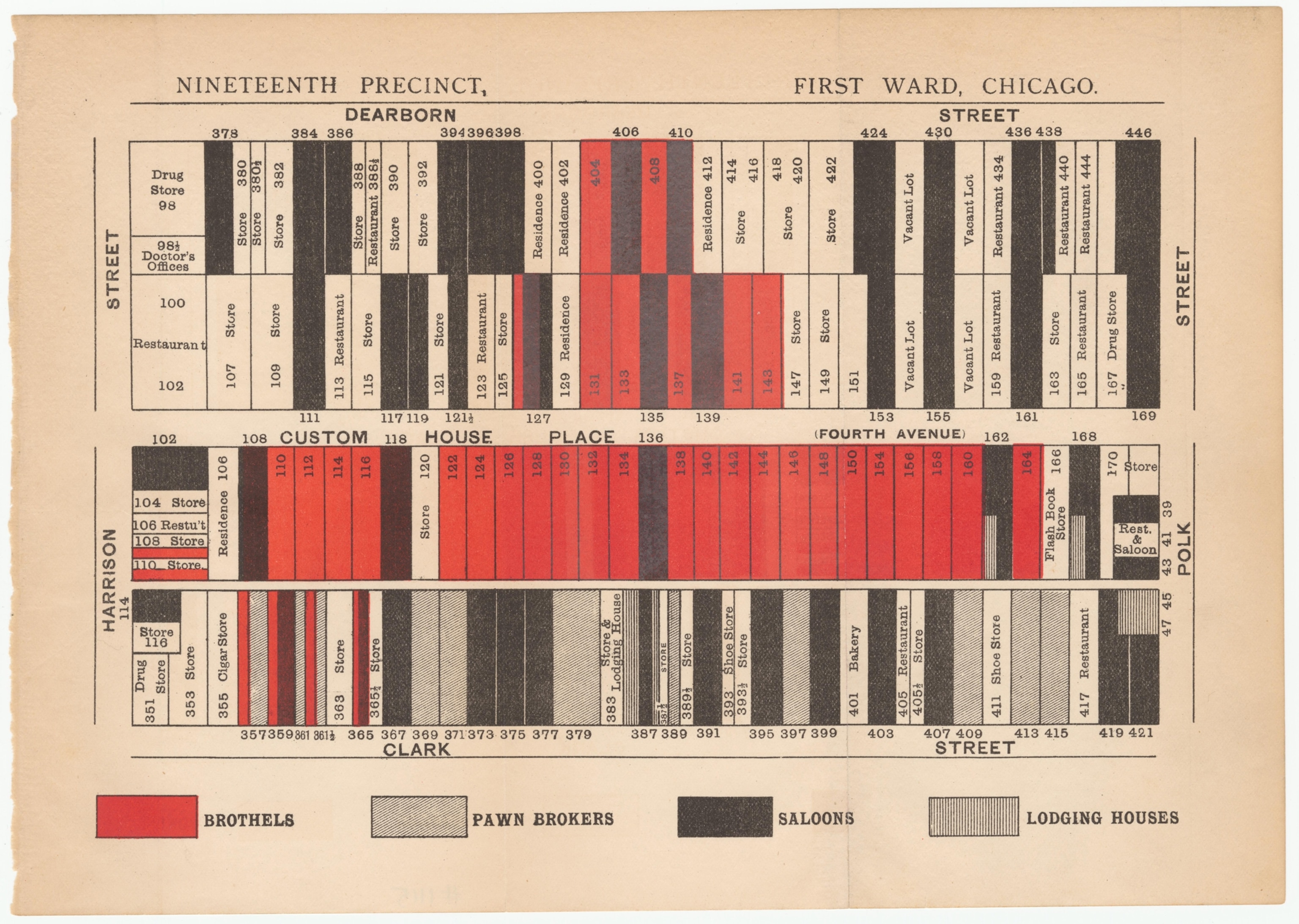
Much like maps that achieve viral popularity today, classic maps seen in Mode’s collection often sought to provoke shock or outrage. Examples include oddly familiar broadsides against wealth inequality: an 1877 cartoon in the German edition of Puck magazine showing the oligarchs William Vanderbilt, Jay Gould, Cyrus West Field, and Russell Sage carving up the country into pieces; a 1884 political poster by the Democratic Party accusing Republicans of giving away 38 percent of the United States to railroad corporations (the real amount was closer to 9 percent, Mode notes, adding that “the effect of the deception was massive”). Even the deepest skeptic of alcohol prohibition would be struck by this 1888 map of taverns in New York City and by the dense concentration of saloons, bordellos, and pawnshops within a few blocks in Chicago in an 1894 map created by temperance advocates.
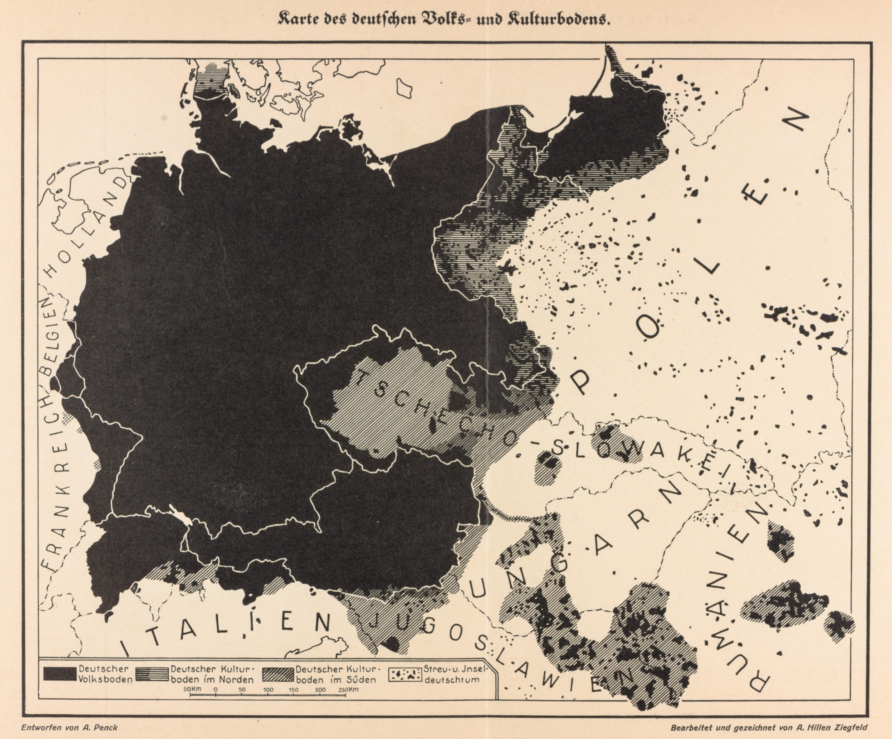
If the core purpose of maps is to portray spatial relationships, it’s not surprising that many of Mode’s maps seem to emphasize a sense of proximity, even encroachment. In the 1920s, after the Treaty of Versailles had forced Germany to make territorial concessions, a popular nationalist map prefigured later aggressions by making it possible, Mode writes, “to claim not only all lost territories but even areas outside pre-war Germany simply by pointing to their German cultural character.”
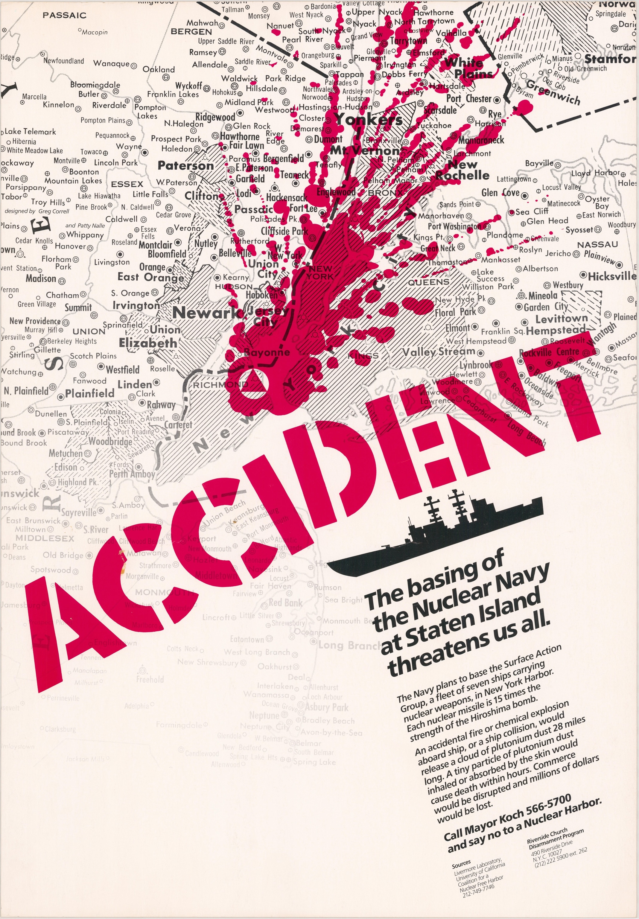
Indeed, fear of encroachment seems to be a popular motivator in these charts, as illustrated by a map made for a successful campaign to keep nuclear warships out of New York Harbor in the 1980s. The map, made by a church-based antinuclear group, overlays a giant red paint splash on a map of the city, next to text warning that a warhead or reactor accident could engulf Manhattan in a 28-mile cloud of plutonium dust. “It’s an example of what can be done using maps,” says Mode, “to make a point to the general public without using any science.”
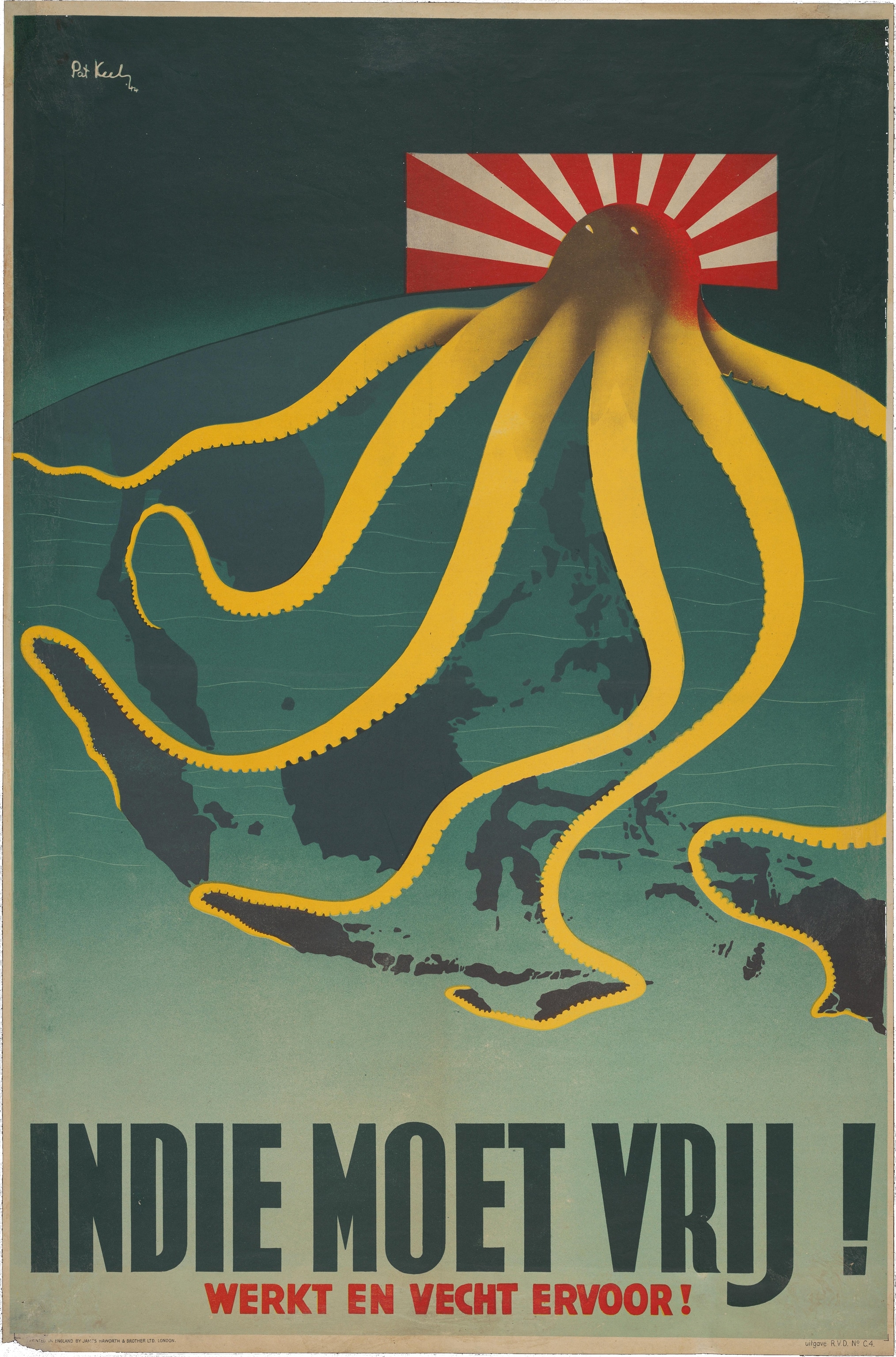
Not surprisingly, a number of memorable images from the collection were produced in wartime. A Japanese map dating from the Russo-Japanese War depicts Russia as a giant octopus astride Europe and Asia. Menacing octopuses seem to be a popular metaphor, as Japan was in turn depicted in World War II, in a Dutch poster urging the liberation of the Netherlands’ former Indonesian colonies. The British produced vivid war graphics as well, such as the arguably correct “Nazi War Aims—Grab! Grab!! Grab!!!” in 1939.
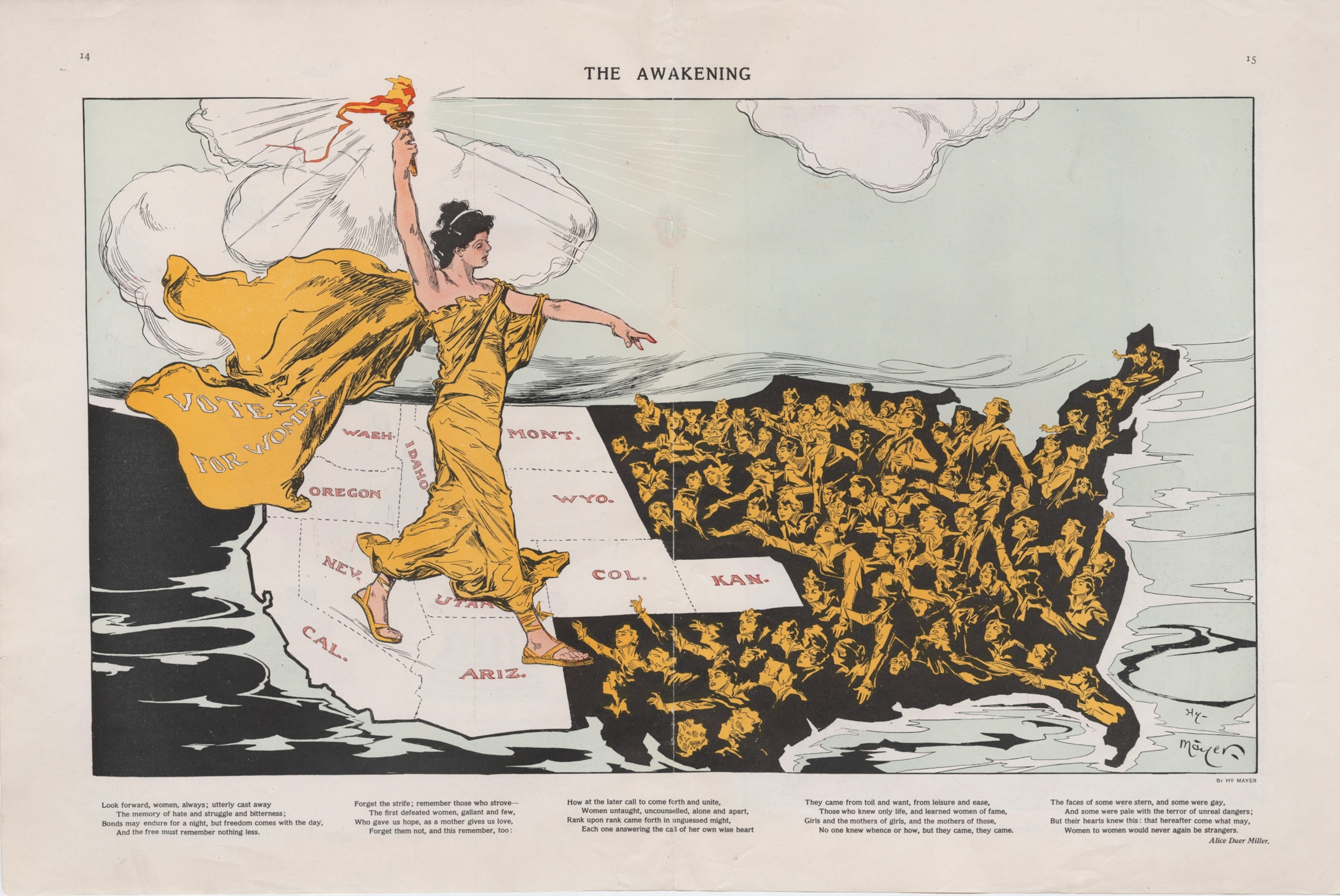
But maps in the collection also draw on pride, uplift, and a sense of humor. During the movement to enfranchise women nationwide, a Puck magazine graphic entitled “The Awakening” shows Lady Liberty astride the newly incorporated western states and territories—where women had the vote—looking back at yearning masses of women in the East.The August 1895 cover of Judge magazine, a rival to Puck and its timeless Thomas Nast cartoons, shows the U.S. as a curious Uncle Sam—his eye Washington, D.C., his nose Florida—peering intently down at Cuba, where an insurgency had just begun, and where Theodore Roosevelt would later lead an invading force to wrest the island from the Spanish.
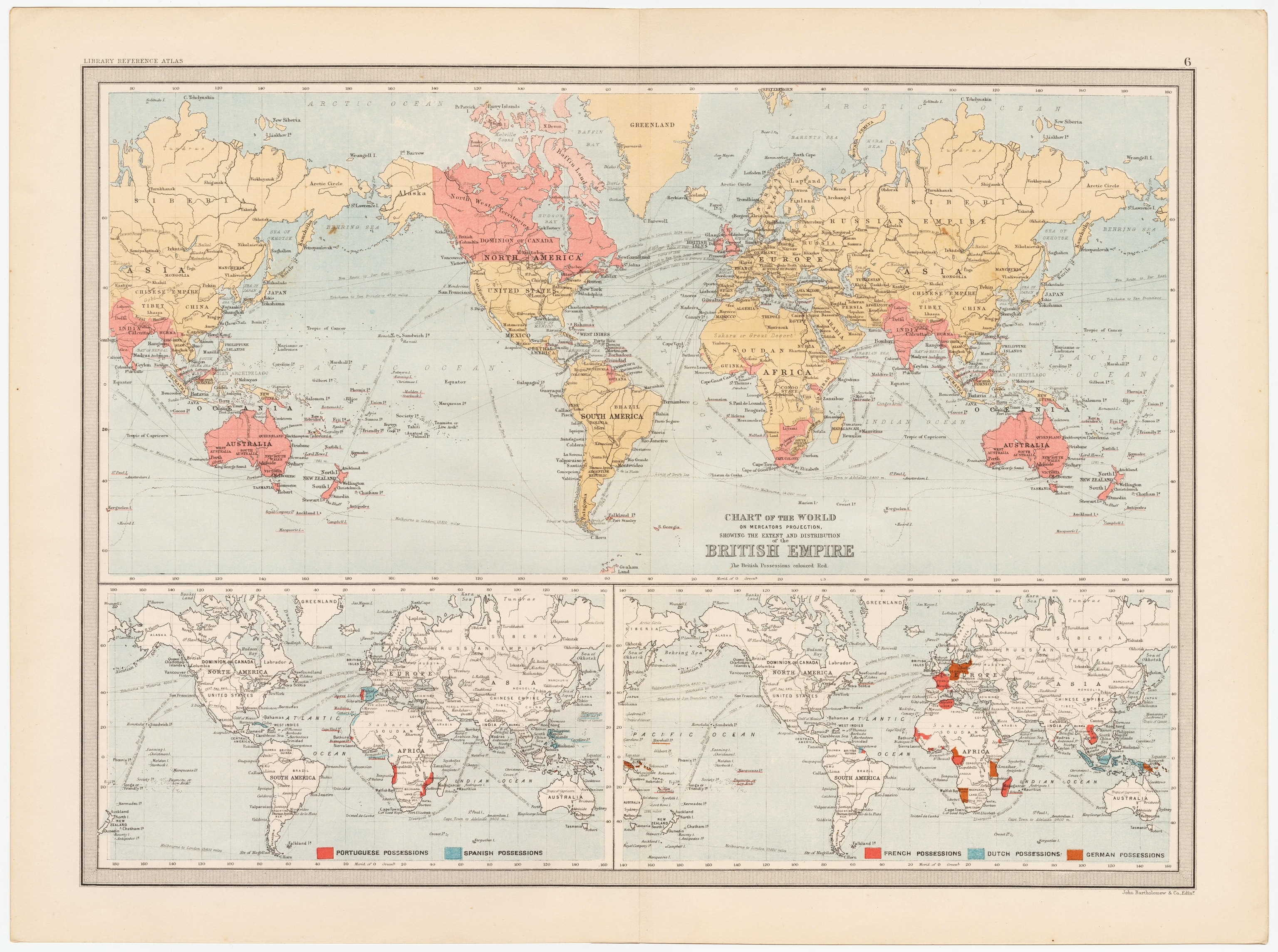
Mode says the historical masters of persuasive maps, though, were the British during their imperial height, when maps helped promote the size, power, and presumable invincibility of a small island nation’s global empire. They used not just maps themselves, he says, but also visual and geographical tactics to shape the viewer’s perception.
An extrawide 1890 map of the British Empire, Mode points out, extends 490 degrees of longitude across a globe with only 360 degrees—ensuring that India, Australia, and New Zealand appear not once but twice. “It really is in many ways an important example of how the British used cartography to emphasize the size, extent, and power of the British Empire.”
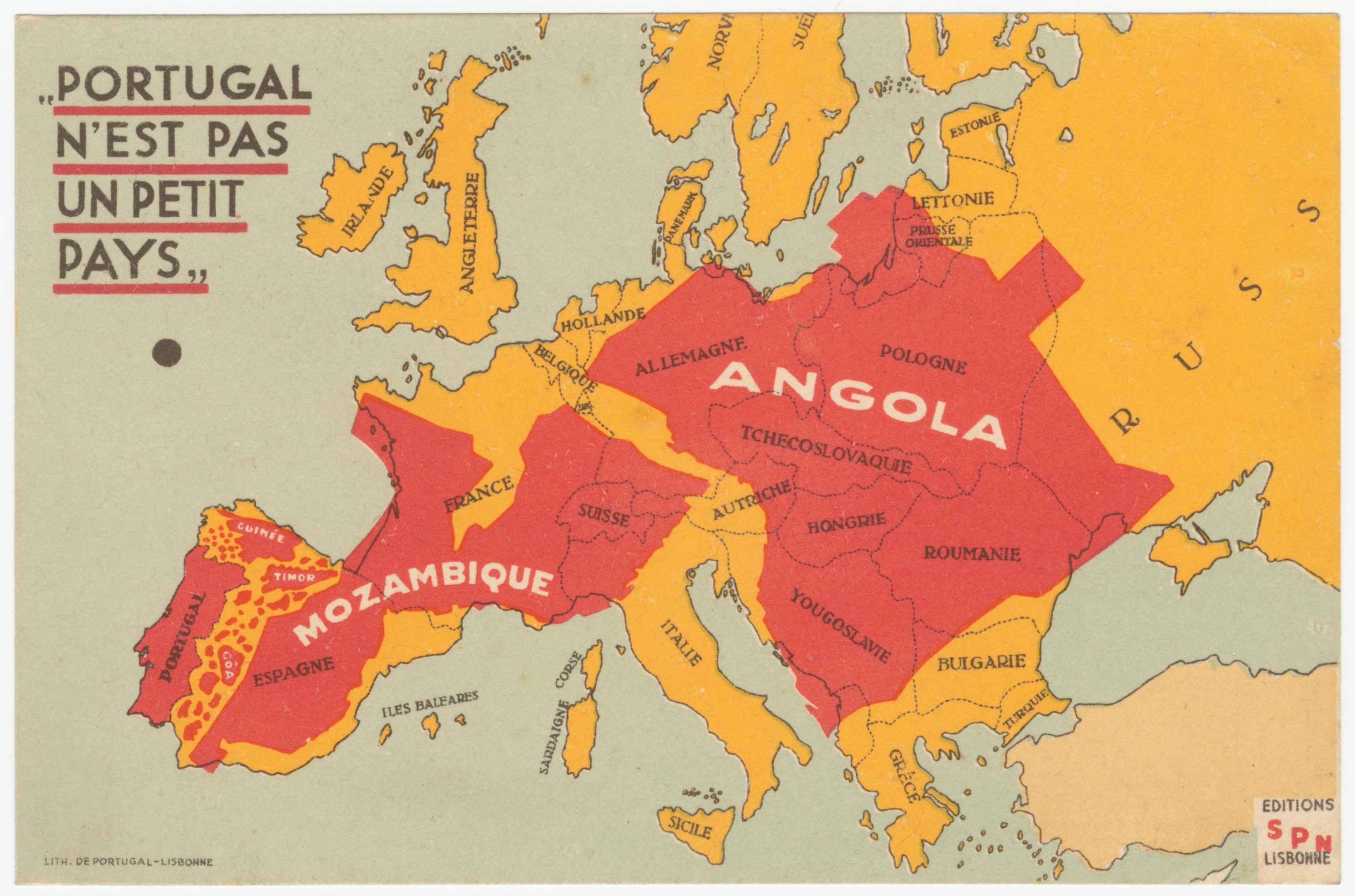
A similar 1934 map entitled “Portugal Is Not a Small Country” overlays the tiny country’s overseas colonies (including Mozambique and Angola) on the rest of Europe.
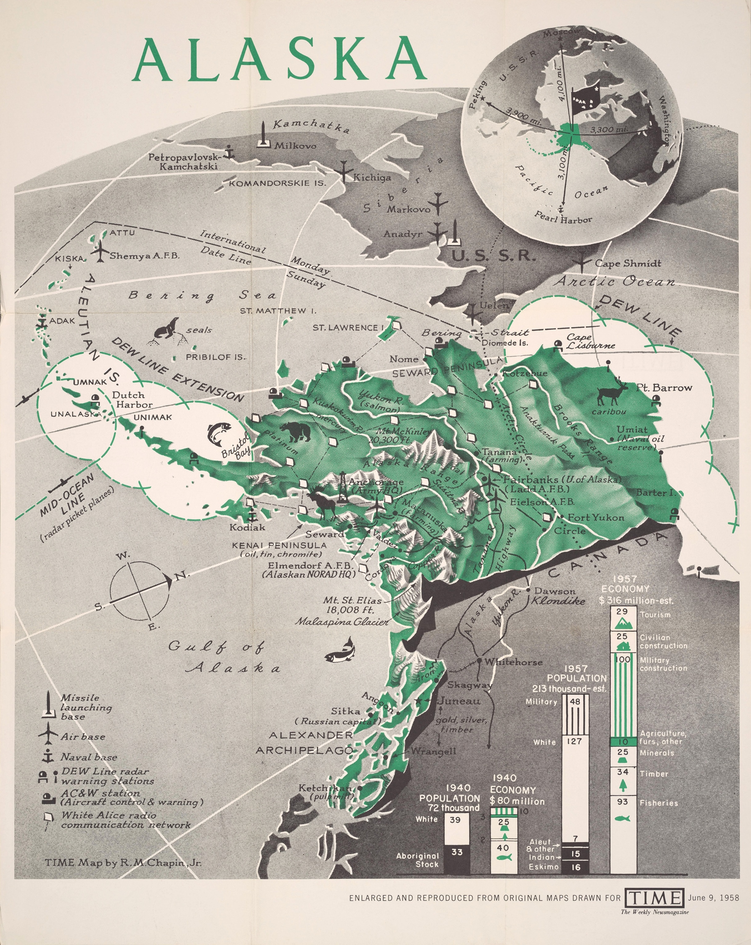
As Mark Monmonier’s venerable book How to Lie with Maps has pointed out, cartographic projection can be another tool of deception. A number of Cold War-era U.S. maps of the Soviet Union adopt an unusual polar viewpoint to emphasize the reach of communism, as in a pamphlet produced by Miami anti-communists in 1966. Mode cites a 1958 map created for TIME magazine that was welcomed by Alaska statehood advocates for its strong visual emphasis of the state’s strategic location relative to the Soviets. In the map’s bird’s-eye perspective, you practically can see Russia from your window.
Are these maps accurate? Not always, says Mode, but he notes that he selected the works based on their effectiveness, not their veracity. The railroad map, for example, drastically overstated the amount of land being granted to the railroad companies; a slavery map produced for the 1856 presidential campaign of abolitionist John C. Frémont counted as slave territories those new states and territories that had not yet decided whether or not they would adopt slavery.
Viewed as a whole, the Cornell collection is a reminder that although there is beauty in truth, an artfully spun point of view can be quite seductive as well. And no maps—even the most scrupulously researched—are completely free of editorial decisions or points of view. As Mode says, “There’s a great quote from a colonel on World War II: ‘Propaganda is what the other side does. What we do is communication.’ ”
Persuasive Cartography: The PJ Mode Collection is online at Cornell University Library’s Division of Rare & Manuscript Collections.
Follow Geoff McGhee on Twitter